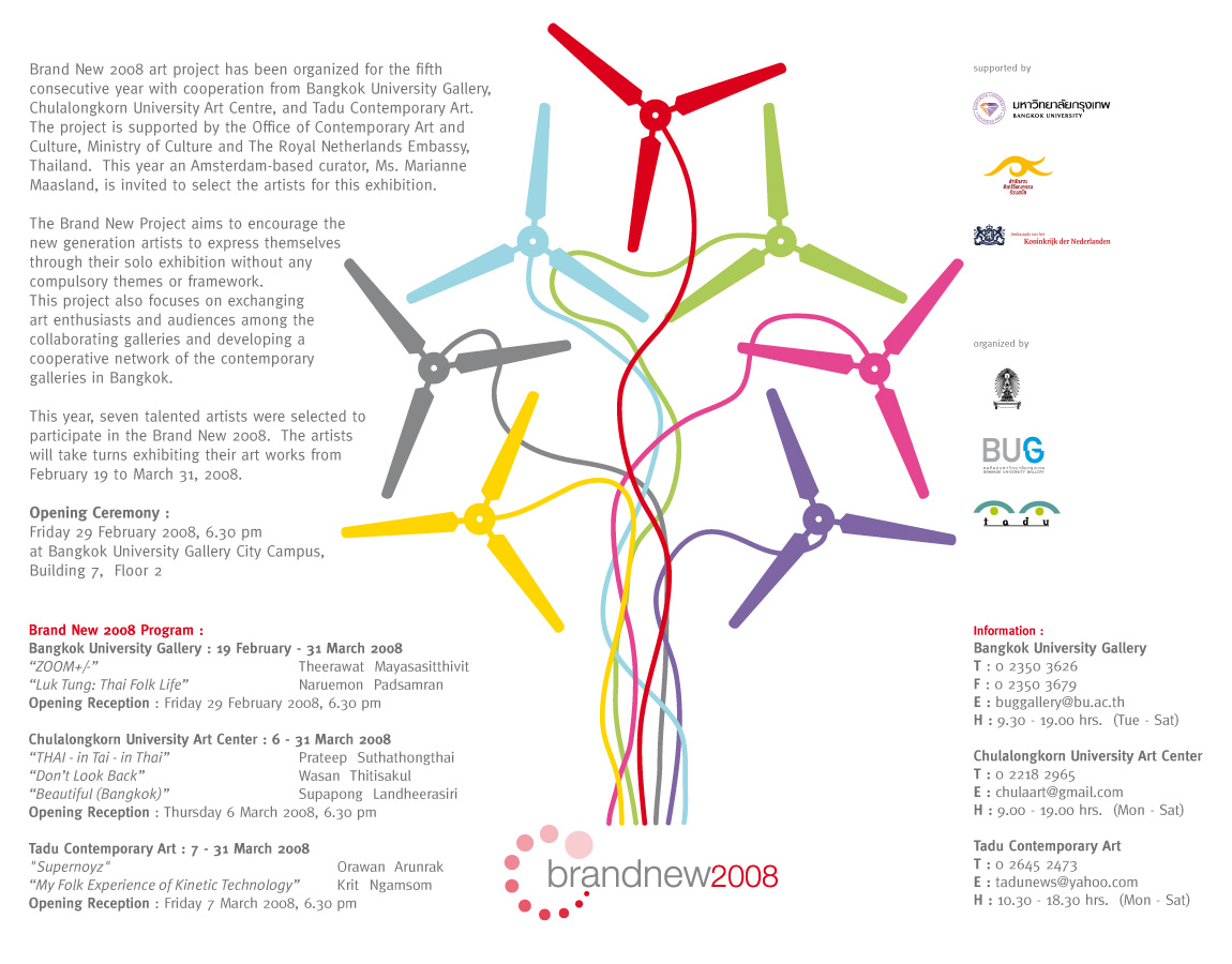
click here
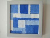
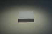
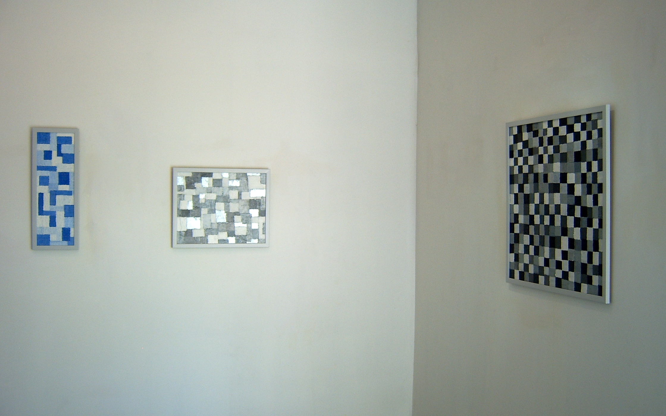
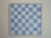
Date : 2014
Medium : Acrylic on Wood
Dimensions : 164 x 80 cm. and 164 x 60 cm.
 click here
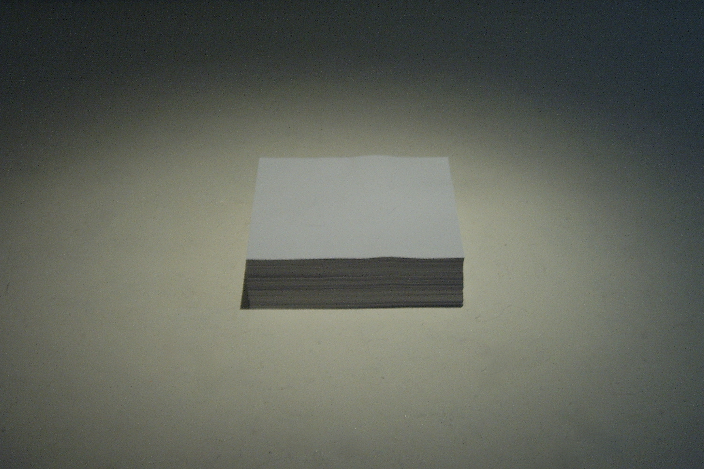
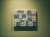
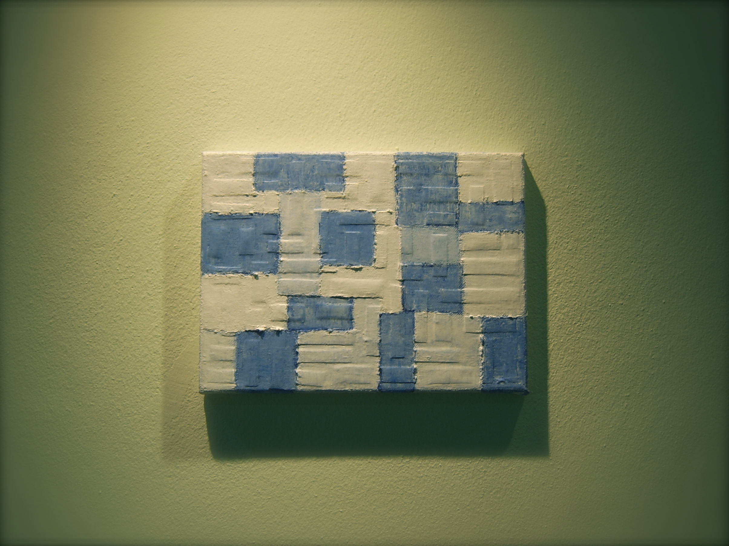
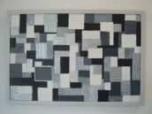
Date : 2014
Medium : Acrylic on Wood
Dimensions : 60 X 164 cm. Each
 click here
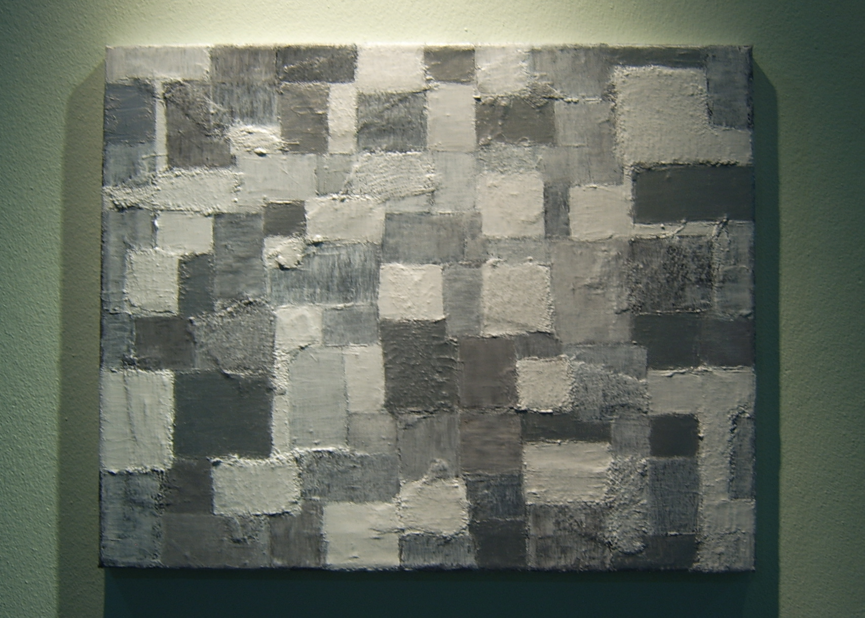
Date : 2010
Medium : Acrylic on Paper
Dimensions : 63.1 X 48 cm.
 click here
Font : Helvetica
Typeface : Regular
Size : 10.1
Paper Size : A4
Date : 2014
Friends with Books: Art Book Fair Berlin
Cafe Moskau Berlin
Sunday 14 December 2014
11am - 7pm
 click here
FAR FAR AWAY... (BUTTERFLY EFFECT)
DIMENSION : VARIABLE SIZE
TECHNIQUE : MIXED MEDIA
YEAR : 2013
 click here
FAR FAR AWAY... (BUTTERFLY EFFECT)
DIMENSION : VARIABLE SIZE
TECHNIQUE : MIXED MEDIA
YEAR : 2013
 click here
DIMENSION : VARIABLE SIZE
TECHNIQUE : MIXED MEDIA
YEAR : 2013
 click here
DIMENSION : VARIABLE SIZE
TECHNIQUE : MIXED MEDIA
YEAR : 2013
 click here
DIMENSION : VARIABLE SIZE
TECHNIQUE : MIXED MEDIA
YEAR : 2013
 click here
DIMENSION : VARIABLE SIZE
TECHNIQUE : MIXED MEDIA
YEAR : 2013
 click here
 click here
 click here
 click here
 click here
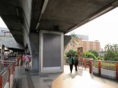
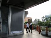
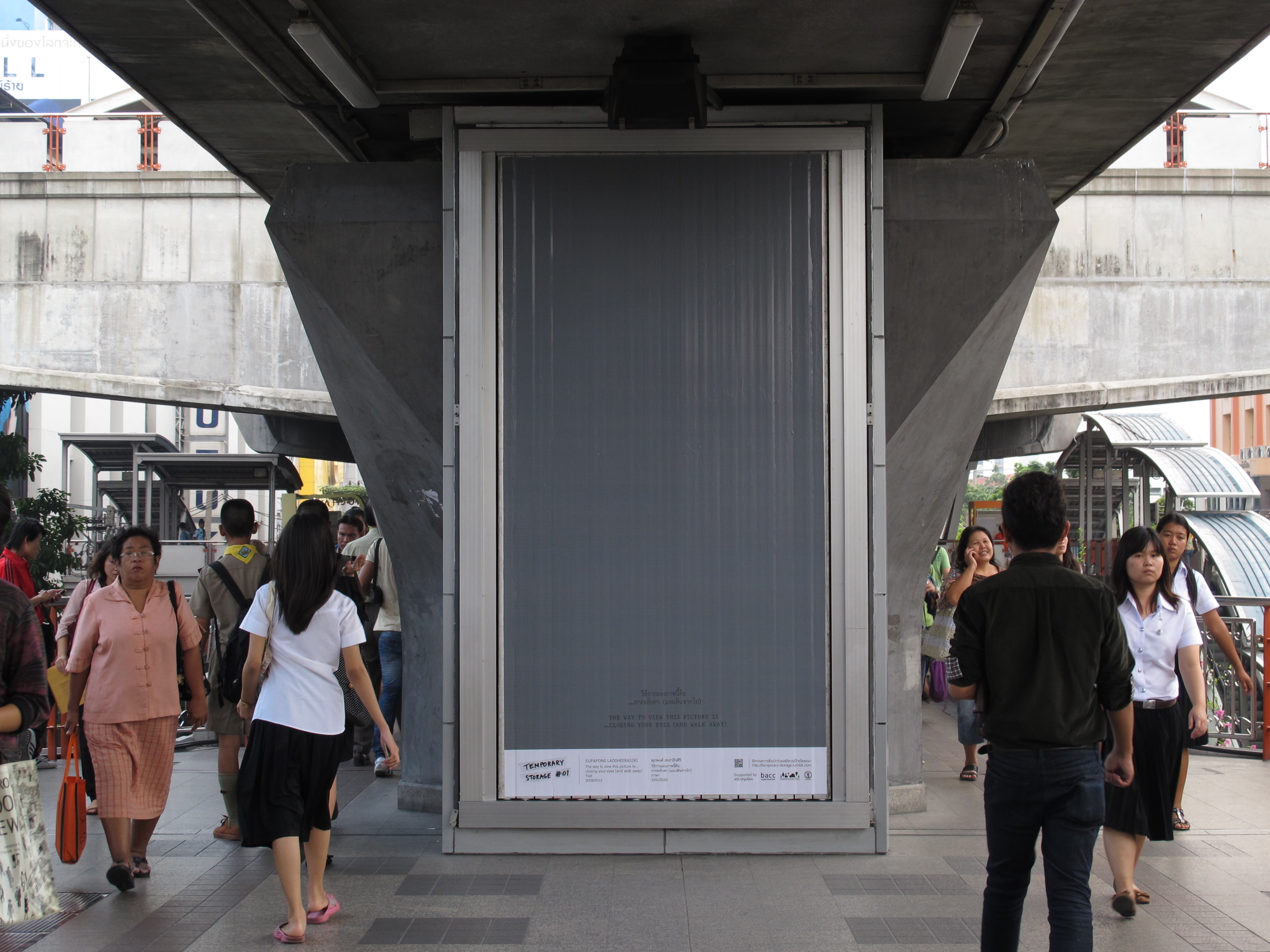
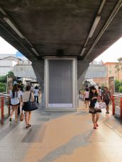
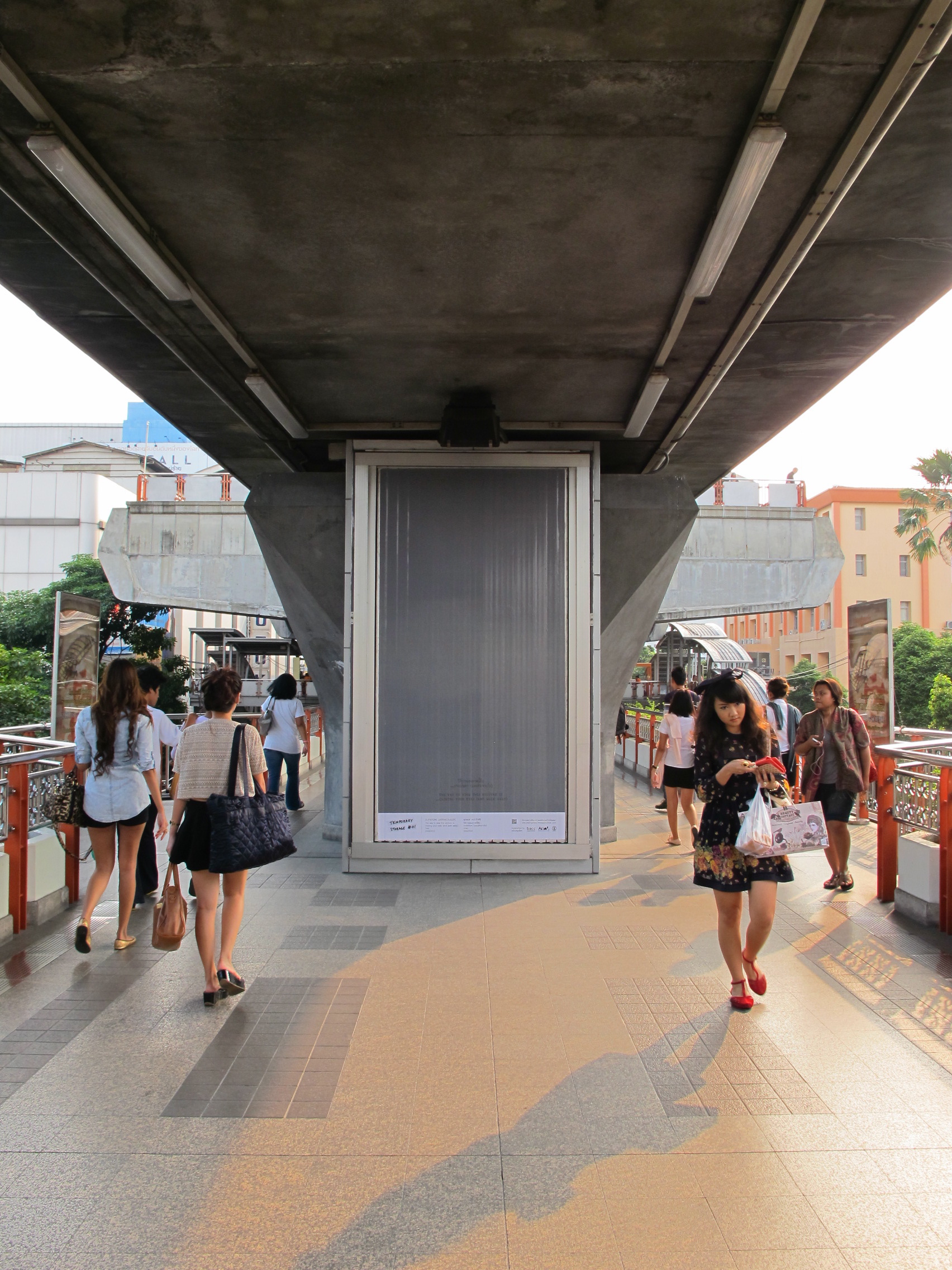
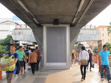
SIZE : 150 x 280 CM.
TECHNIQUE : DIGITAL PRINT ON ADVERTISING BANNER
YEAR : 2008/2012
SITE : SKY WALK, BTS (SKY TRAIN) VICTORY MONUMENT STATION, BANGKOK, THAILAND.
 click here
SIZE : 18 X 20 INCH
TECHNIQUE : COLOR DIGITAL PHOTOGRAPHIC PRINT
YEAR : 2012
 click here
SIZE : 18 X 20 INCH
TECHNIQUE : COLOR DIGITAL PHOTOGRAPHIC PRINT
YEAR : 2012
 click here
SIZE : 18 X 20 INCH
TECHNIQUE : COLOR DIGITAL PHOTOGRAPHIC PRINT
YEAR : 2012
 click here
 click here
 click here
SIZE : 40 x 40 CM.
TECHNIQUE : COLLAGE AND ACRYLIC ON CANVAS
YEAR : 2011
 click here
 click here
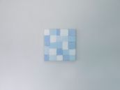
SIZE : 25 x 25 CM.
TECHNIQUE : COLLAGE AND ACRYLIC ON CANVAS
YEAR : 2011
 click here
SIZE : 50 x 50 CM.
TECHNIQUE : COLLAGE AND ACRYLIC ON CANVAS
YEAR : 2011
 click here
SIZE : 20 X 20 CM.
TECHNIQUE : COLLAGE AND ACRYLIC ON CANVAS
YEAR : 2011
 click here
SIZE : 20 X 20 CM.
TECHNIQUE : COLLAGE AND ACRYLIC ON CANVAS
YEAR : 2011
 click here
SIZE : 50 x 40 CM.
TECHNIQUE : COLLAGE AND ACRYLIC ON CANVAS
YEAR : 2012
 click here
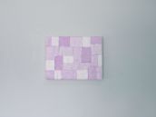
SIZE : 20 X 20 CM.
TECHNIQUE : COLLAGE AND ACRYLIC ON CANVAS
YEAR : 2011
 click here
SIZE : 60 X 20 CM.
TECHNIQUE : COLLAGE AND ACRYLIC ON CANVAS
YEAR : 2011
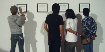
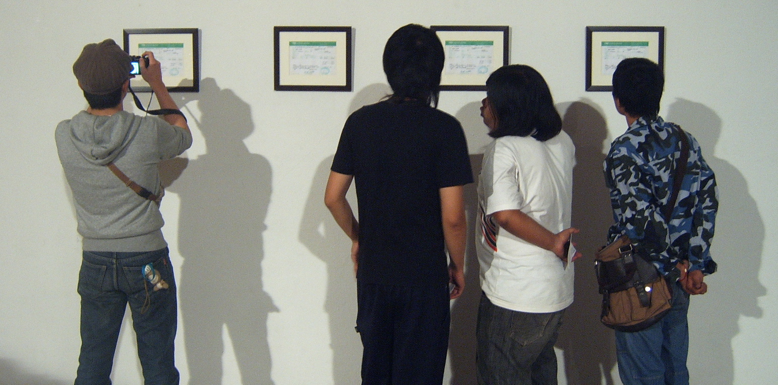
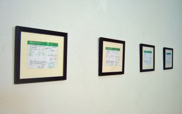
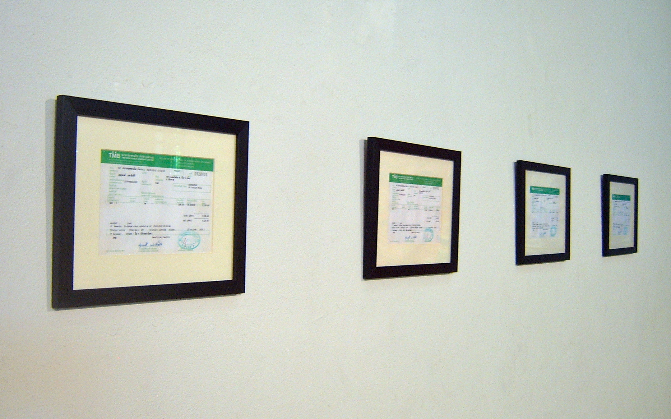
 click here
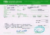
SIZE : 15 X 21 CM.
MATERIAL : TAX INVOICE / RECEIPT
YEAR : 2012
 click here
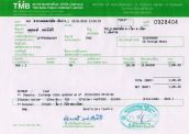
SIZE : 15 X 21 CM.
MATERIAL : TAX INVOICE / RECEIPT
YEAR : 2012
 click here
 click here
 click here
 click here
 click here
 click here
MATERIAL : PAPER
SIZE : 39.5 x 39.5 x 11 CM.
YEAR : 2011
 click here
SIZE : 20 X 24 CM
TECHNIQUE : PERMANENT PEN ON CANVAS
YEAR : 2011
 click here
SIZE : 20 X 24 CM
TECHNIQUE : PERMANENT PEN ON CANVAS
YEAR : 2011
 click here
SIZE : 20 X 24 CM
TECHNIQUE : PERMANENT PEN ON CANVAS
YEAR : 2011
 click here
SIZE : 20 X 24 CM
TECHNIQUE : PERMANENT PEN ON CANVAS
YEAR : 2011
 click here
SIZE : 20 X 24 CM
TECHNIQUE : PERMANENT PEN ON CANVAS
YEAR : 2011
 click here
 click here
 click here
 click here
 click here
 click here
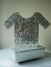
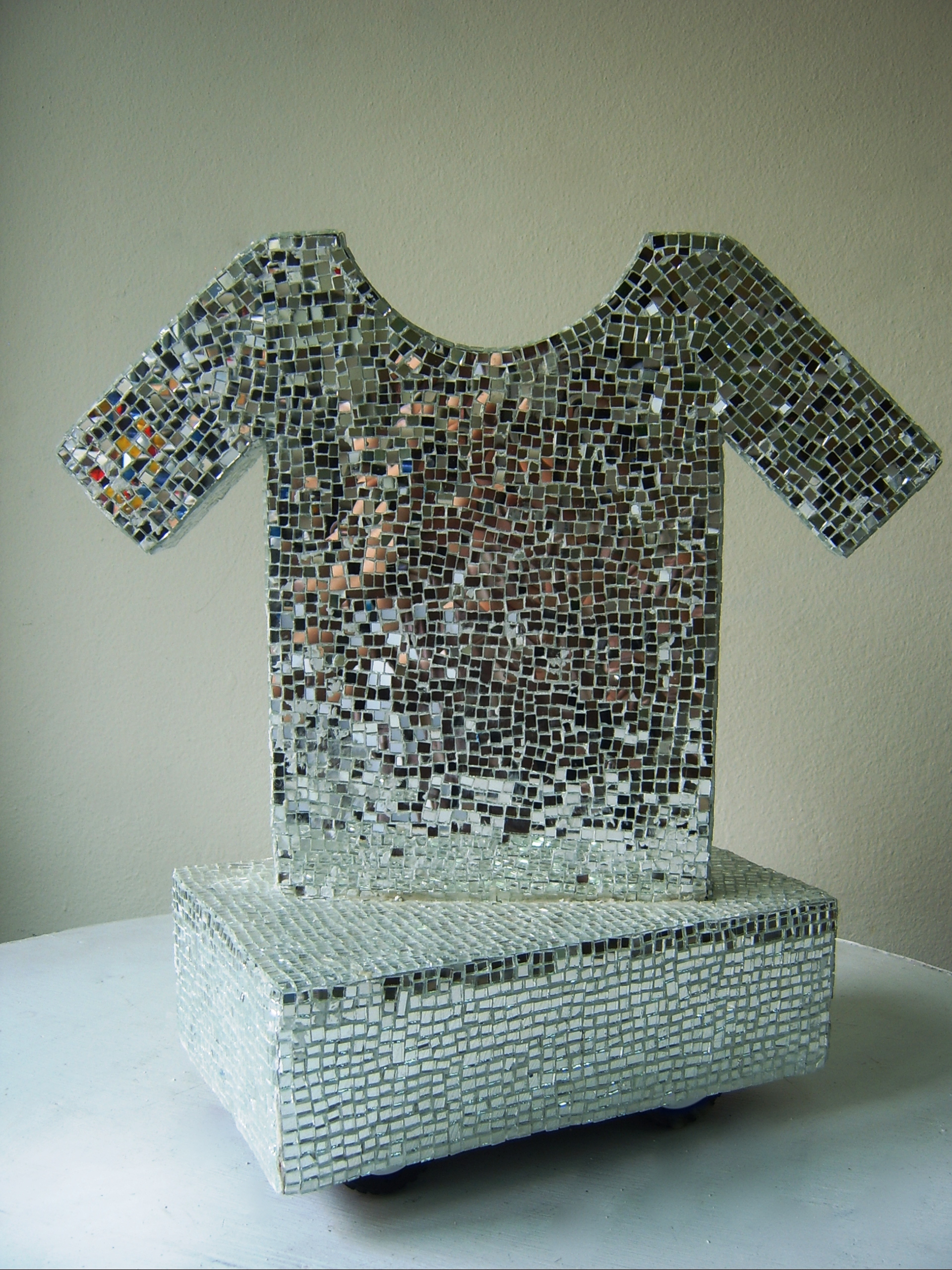
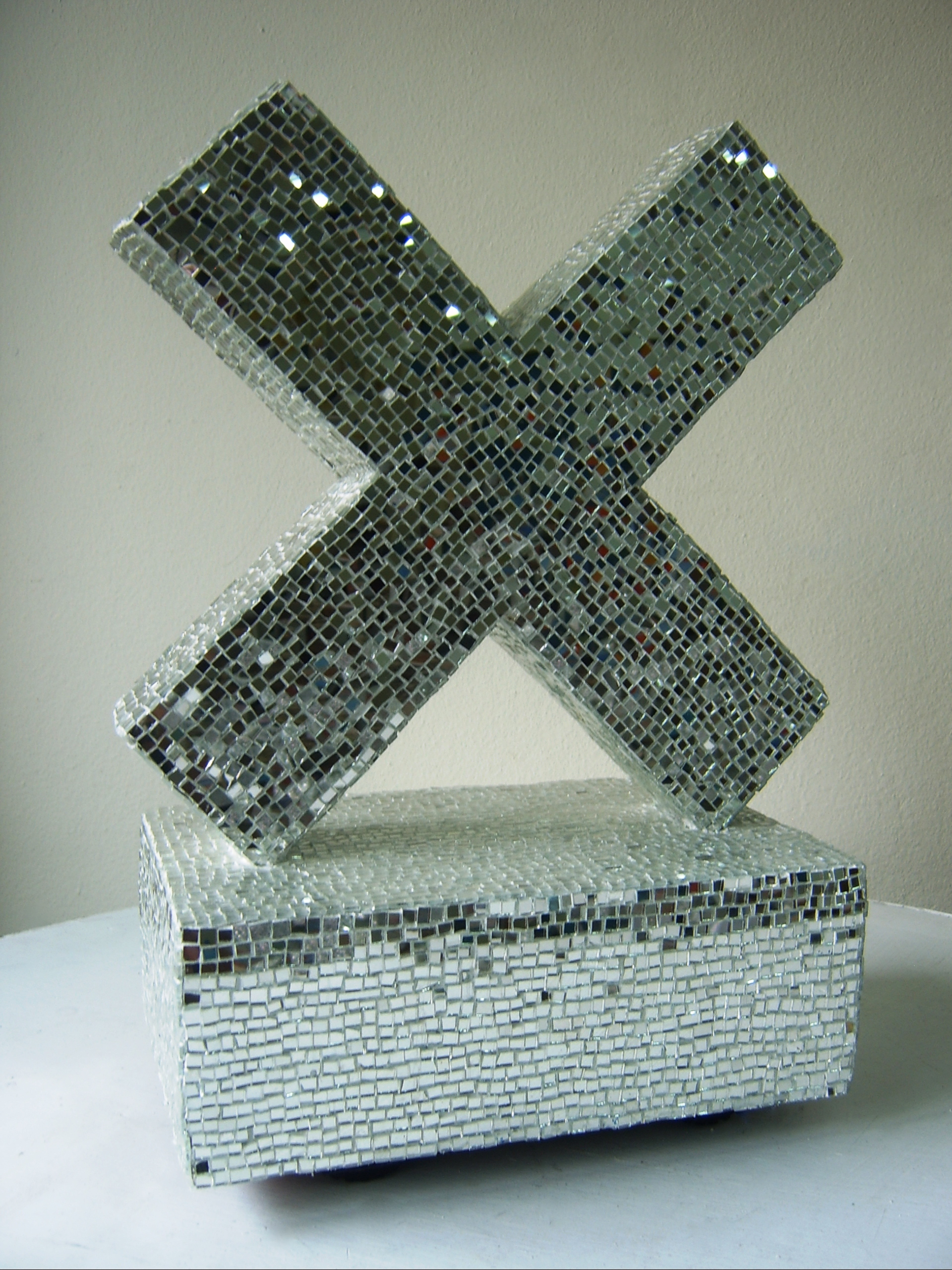
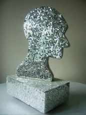
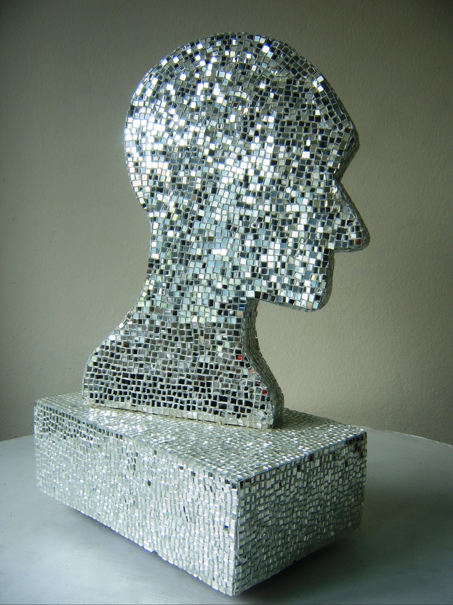
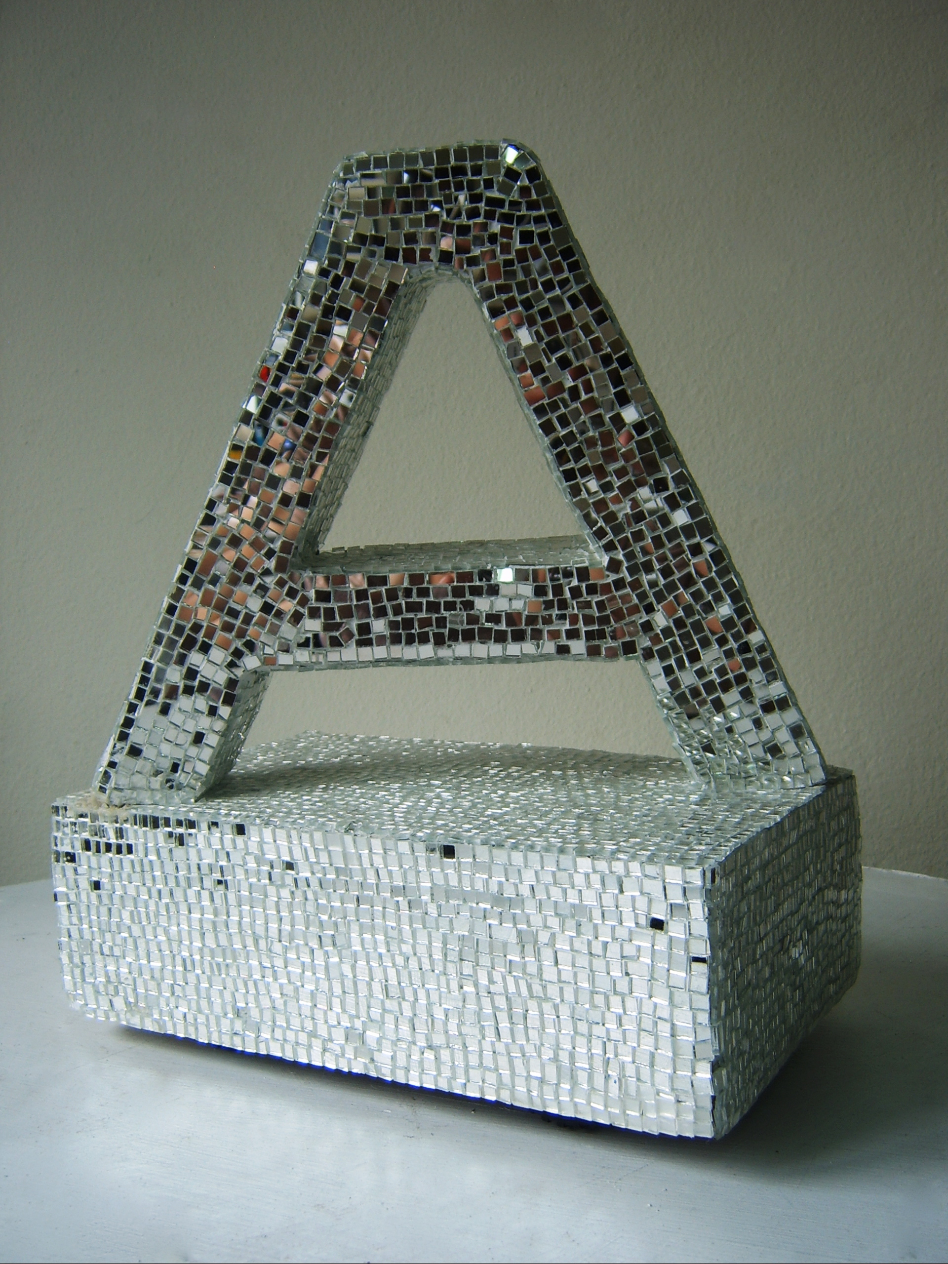
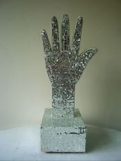
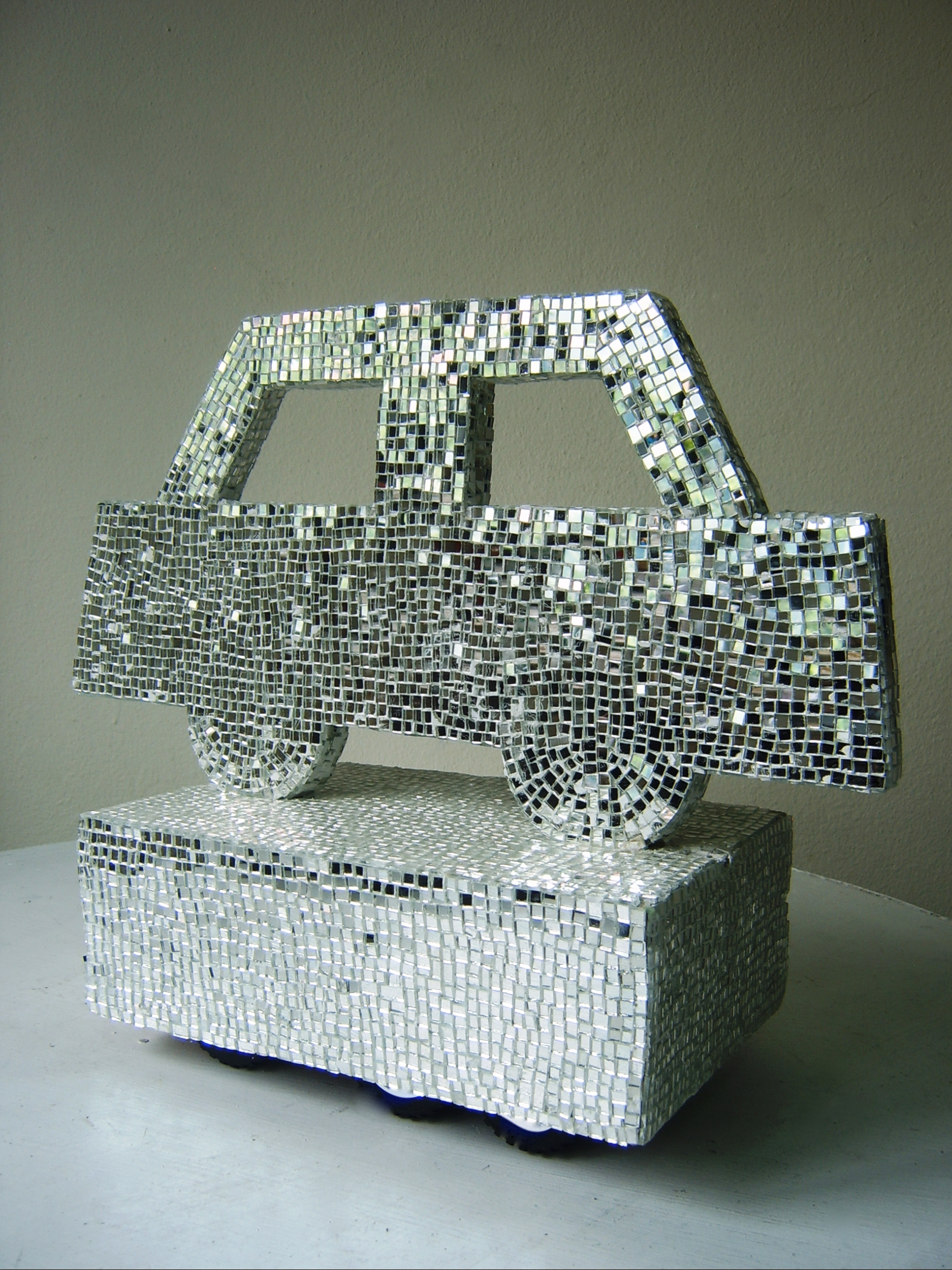
TECHNIQUE : MIXED MEDIA
SIZE : DIMENSIONS VARIABLE
YEAR : 2009
 click here
 click here
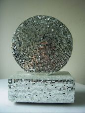
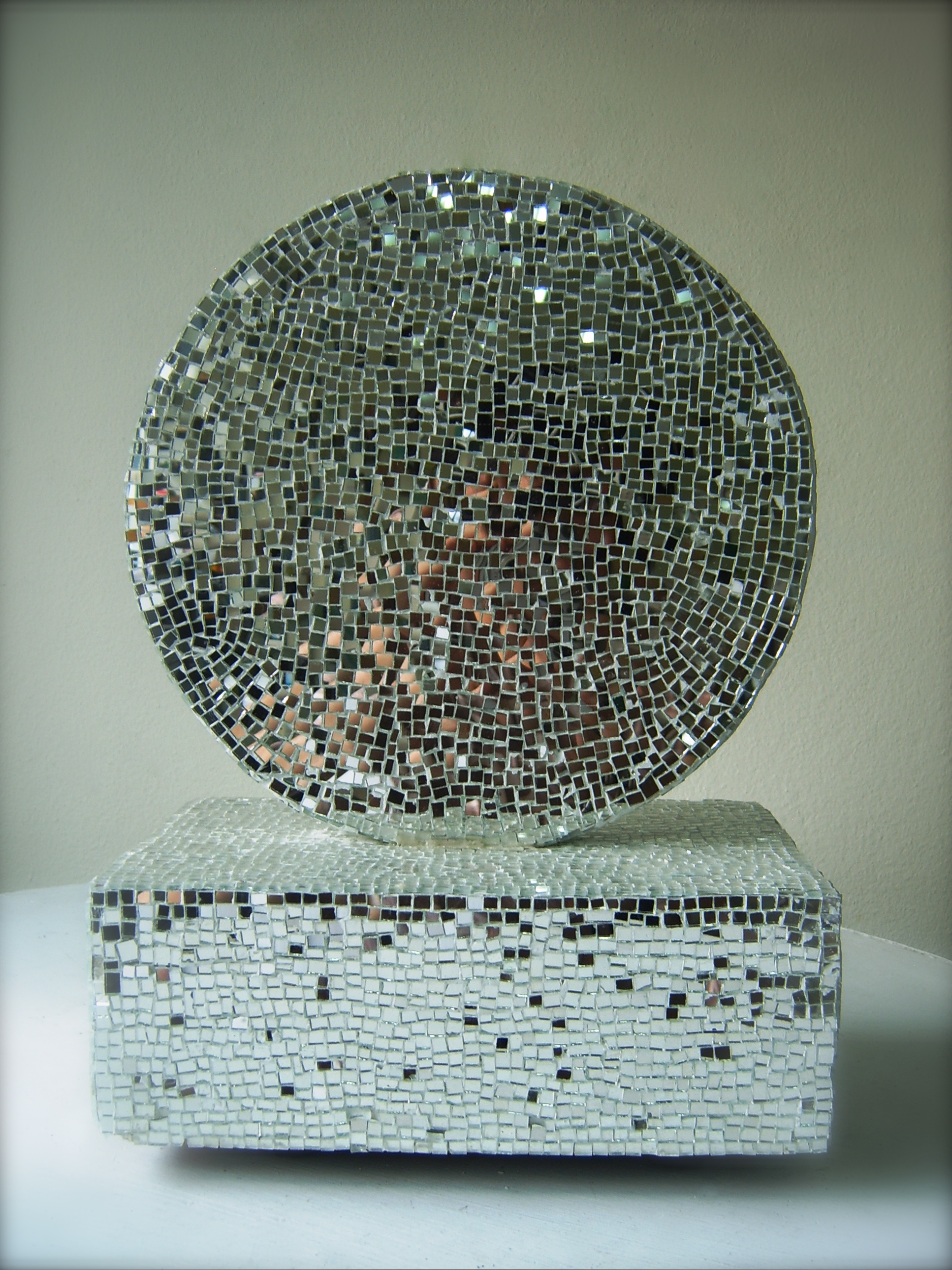
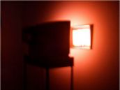
Wake Up ?
Technique: Mixed media
Size : 20 x 20 x 20 cm
Year: 2008
 click here
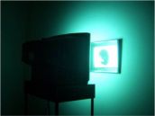
Technique : Mixed media
Size : 80 X 100 cm
Year : 2008
 click here
 click here
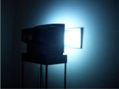
Technique : Mixed media
Size : 60 X 80 cm
Year : 2008
 click here
 click here
 click here
 click here
 click here
 click here
 click here
 click here
 click here
 click here
 click here
 click here
 click here
13 October 2007
 click here
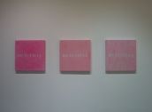
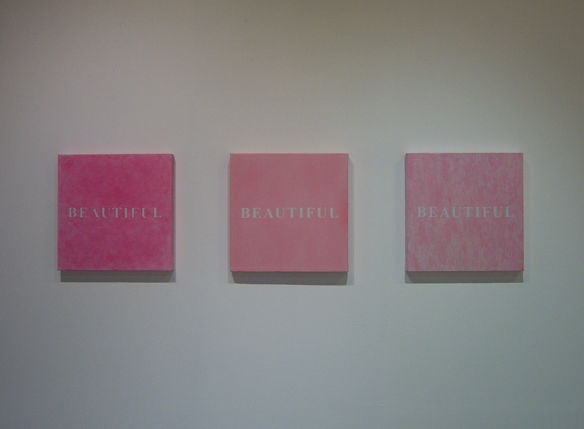
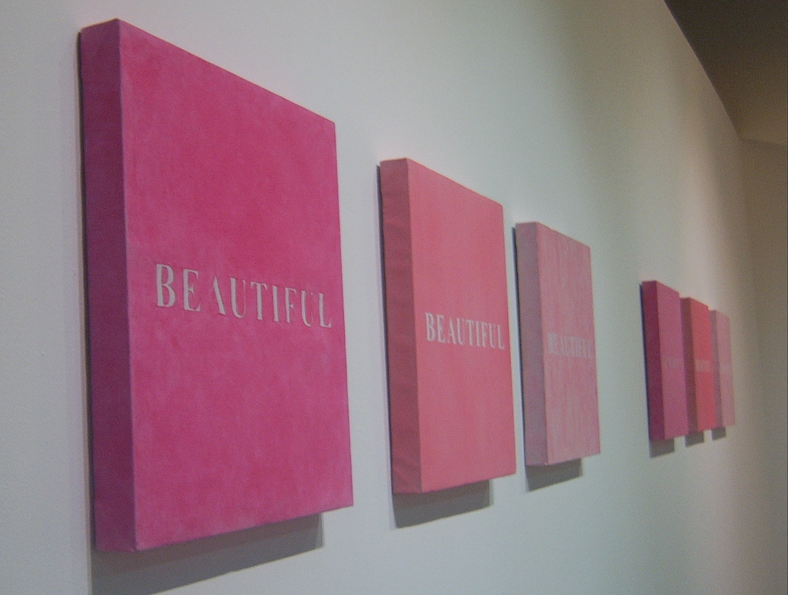
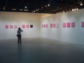
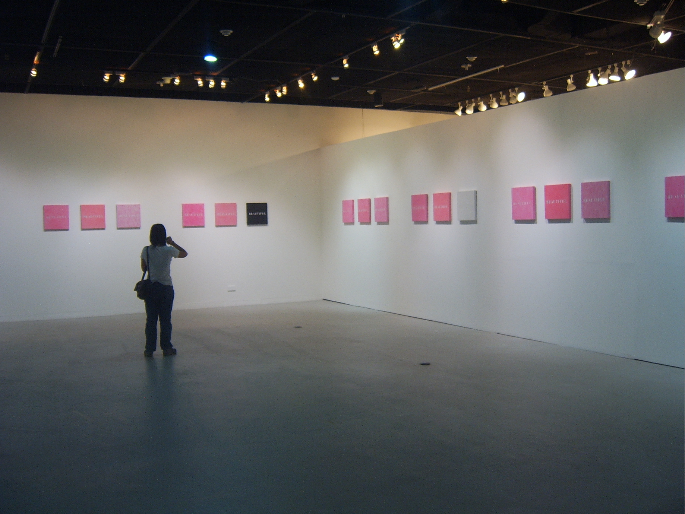
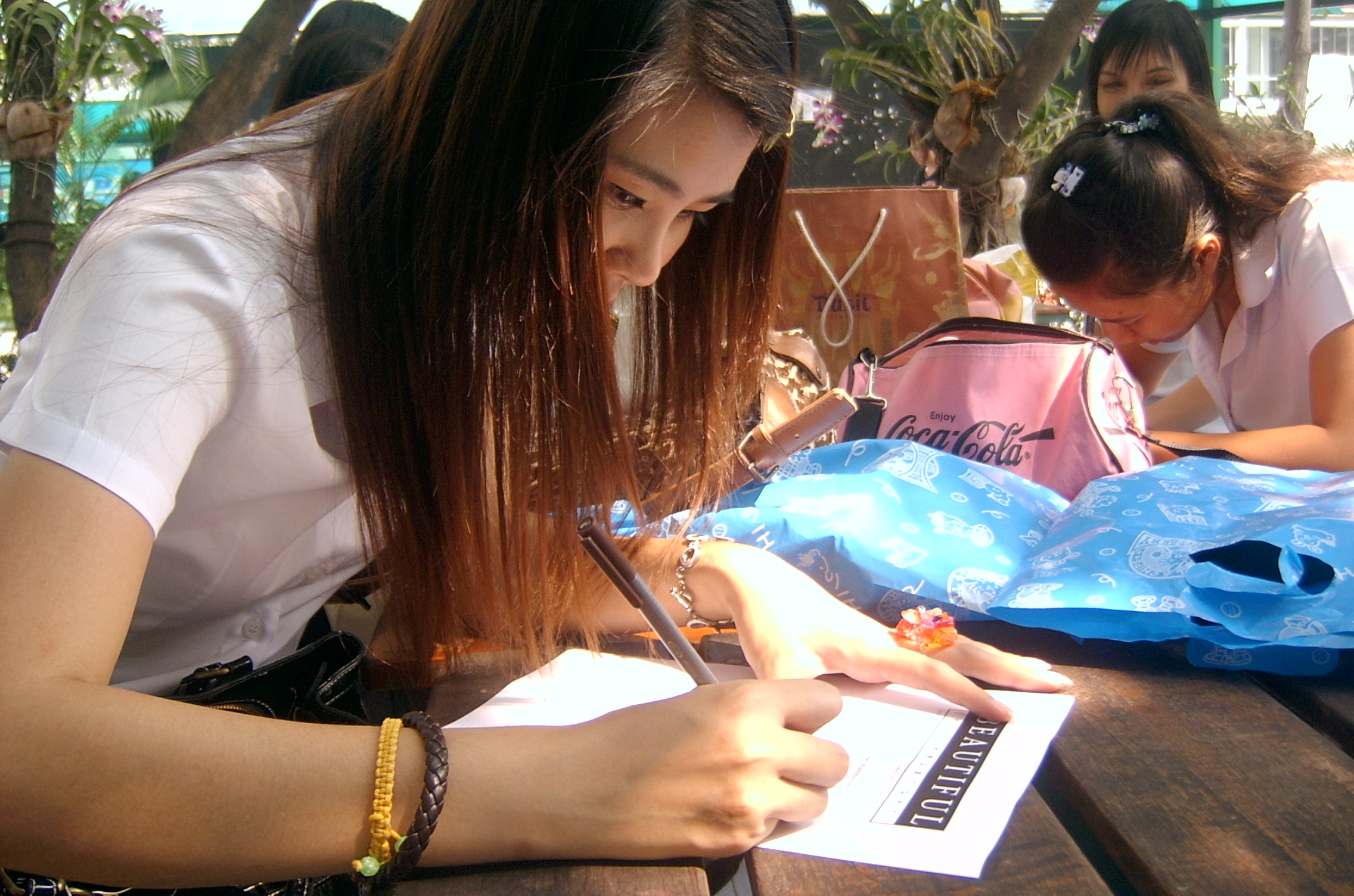
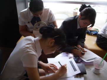
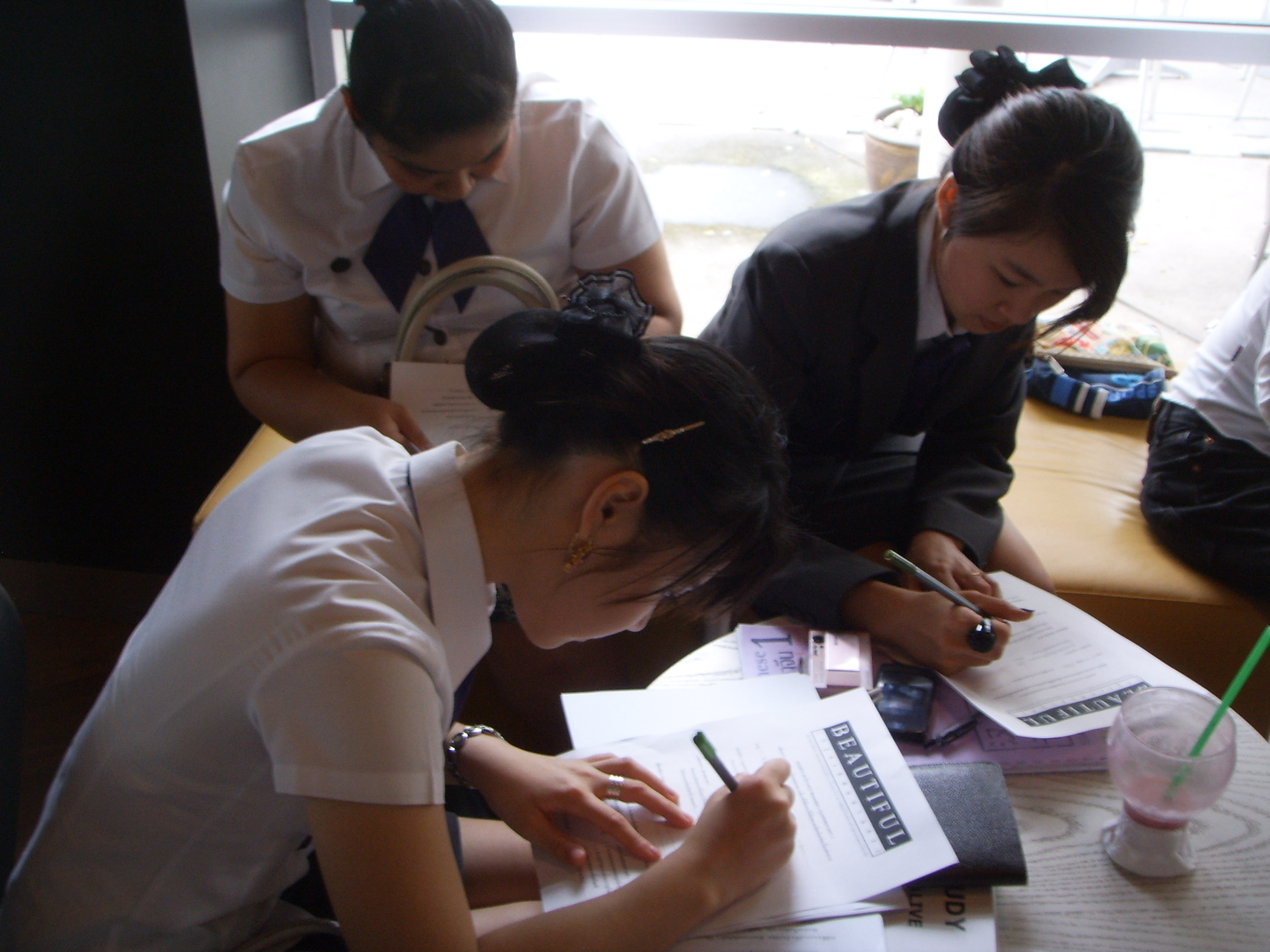
22 October 2007
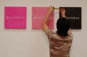
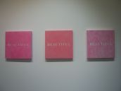
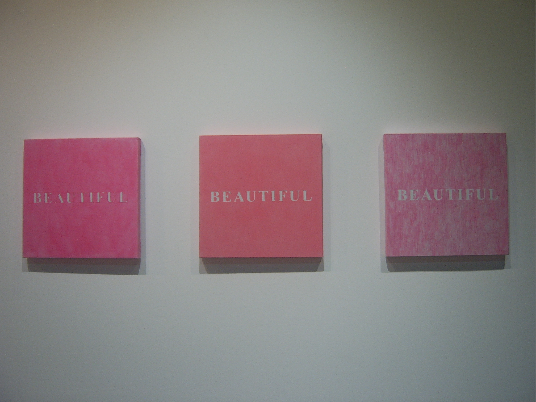
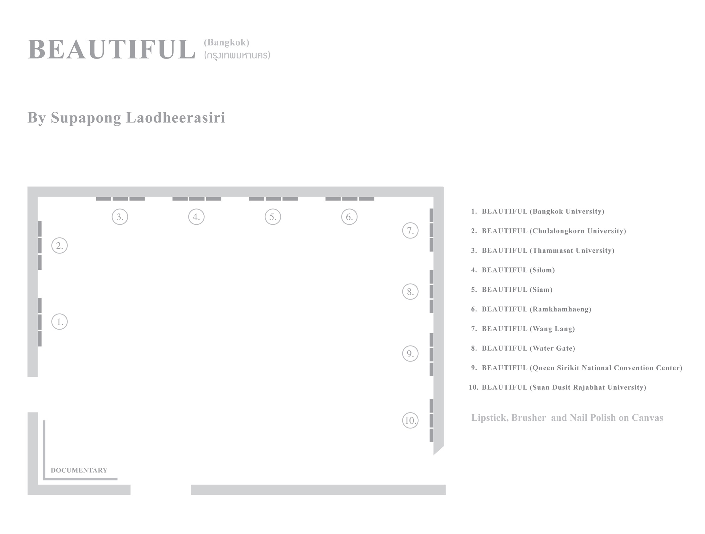
Beautiful (Bangkok)
Technique : Lipstick, brusher and nail paint
on canvas
Size : 40 X 40 cm
(30 pieces)
Year : 2008
 click here
Date : 2015
Medium : Acrylic on canvas
Dimensions : 80 X 60 cm. and 60 X 80 cm.
Exhibition : Her Royal Highness Princess Maha Chakri Sirindhorn’s 60th Birthday Anniversary
Period : 13 November 13 December 2015
Place : King Mongkut's Institute of Technology Ladkrabang Convention Hall, Bangkok, Thailand.
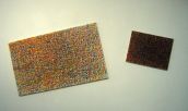
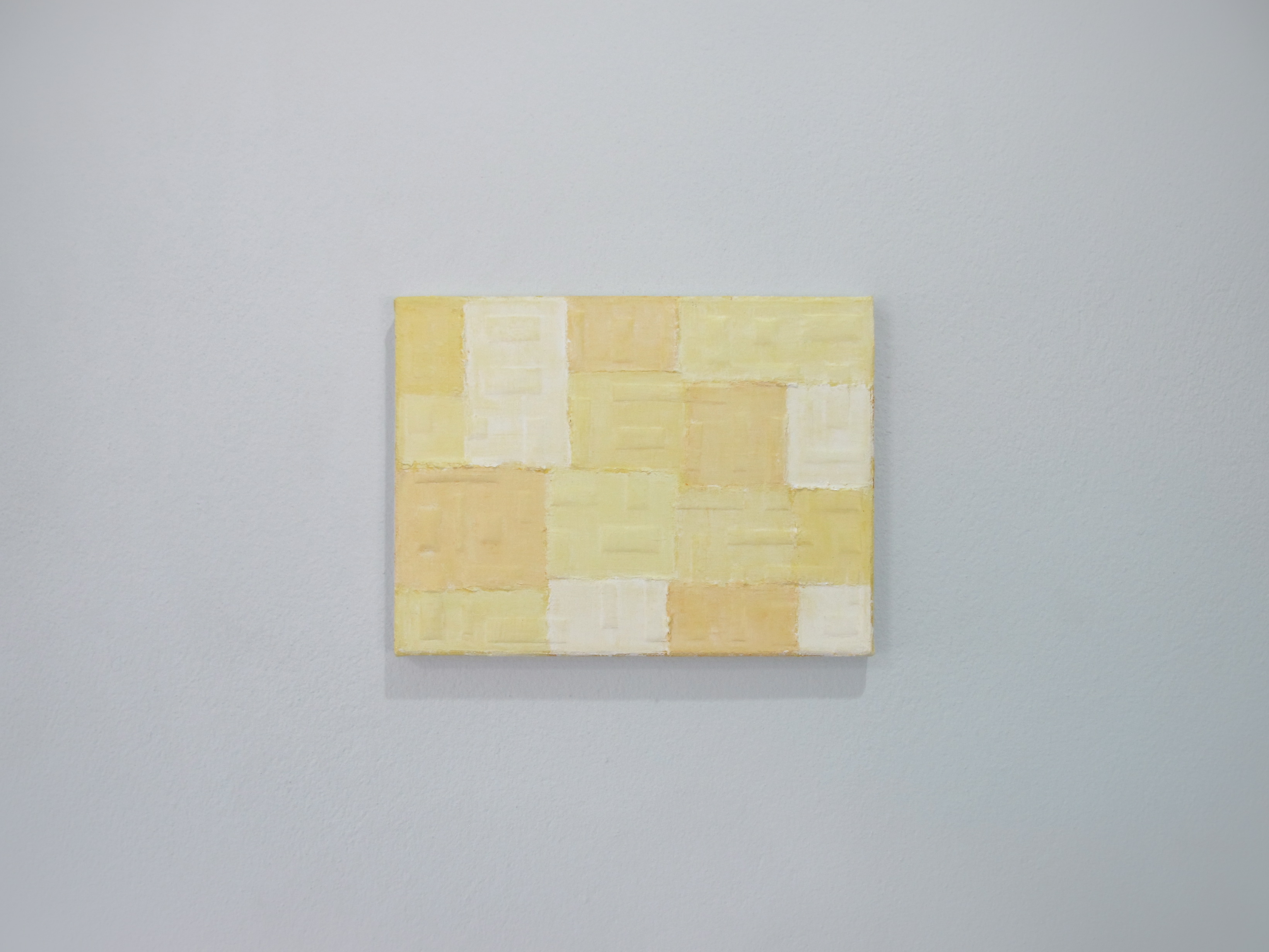
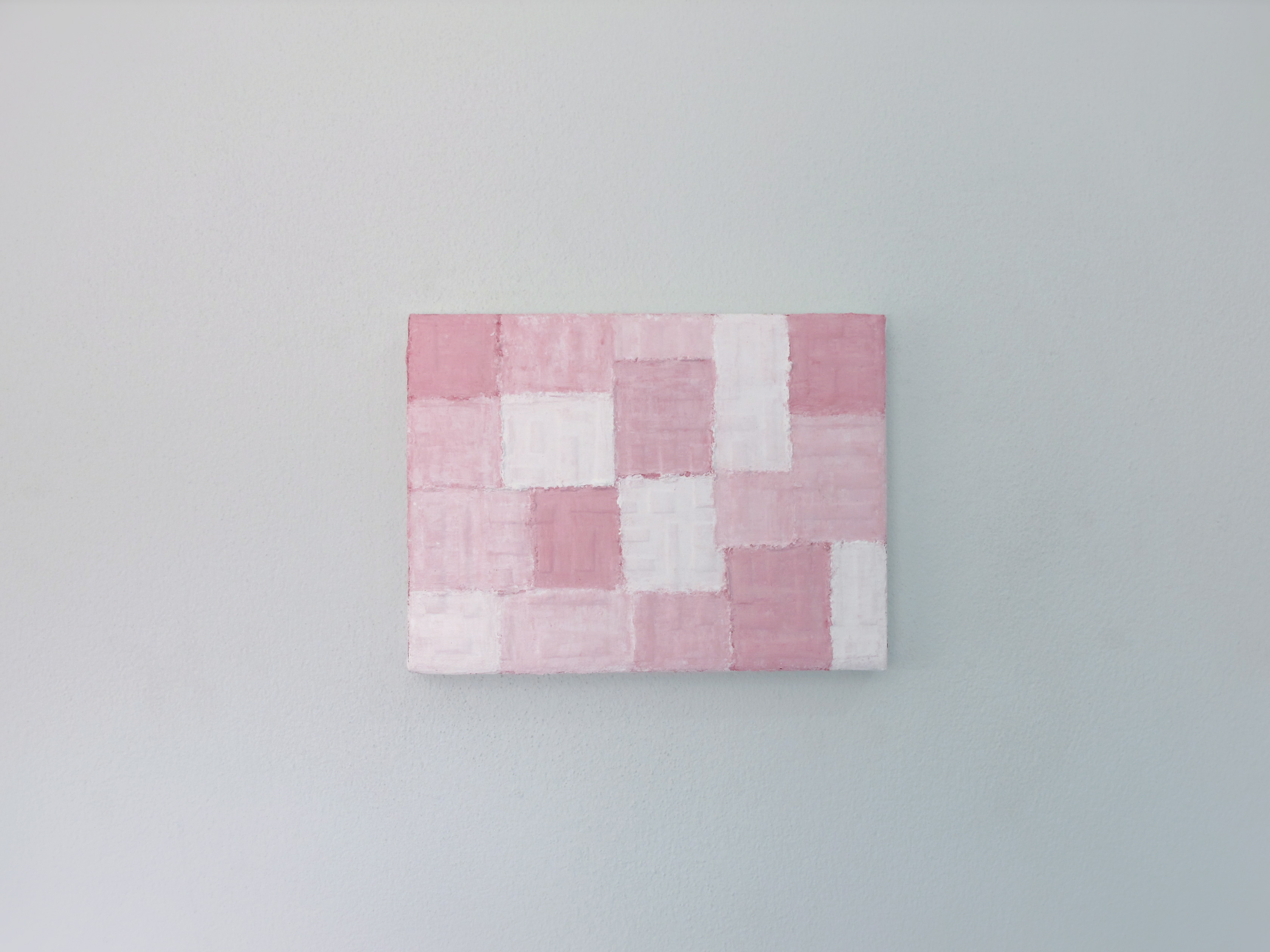
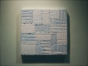
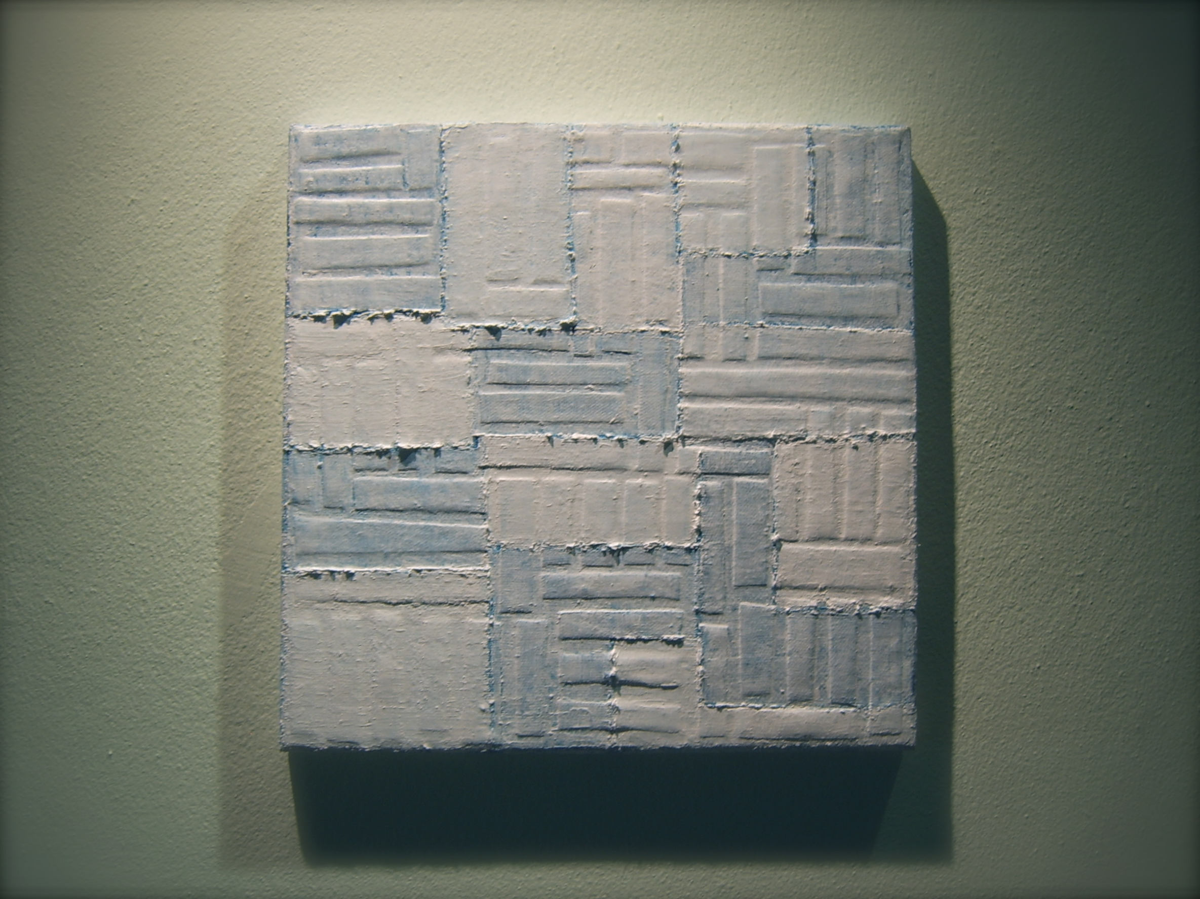
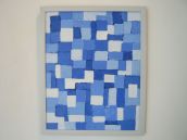
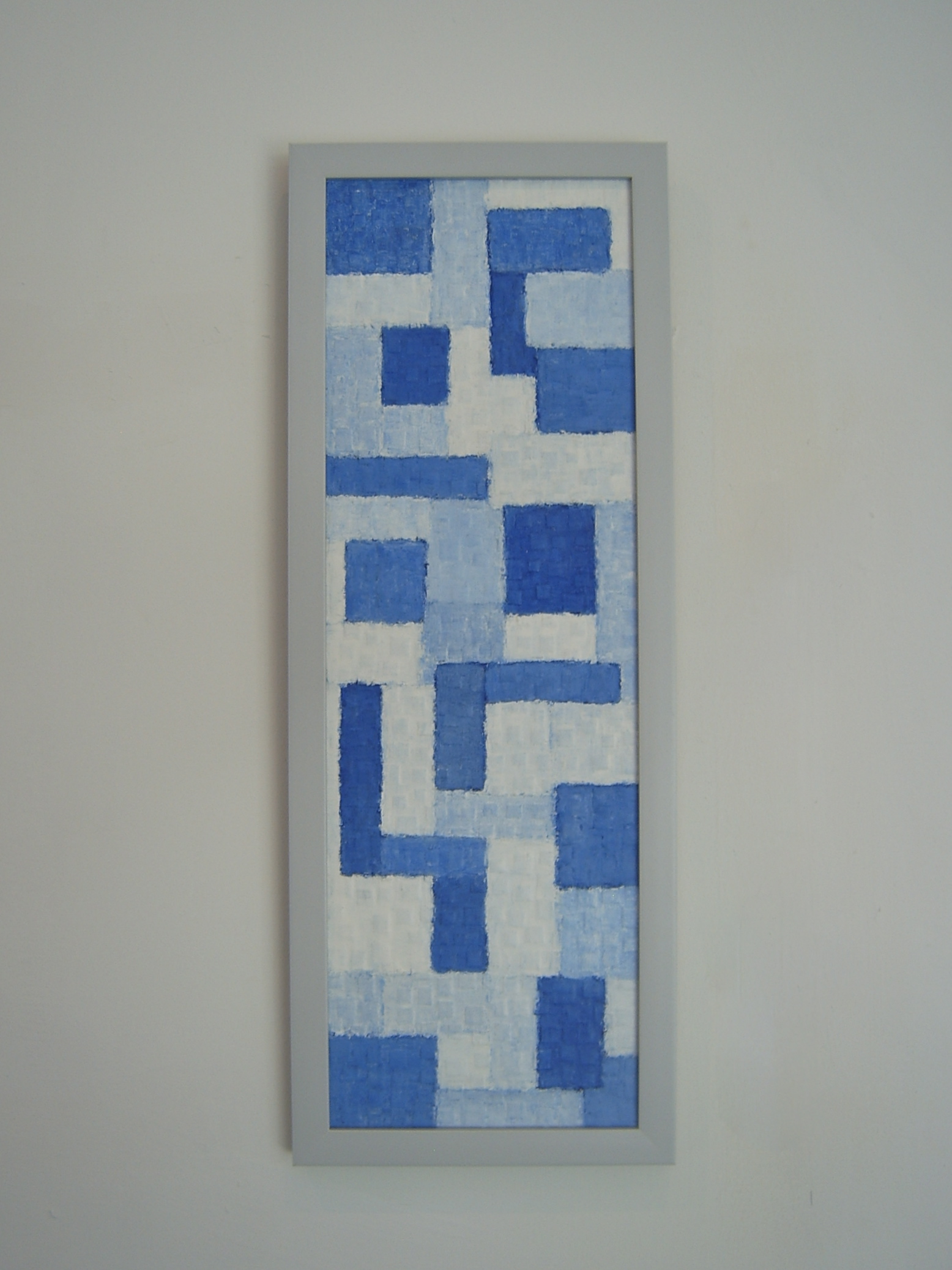
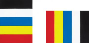
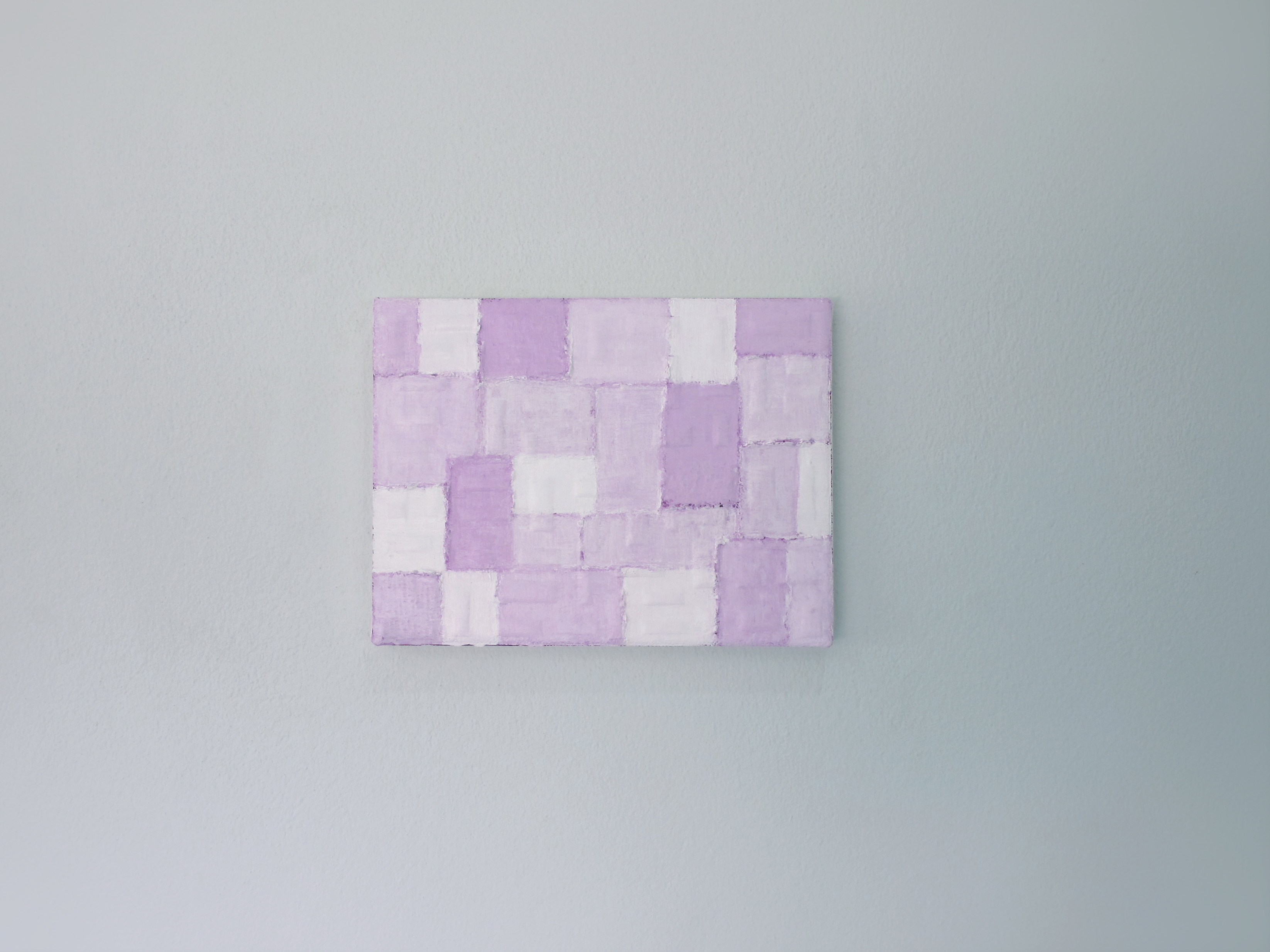
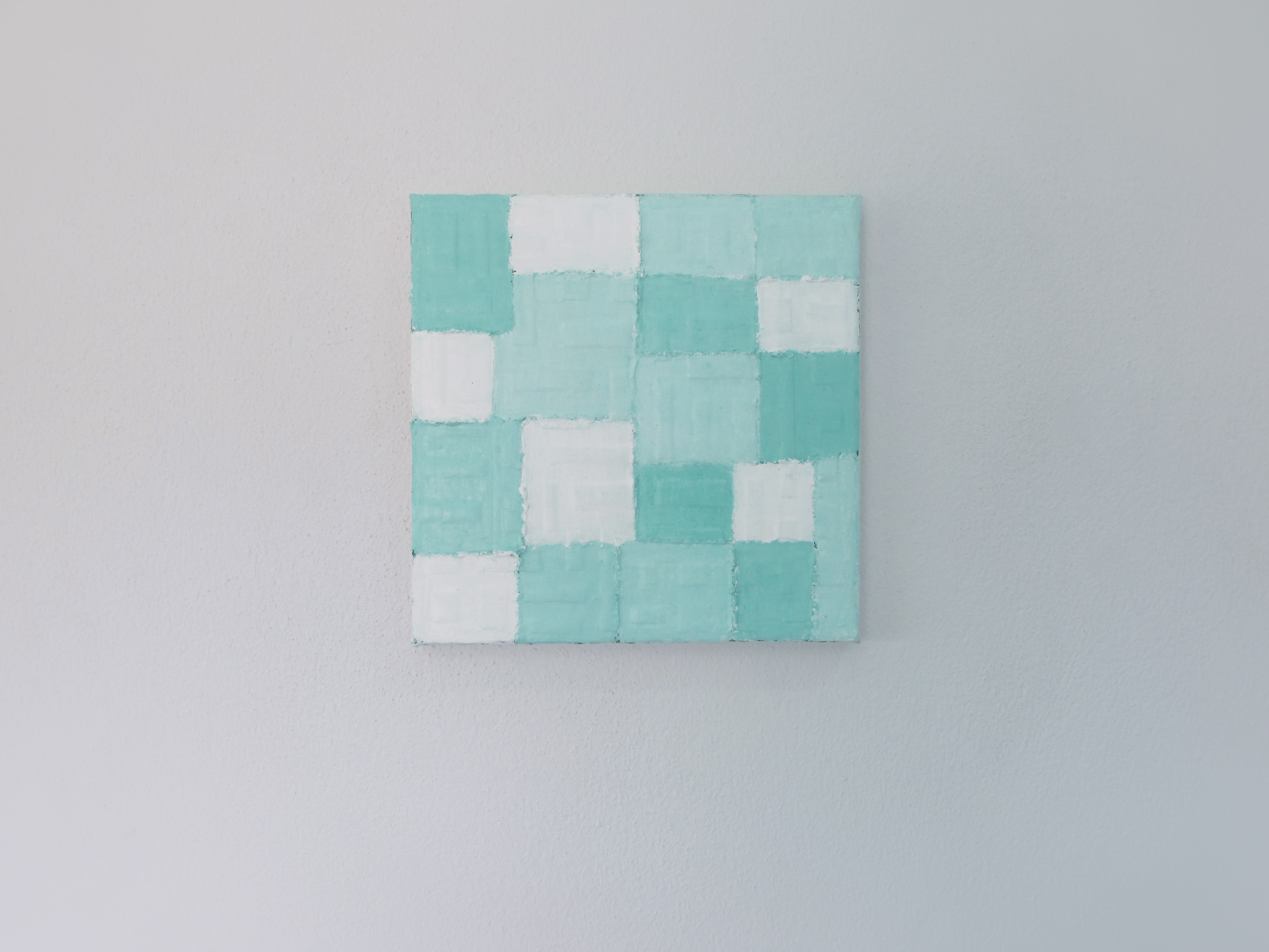
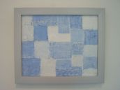
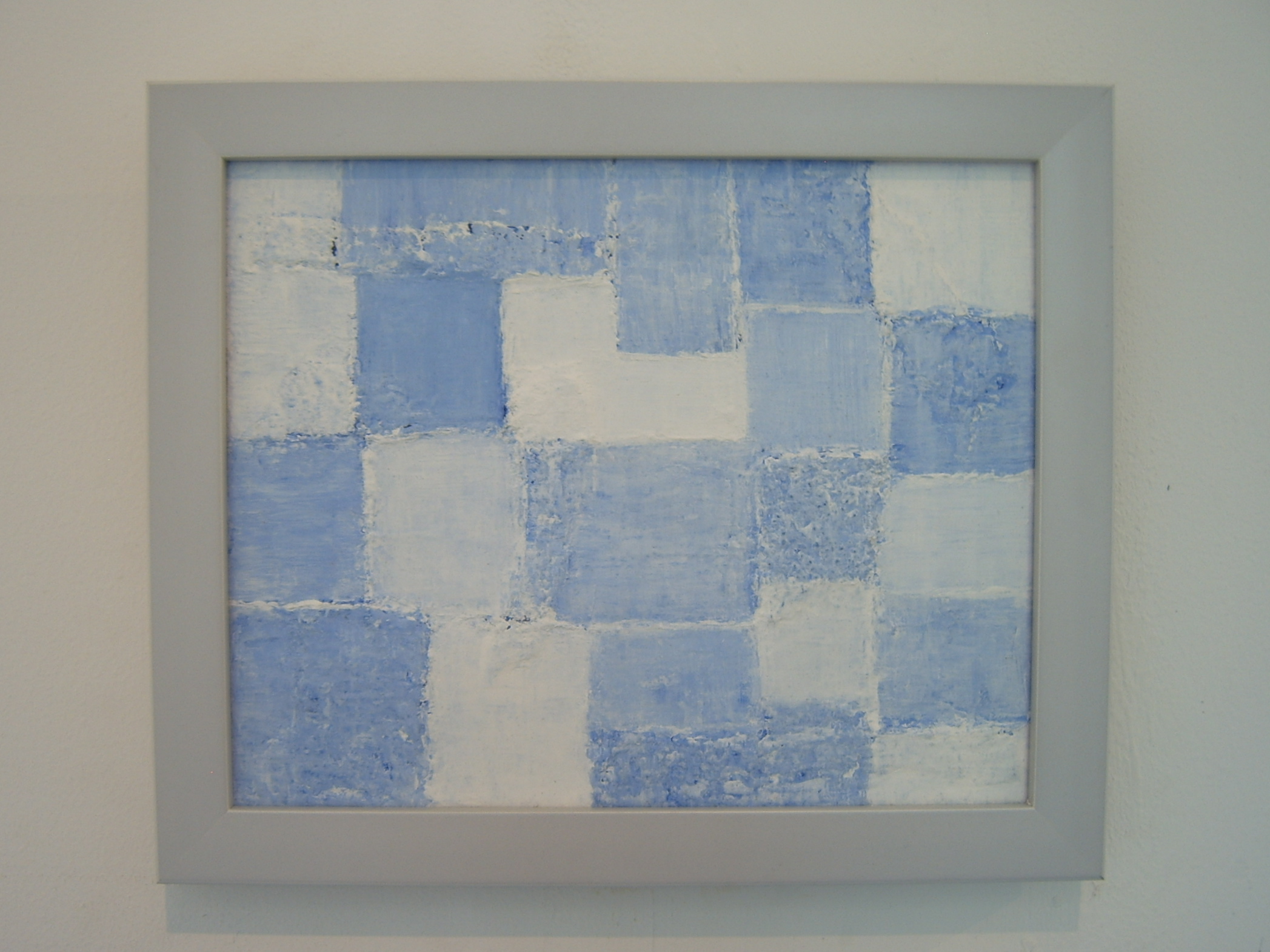
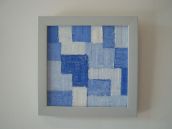
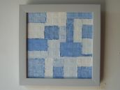
"Untitled"
My paintings show the basic of visual elements of art for instance primary colors, the horizontal, the vertical as well as the geomatic form. I got inspiration from the first flag of the Republic of China, between 1912 and 1928. They relate to the political conflict and the war in China from 1910s to 1950s that caused Chinese migration as well as my grandparents to Thailand.
In addition, nowadays, emigration from the political conflict, the ethnic conflict and the war are really serious situations of our world for example Syrian refugees, Uighur refugees and Rohingya refugees.
During the Sui Dynasty, there were historical records of a system of military banners using the colors red (fire), blue (wood), yellow (earth), white (metal), and black (water) representing the five elements. Tang Dynasty inherited this system, and has arranged the colors in a united flag according to the above order of elements for military use. In subsequent historical periods, this "flag of the five united elements" were altered and readapted for military or official uses. In the Qing Dynasty painting which records the Manchu victory over the Muslim Du Wenxiu rebellion in Yunnan, a Qing military flag with the five elements arranged in the order of yellow, white, black, green and red can be seen.
After the Wuchang Uprising, the Qing dynasty made the transition to the Republic of China. There were a number of competing flags that could have been used by the revolutionaries. The military units of Wuchang wanted the 9-star flag with Taijitu. Sun Yat-sen preferred the Blue Sky and White Sun flag to honor Lu Haodong.
A variation of this flag was adopted by Yuan Shikai's empire and the Japanese puppet state of Manchukuo (Flag of Manchukuo). In Manchukuo, similar slogan was used, but the five races are changed into Japanese (red), Han Chinese (blue), Mongols (white), Koreans (black) and Manchus (yellow).
 click here
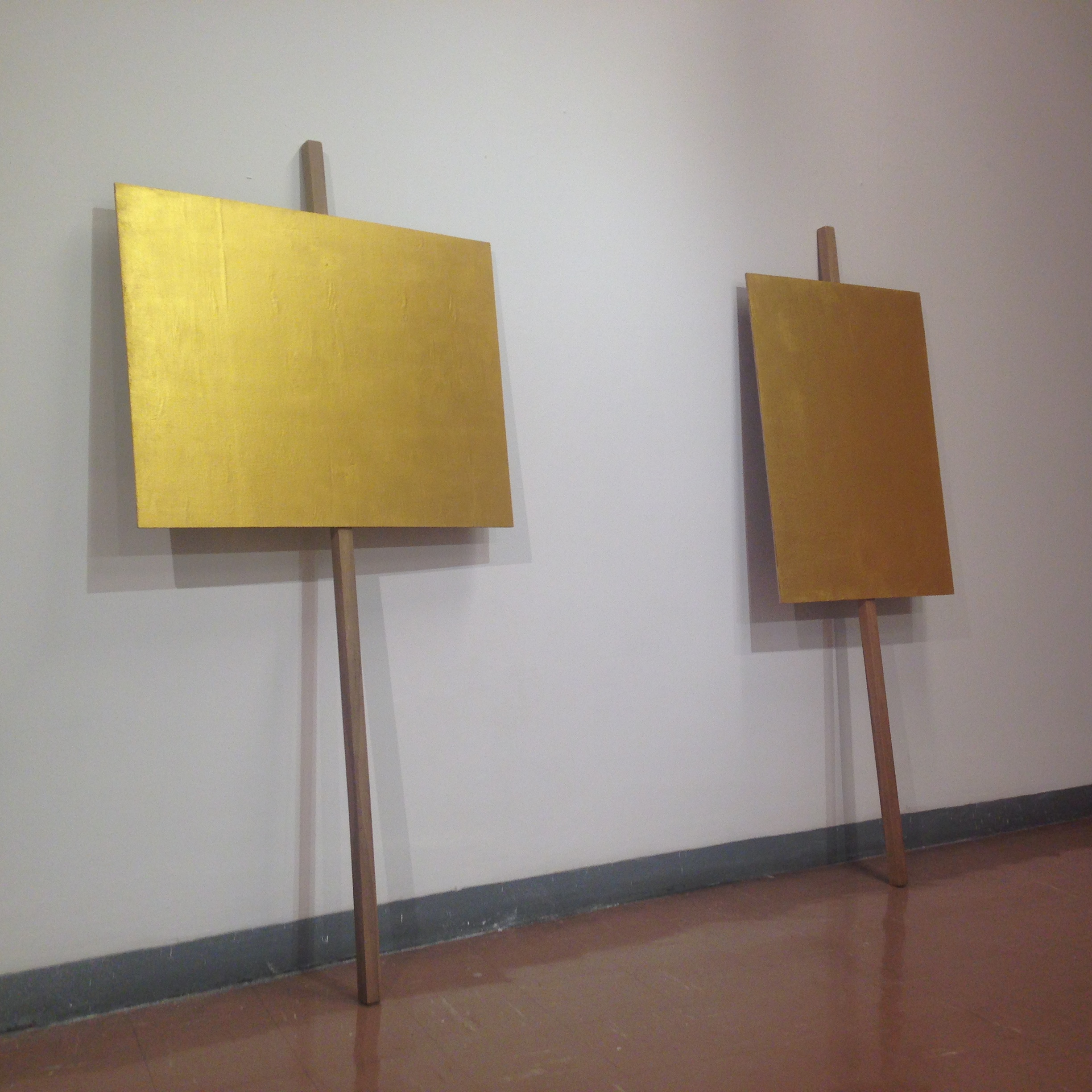
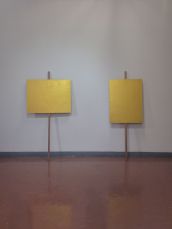
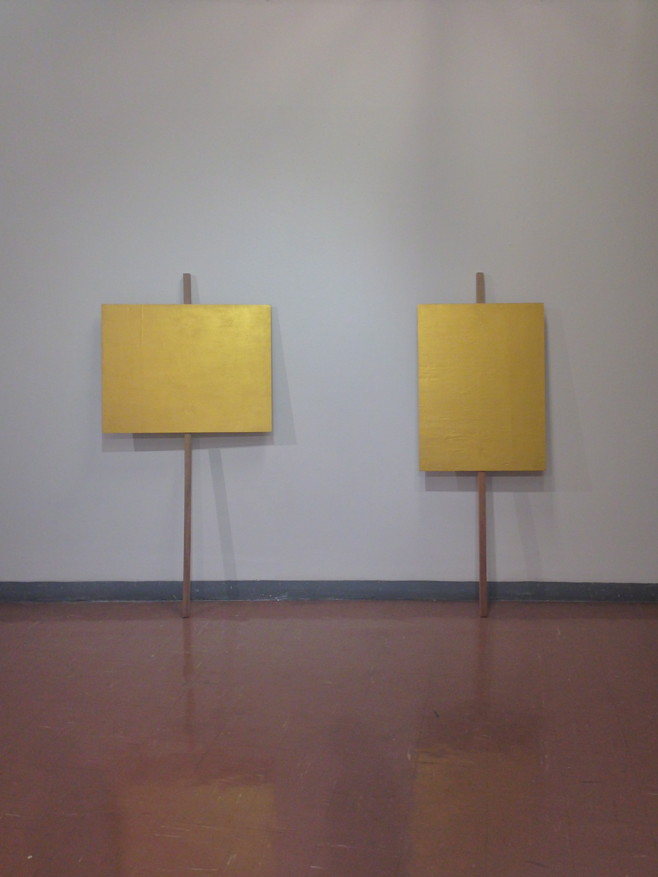
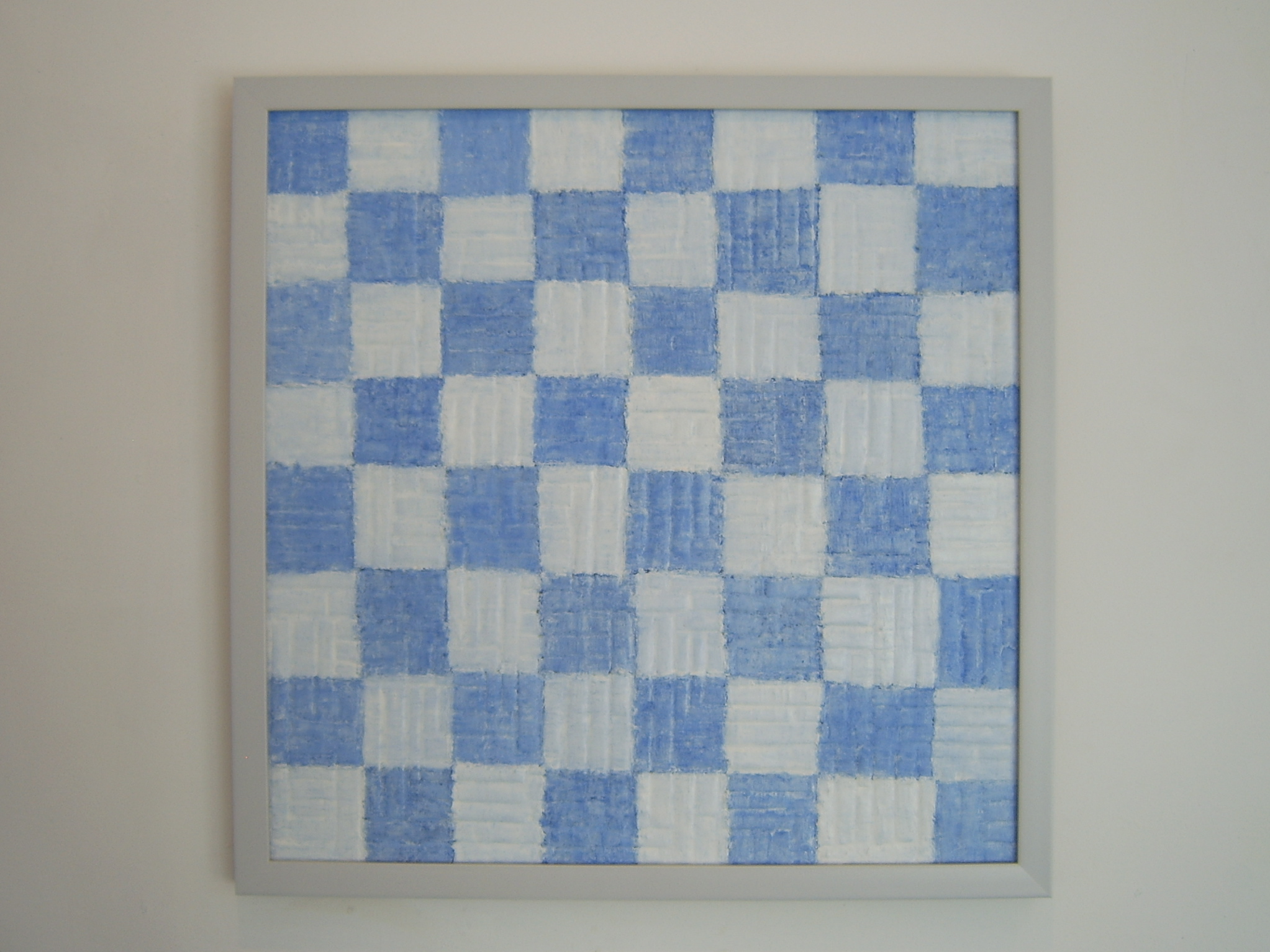
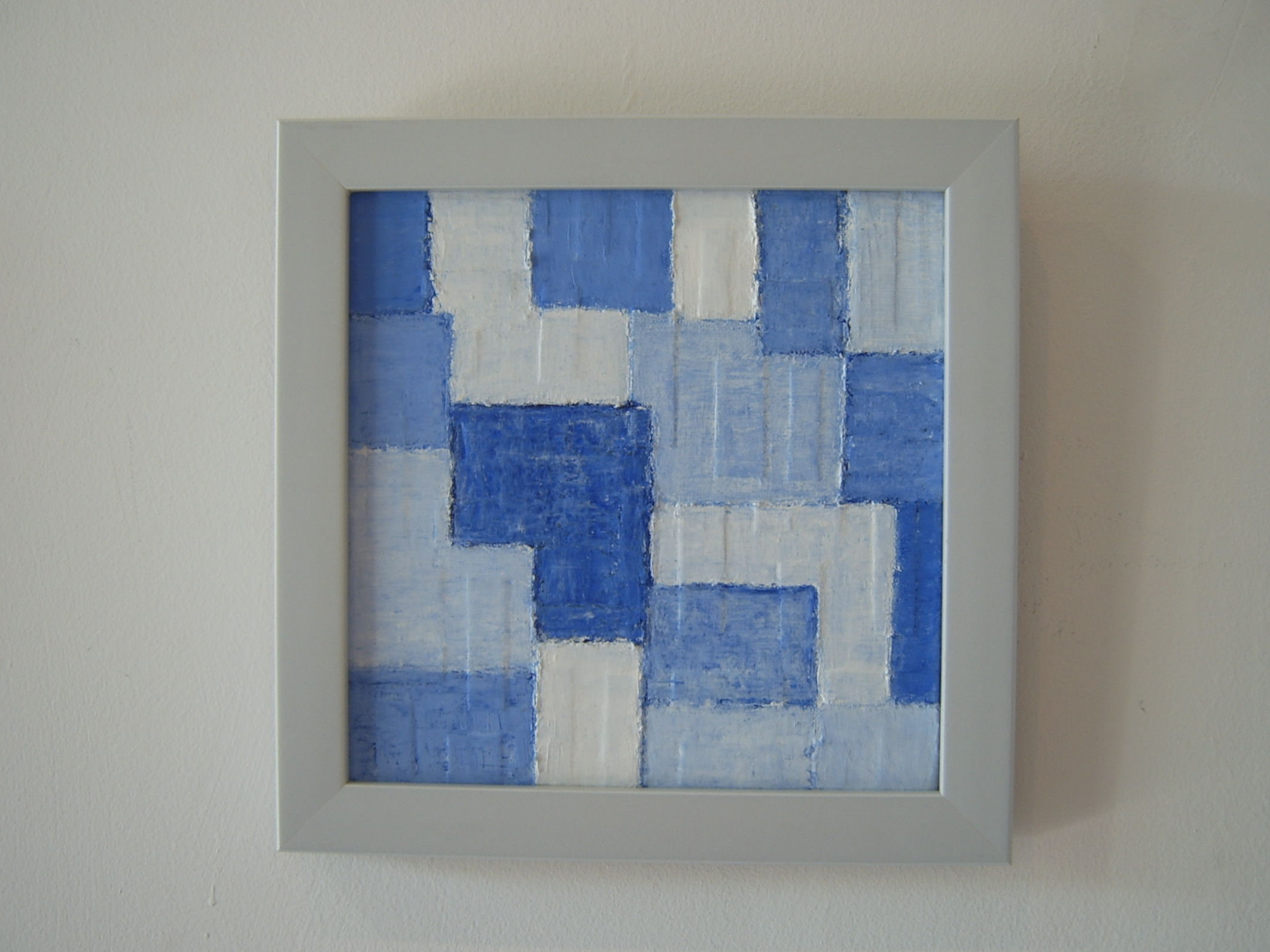
Date : 2014
Medium : Acrylic on Wood
Dimensions : 164 x 80 cm. and 164 x 60 cm.
Period : 13 December 2014 - 3 January 2015
Place : Baam Tuek Art Center, Chiang Mai, Thailand.
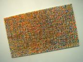
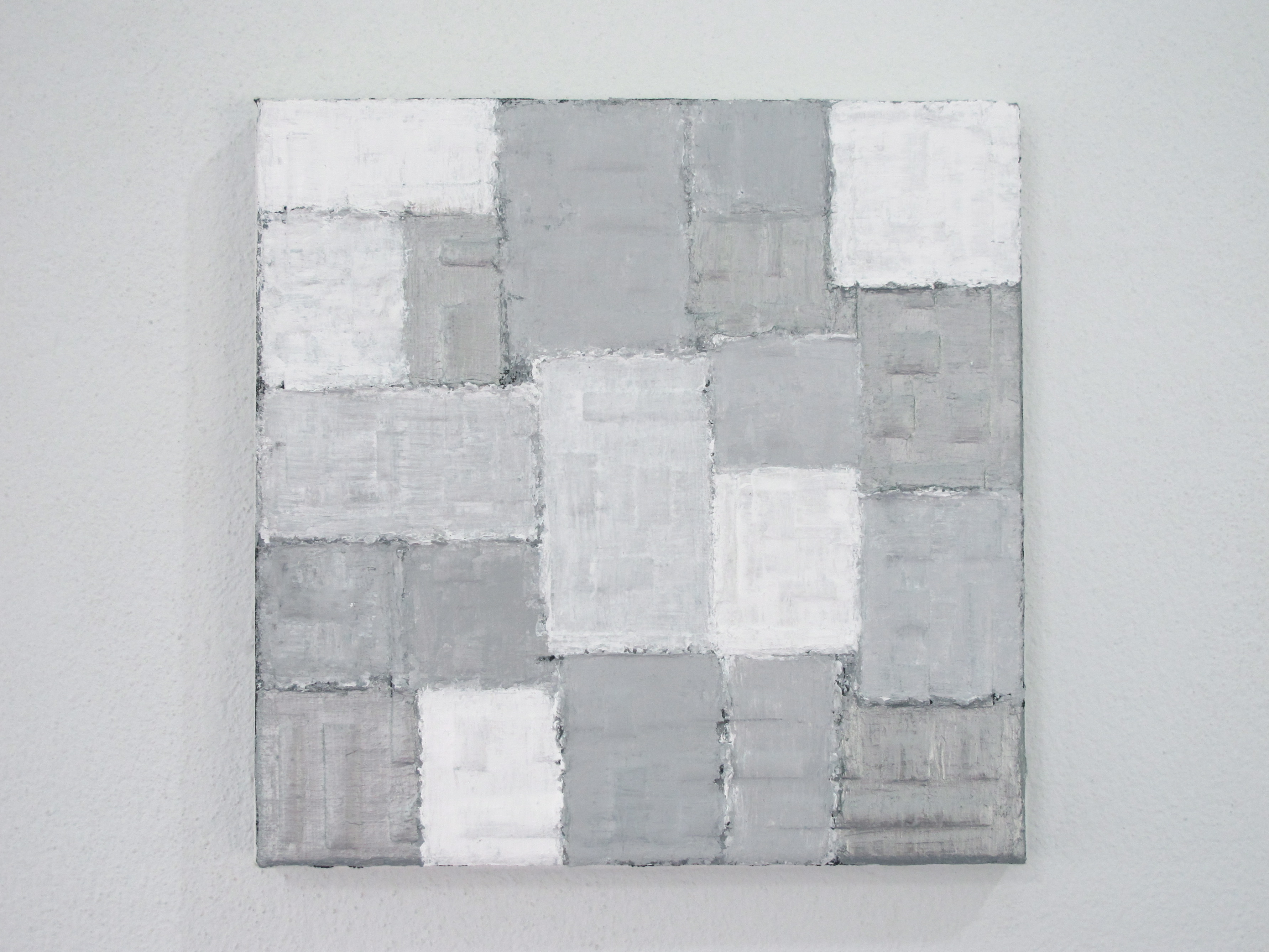
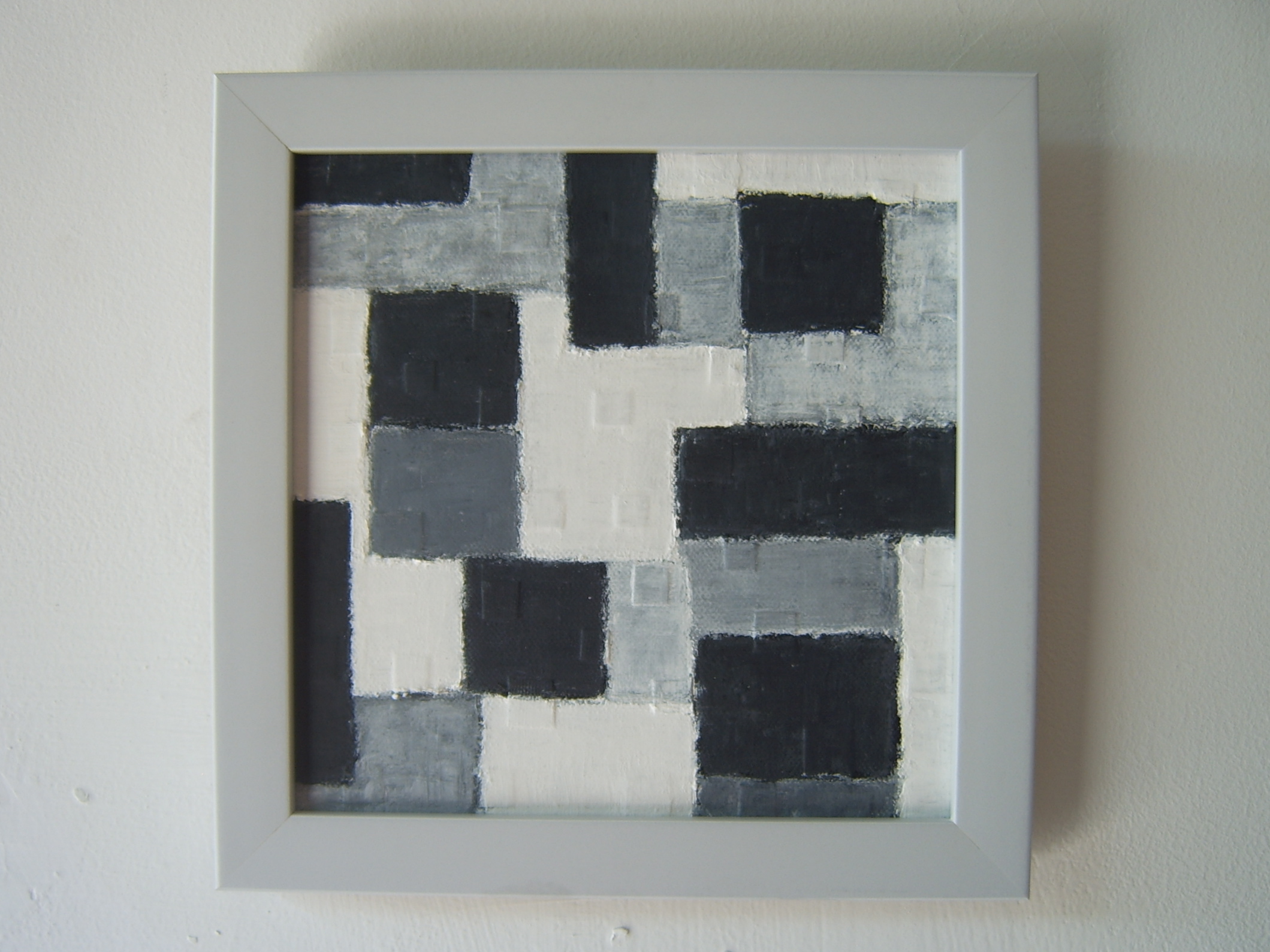
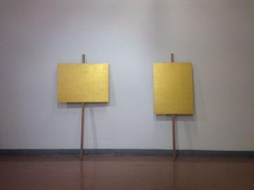
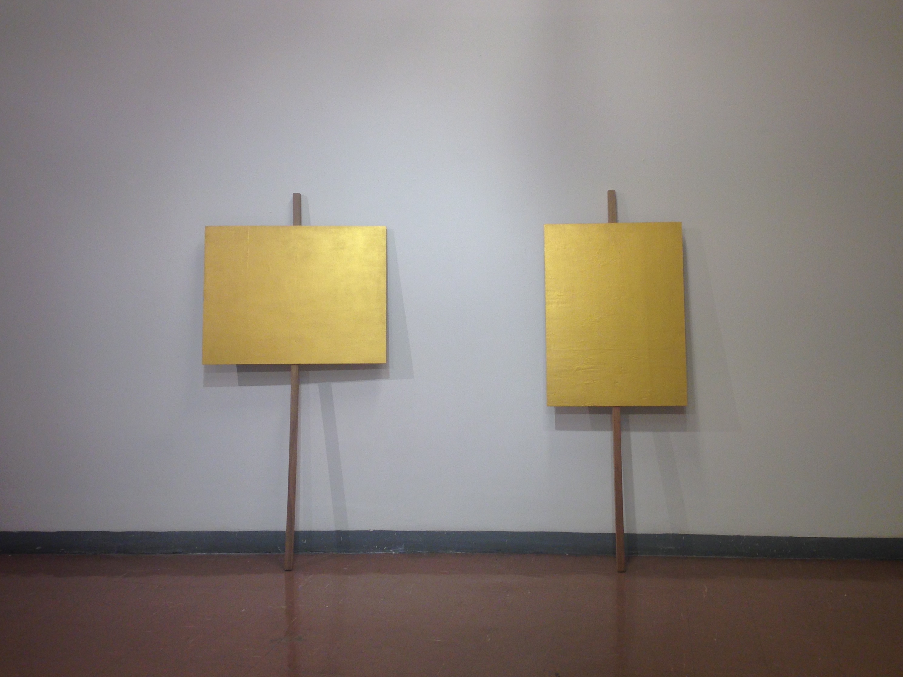
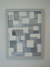
“When There is a Bright Golden Sky”
“When there is a bright golden sky” is the second last line in a famous poem written during the moment of “14 October 1973”, an important political crisis in Thailand’s history. The uprising was led by a group of students and civilians demanding a constitution from the military dictatorship government. Even now (2014 - present), Thailand is still under a military junta where expressing one’s political opinion is strictly controlled.
I have linked the 14 October 1973 political crisis in the history of Thailand with the current situation. To create a question about the political stability and future development for Thailand, as well as the freedom of speech in political views, this art work is created to resemble a protest board but painted in golden color and without any message.
 click here
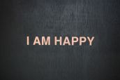
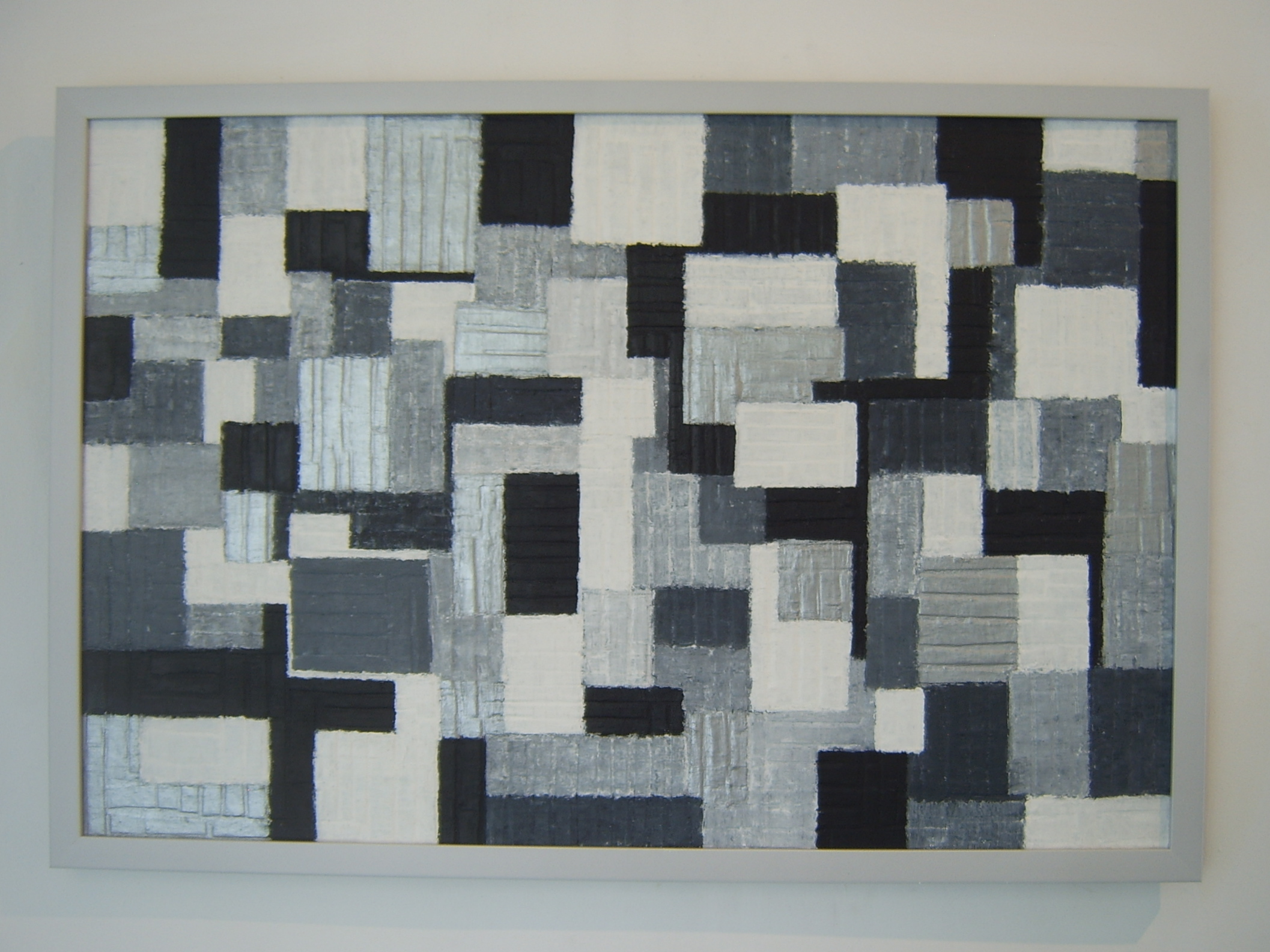
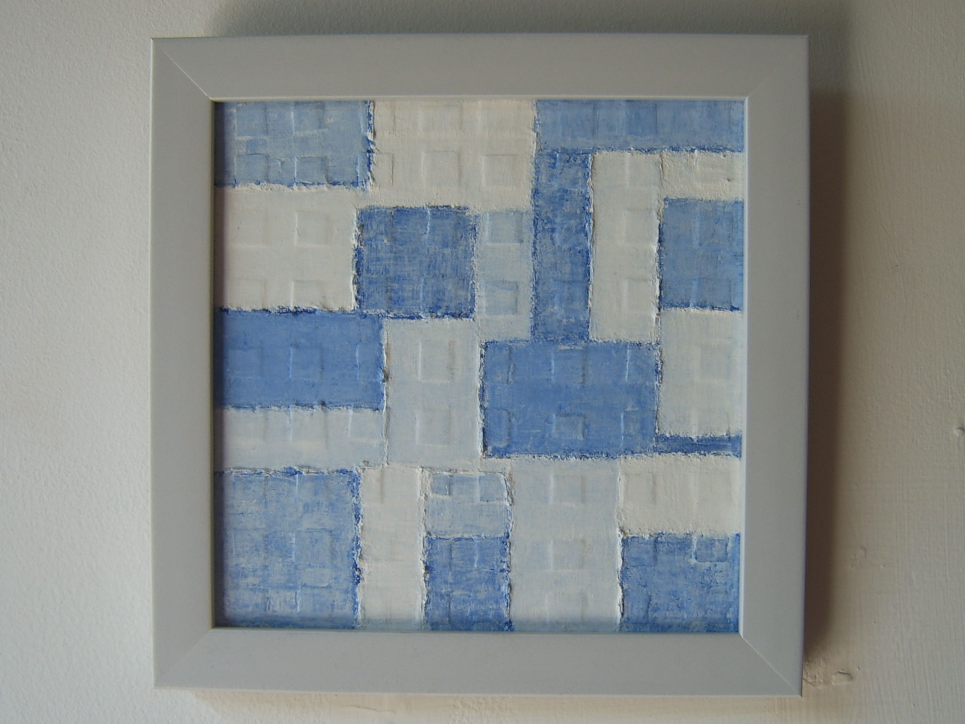
Date : 2014
Medium : Acrylic on Wood
Dimensions : 60 X 164 cm. Each
Period : 5 - 29 September 2014
Place : Chiang Mai University Art Center, Chiang Mai, Thailand.
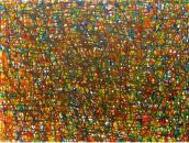
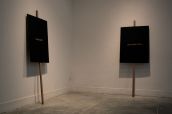
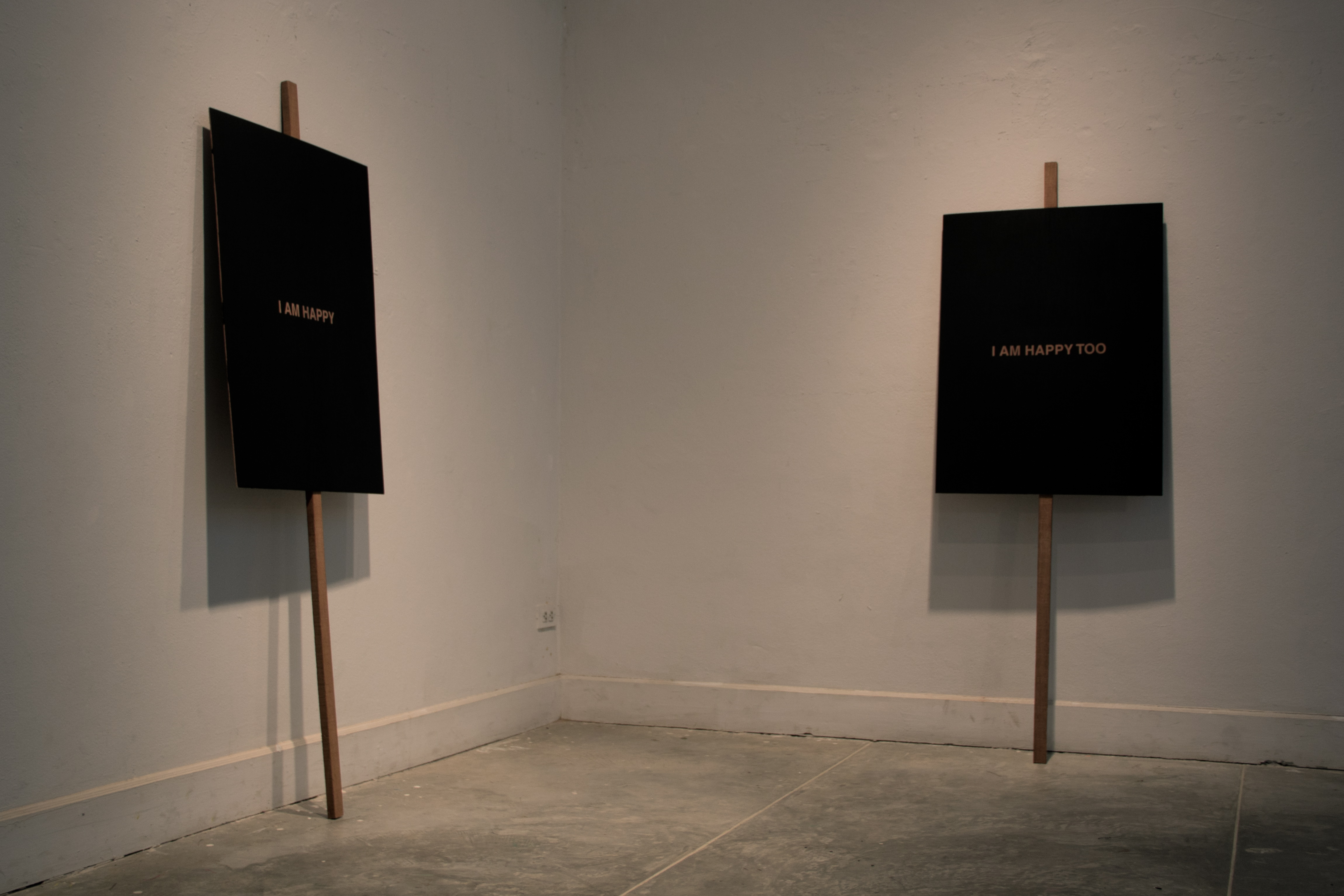
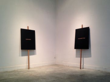
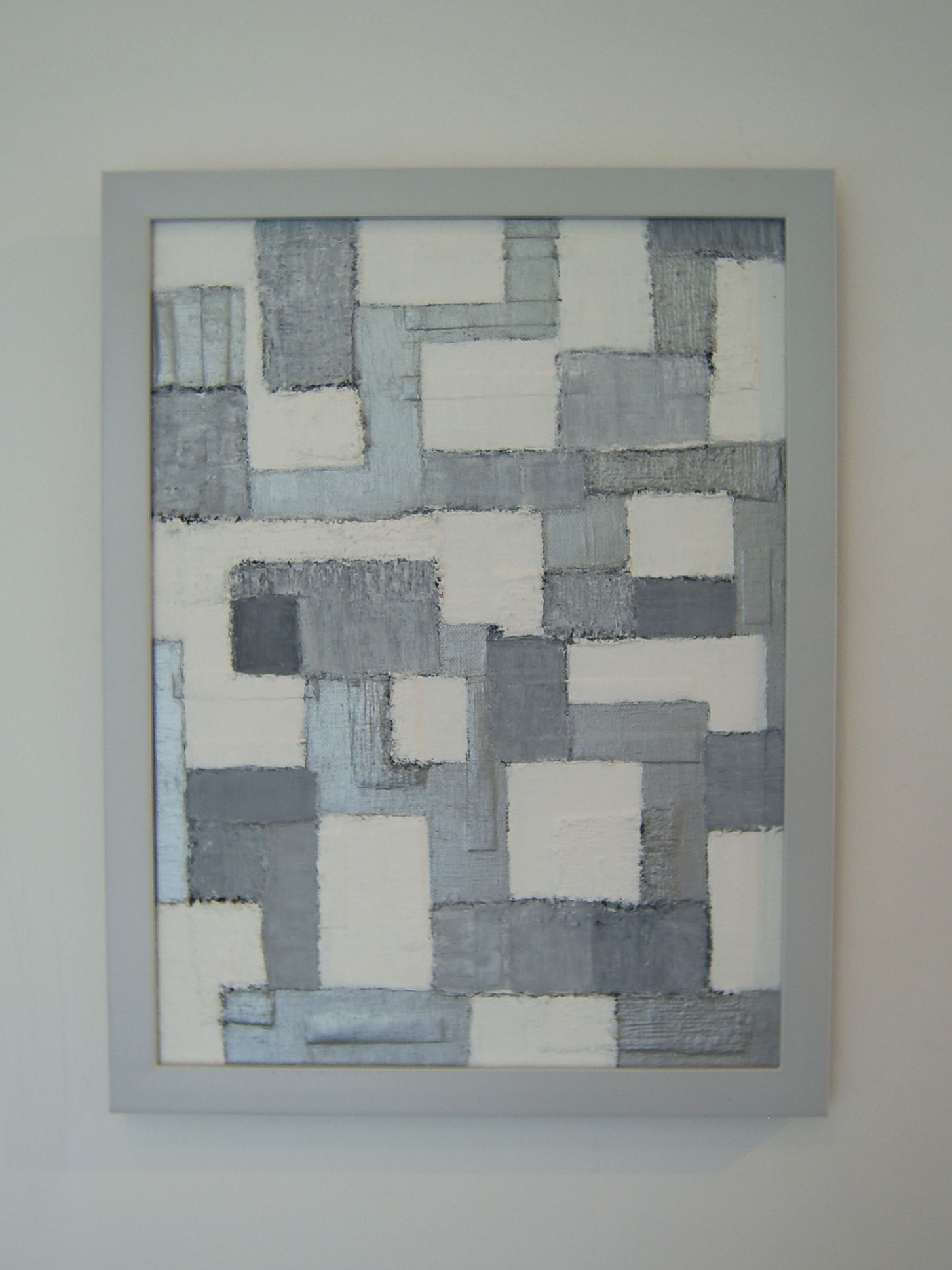
“I am Happy / I am Happy Too (Made in Thailand, 2014)”
In Thailand currently (2014 - present) “Returning Happiness” topic (Military dictatorship government’s noteworthy policy) is extensively and frequently discussed on media. Based on political problem in Thailand, I have an opinion that happiness issue that raised by the government and political problem such as freedom of getting information and giving political opinion should be questioned and reconsidered. This art work is created to resemble a protest board but the messages were changed to “I am Happy” and “I am Happy Too.”
 click here
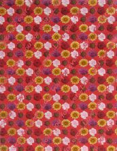
Date : 2011
Medium : Acrylic on Paper
Dimensions : 48 X 63.1 cm.
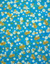
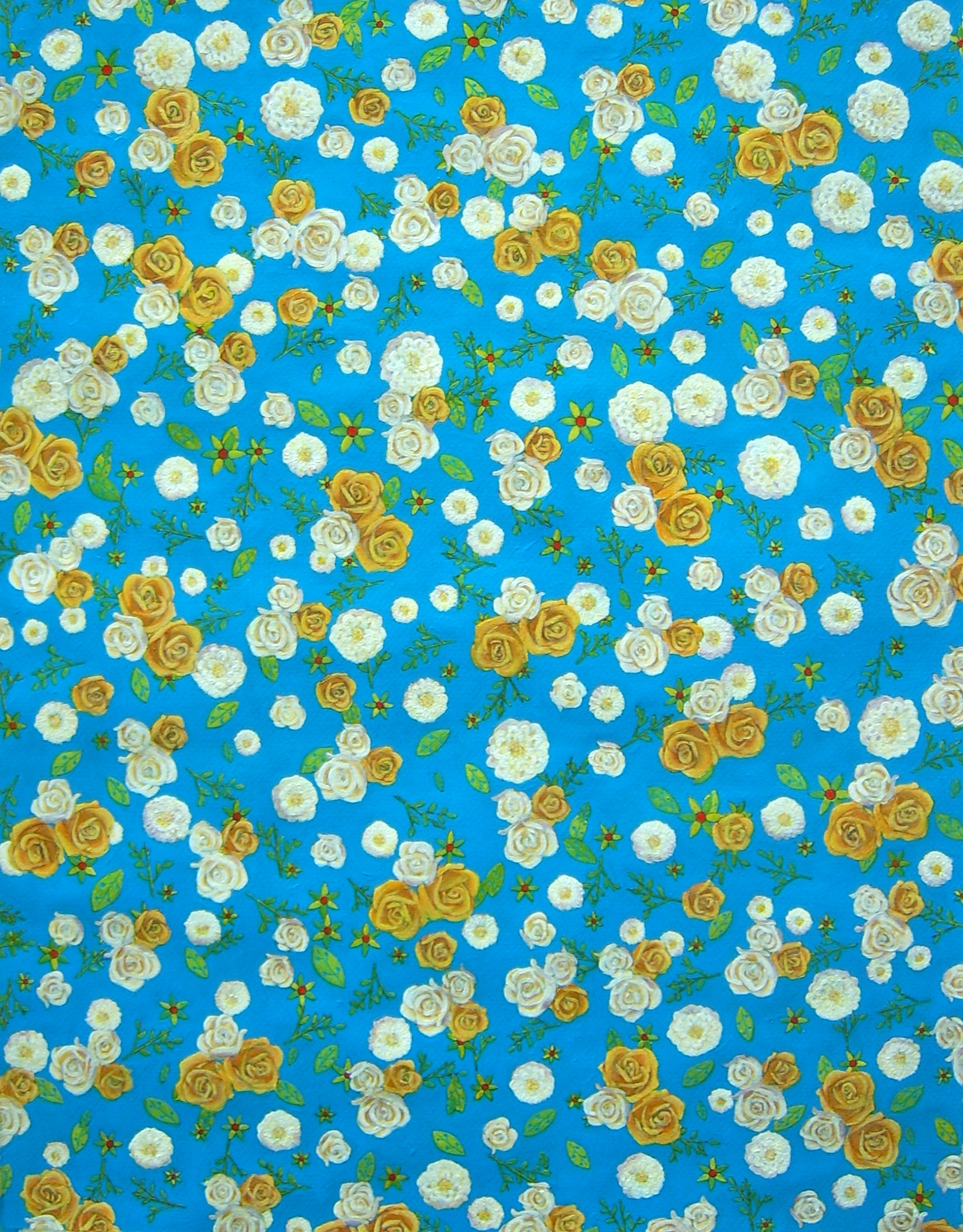
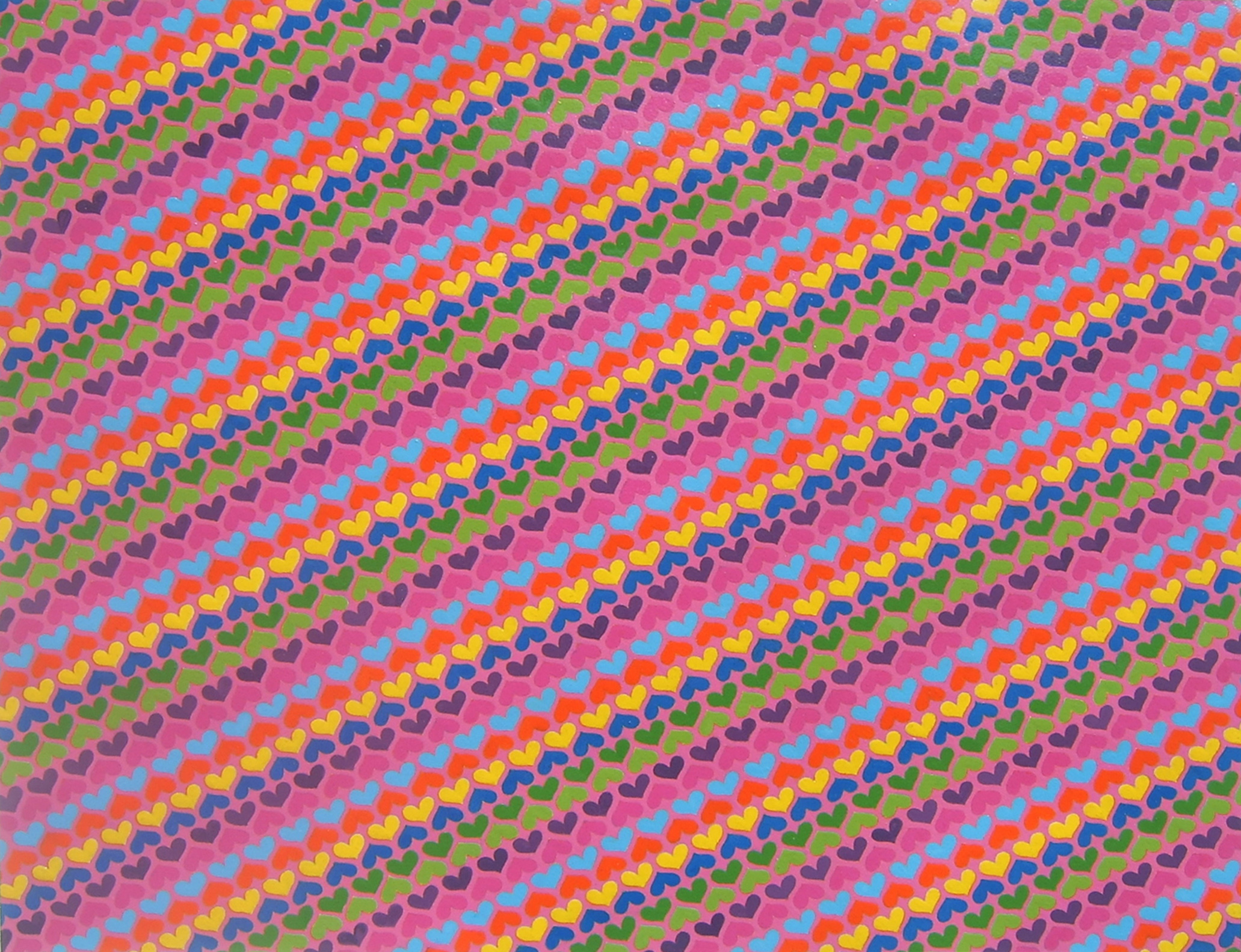
“Gift Wrapping Paper”
When compared with a painting, a piece of gift wrapping paper may seem to be of less value and worthless than the first due to its obsolete patterns and the way it was mass-produced. A painting, however, is created by the hands of and artist and therefore possesses a uniqueness unlike that of a piece of gift wrapping paper.
In this series of paintings “Gift Wrapping Paper”, gift wrapping paper is used as model for my paintings. Once turned into an art piece, gift wrapping paper can create a question about the gap of art and its value assessment.
 click here
Date : 2013
Medium : Monoacrylic on Color Digital Photographic Print (Image of L.H.O.O.Q.)
Dimensions : 19.7 X 12.4 cm.
Period : 9 February - 29 March 2014
Place : Ver Gallery, Bangkok, Thailand.
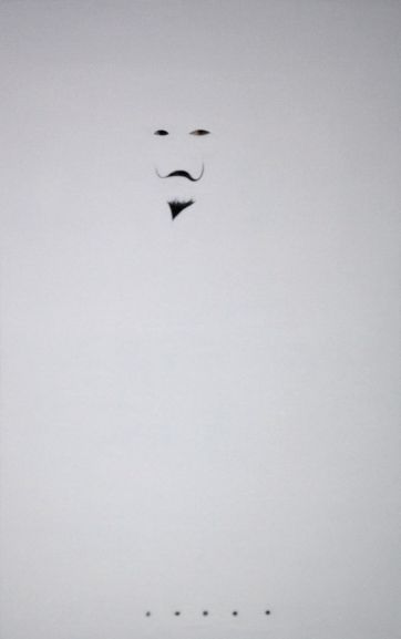
". . . . ."
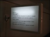
I used “L.H.O.O.Q” of Marcel Duchamp’s work to create my art work. I painted white color on this picture except eyes, mustache, beard and 5 dots. The eyes are originally painted by Leonado Da Vinci. Mustache, beard and 5 dots are drawn by Marcel Duchamp. How I painted white color on this picture is changing image and making the new way of interpretation. Painting white color makes the picture become vacancy. There are only eyes, mustache, beard and 5 dots that show on the picture. Mustache and beard remind something like wearing a mask or disguising. It has mysterious atmosphere. The word L.H.O.O.Q. was painted to be “. . . . .” so it becomes blank caption that need someone to fulfill.
 click here
 click here
 click here
 click here
Exhibition by BACC Exhibition Department
2nd August – 1st September 2013, 7th floor Bangkok Art and Culture Centre, Bangkok.
Opening ceremony : 1st August 2013 at 18.30 hr.
Link : https://www.facebook.com/CROSSSTITCHBACCEXHIBITION?fref=ts
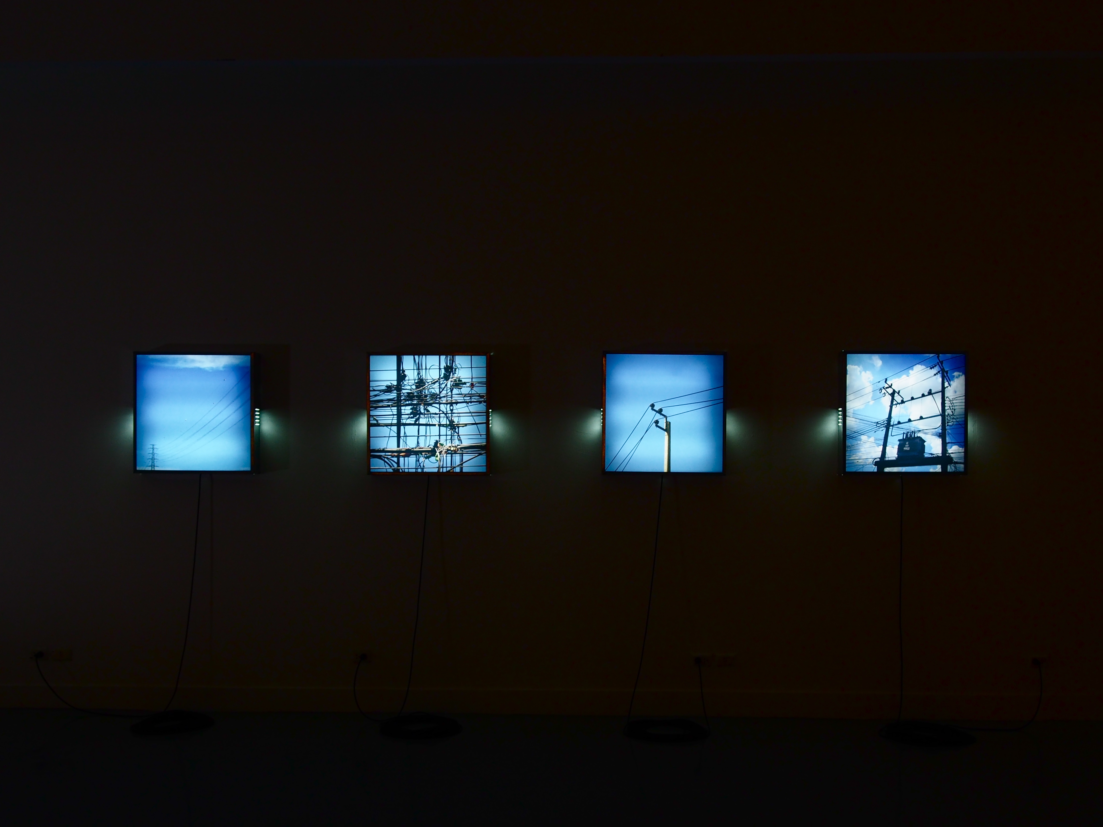
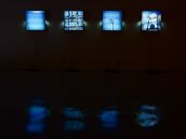
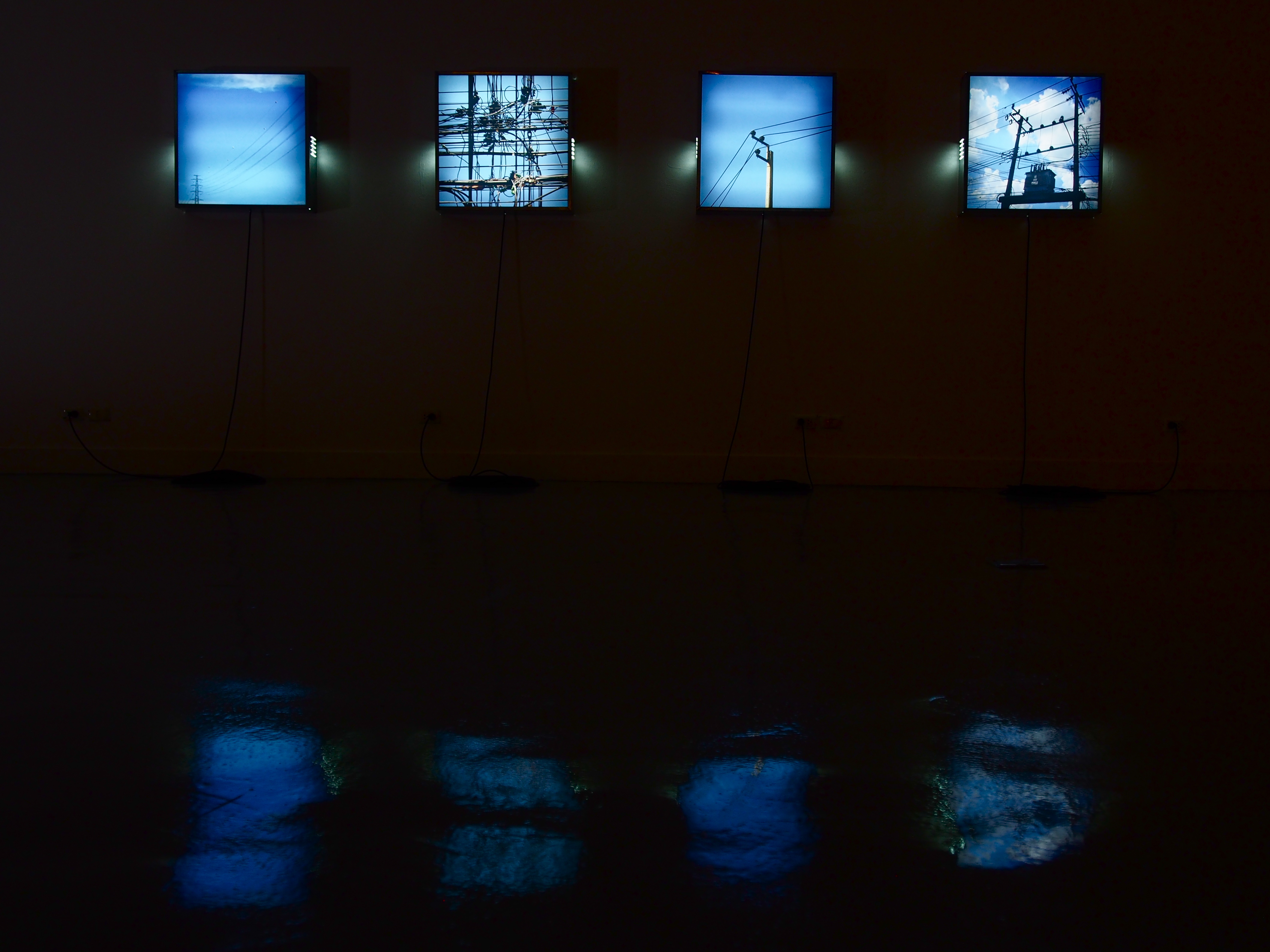
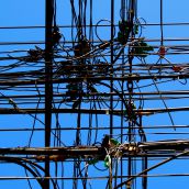
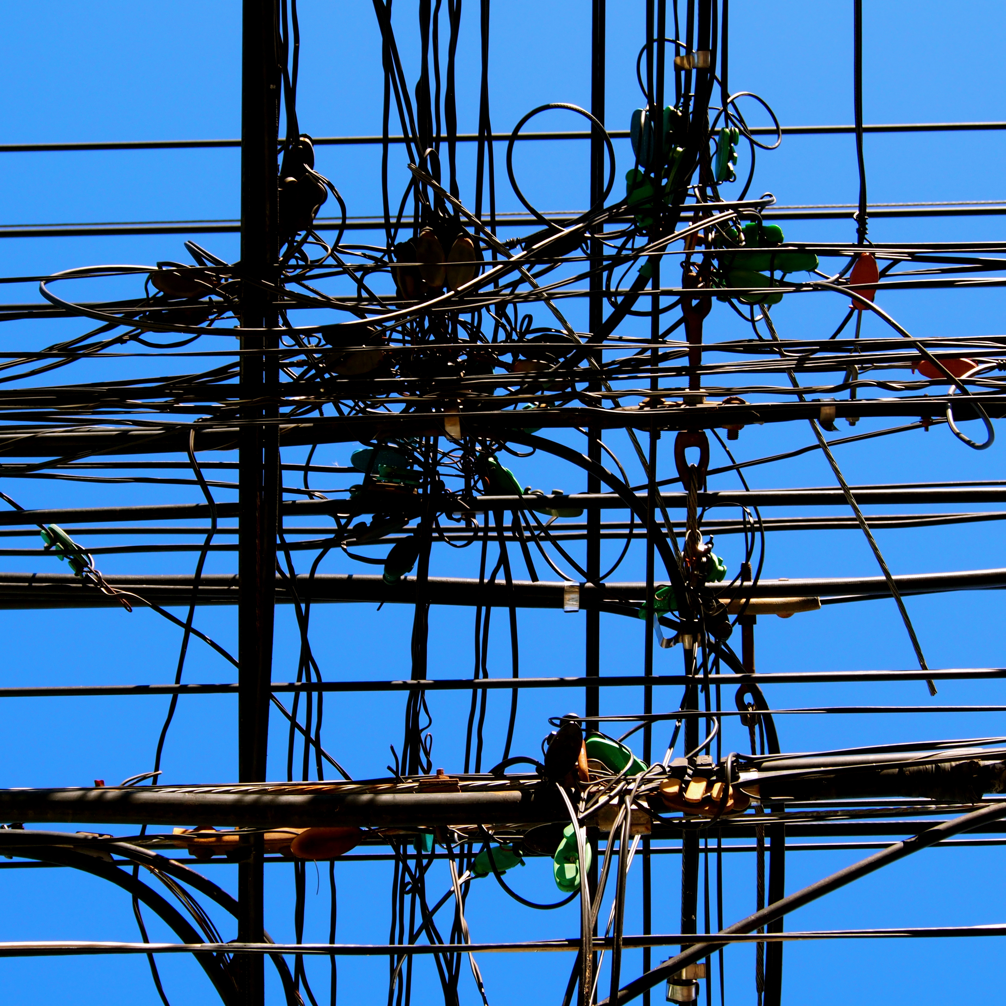
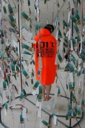
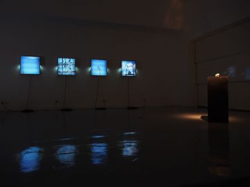
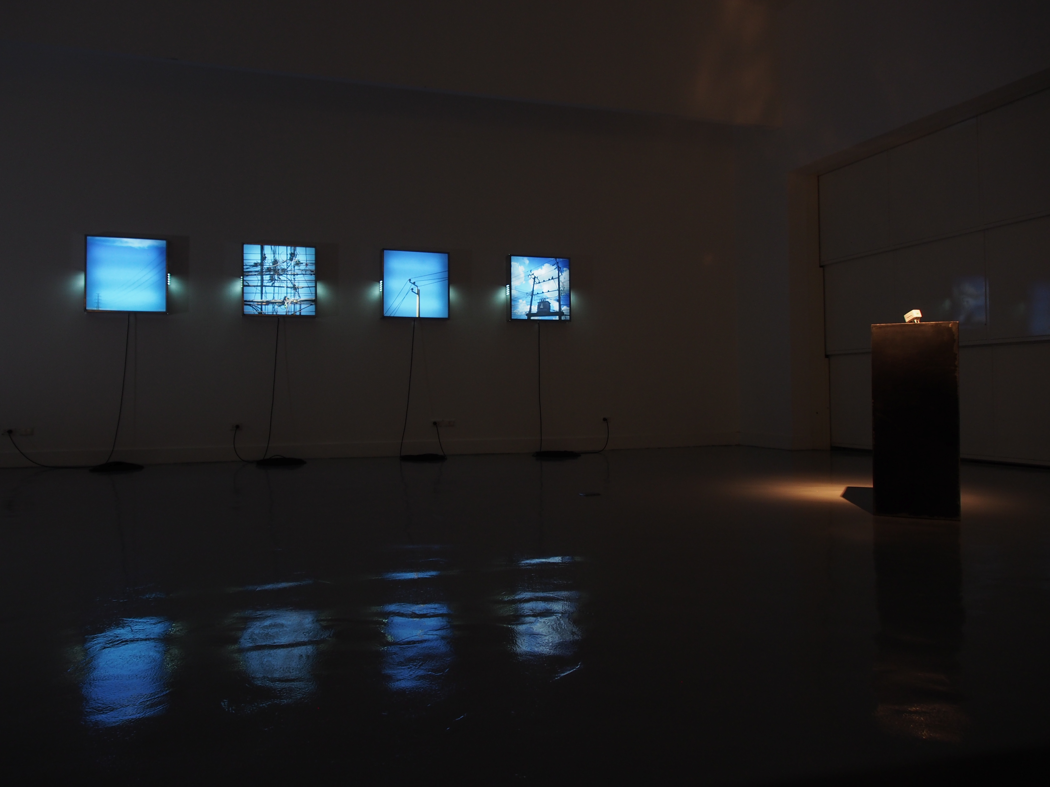
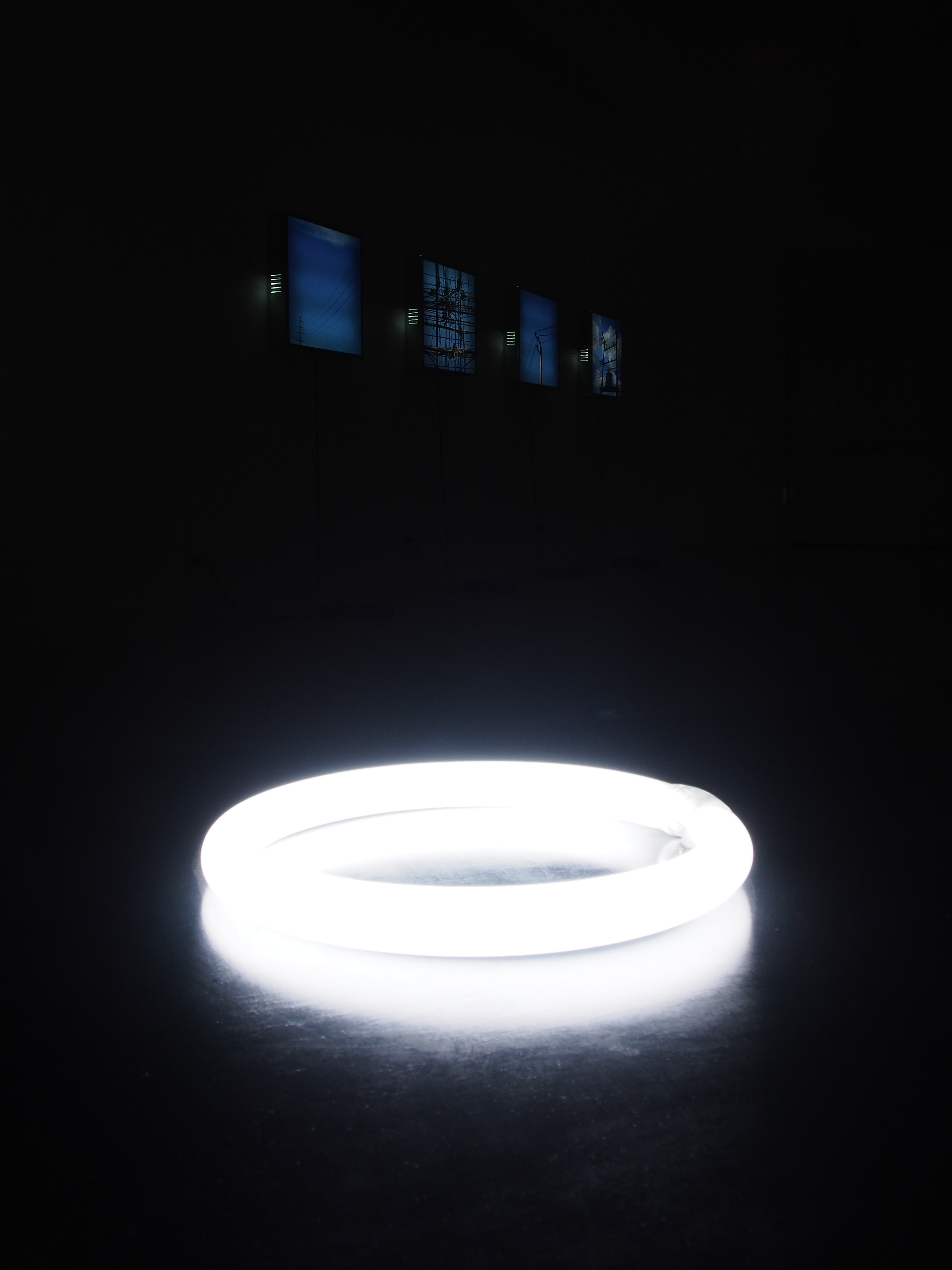
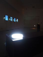
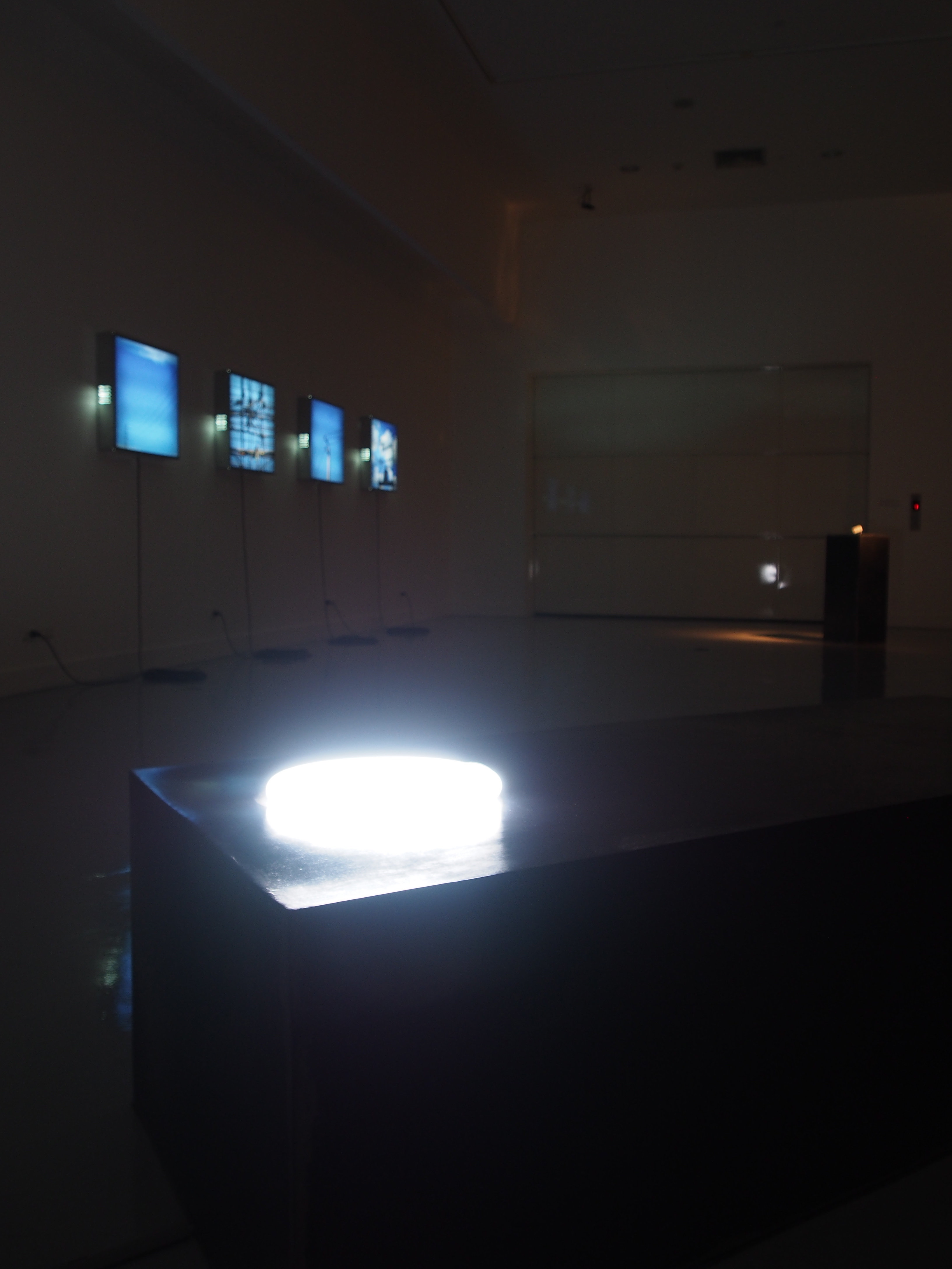
"Tales of Electrician"
Tales of Electrician presents the metaphor of energy: electrical apparatus is referred to another thing in order to represent the concept of connection, transmission and transformation, and so on. The work consists of 3 parts:
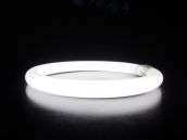
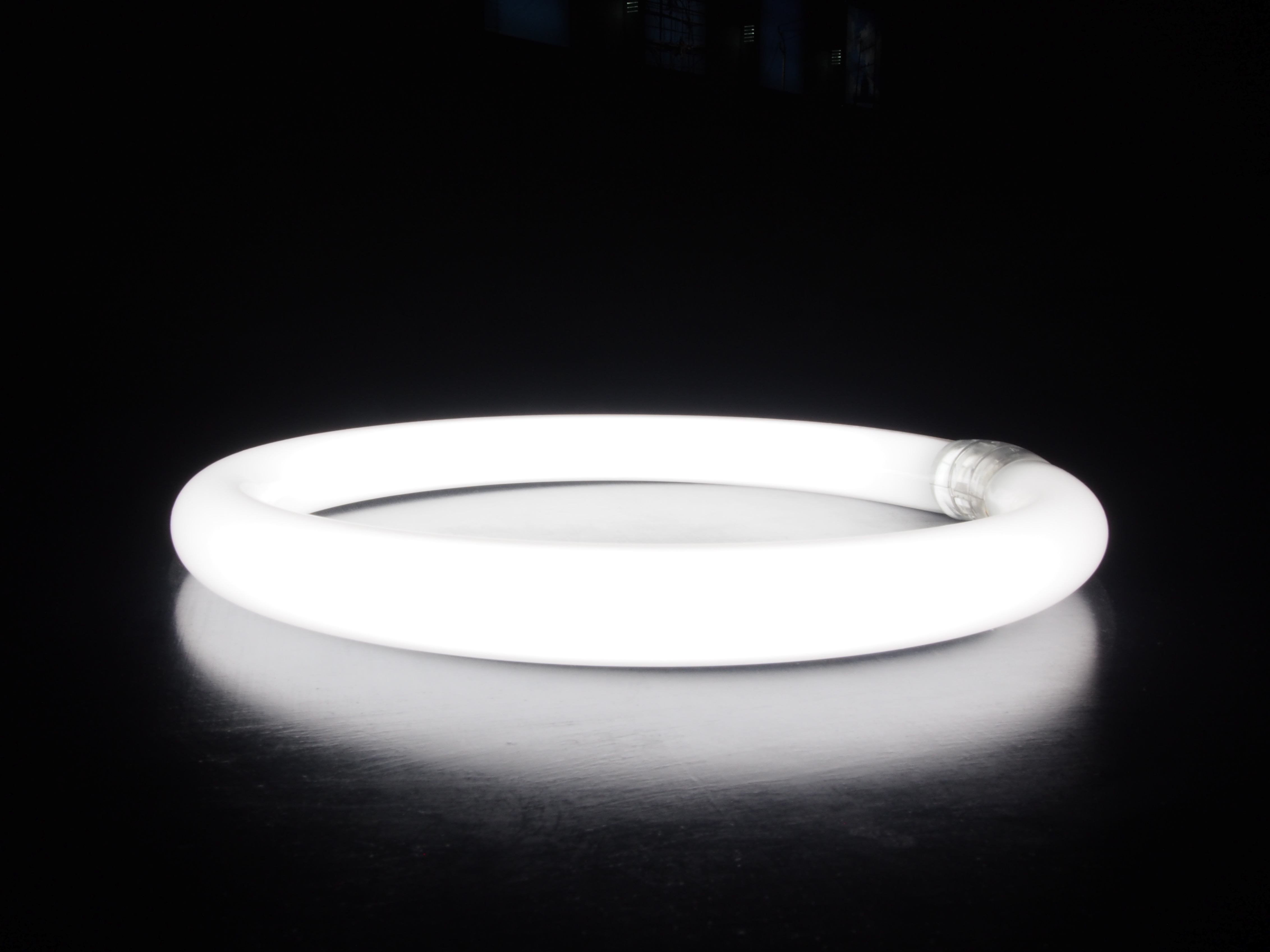
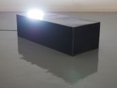
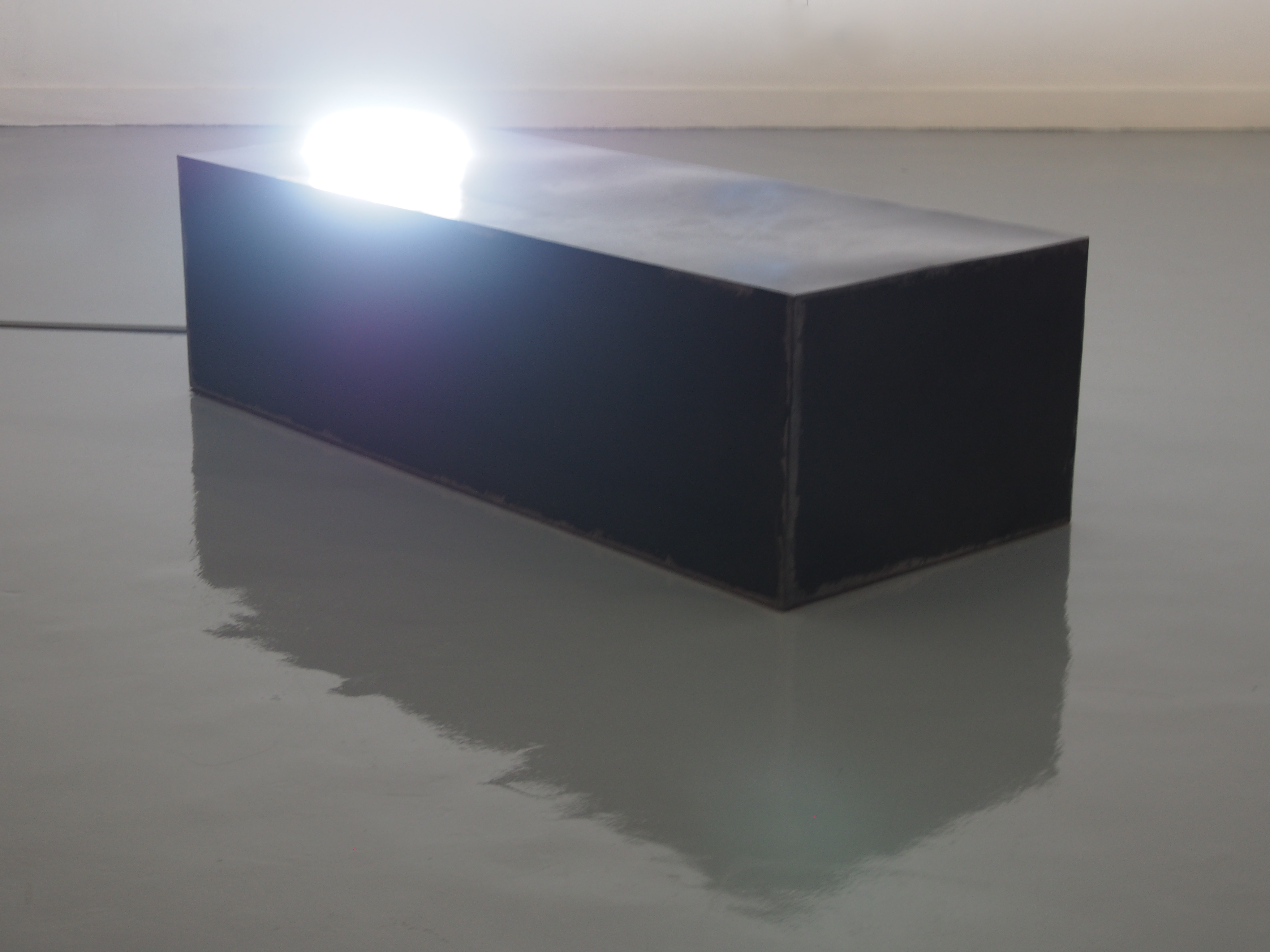
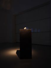
"Sleeping Angel"
A circular neon lamp is like a nimbus over the head of an angel. The light shone from a lamp signifies energy. One could imaginatively associate a lamp placed on a bed-like iron platform to an image of a sleeping angel. Formlessness of electric energy (unable to be seen yet exists), inexistence of an angel in the real world (who may exist in imagination or superstitious belief), and dreams during stages of sleep are also impalpable and they do not occur in the physical world (yet perceivable); these are resemble and interconnected.
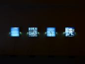
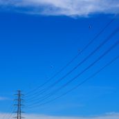
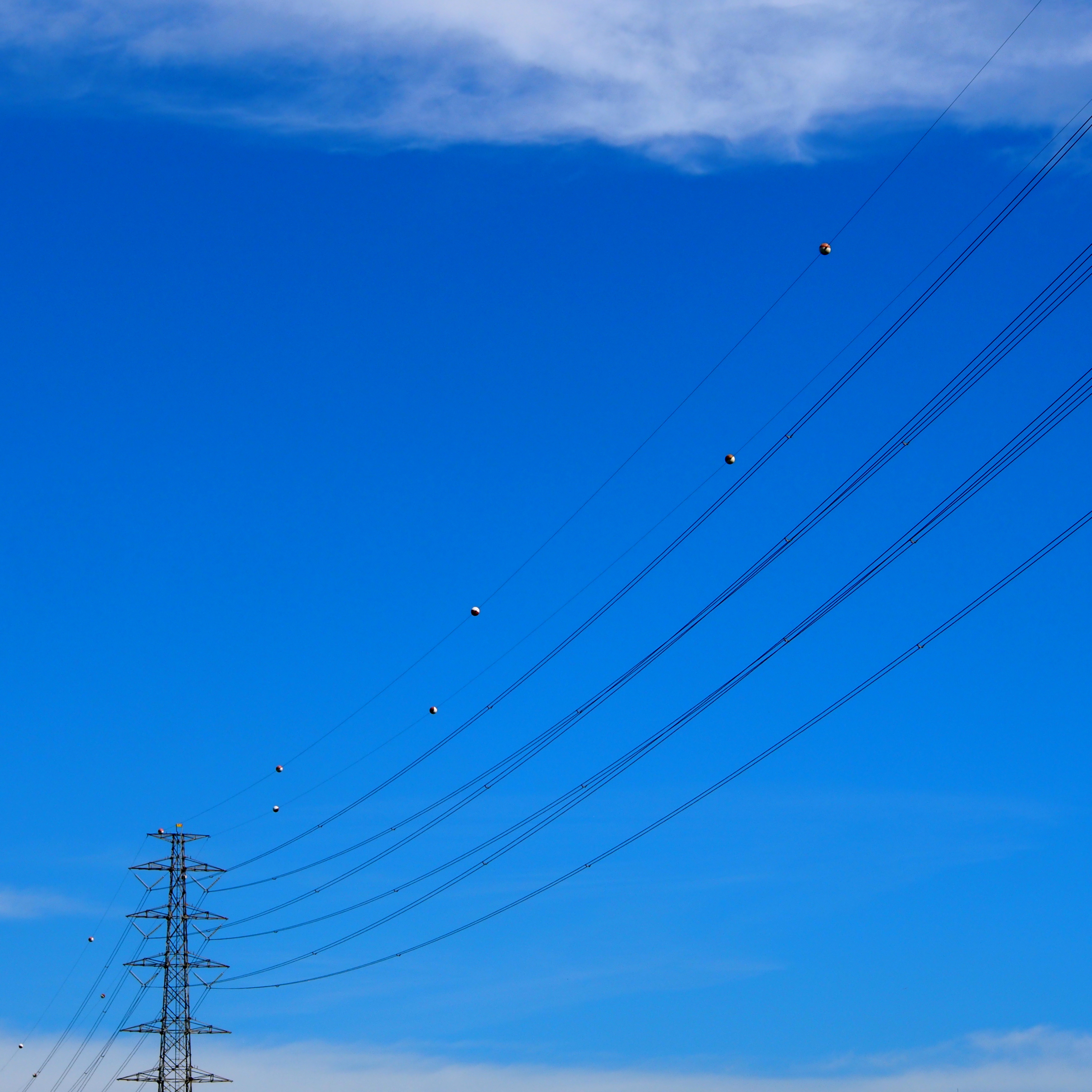
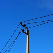
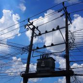
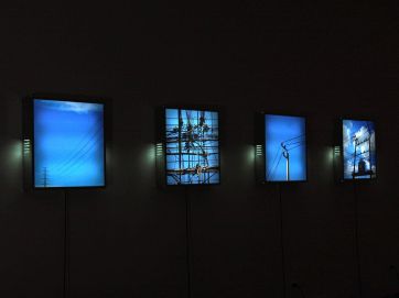
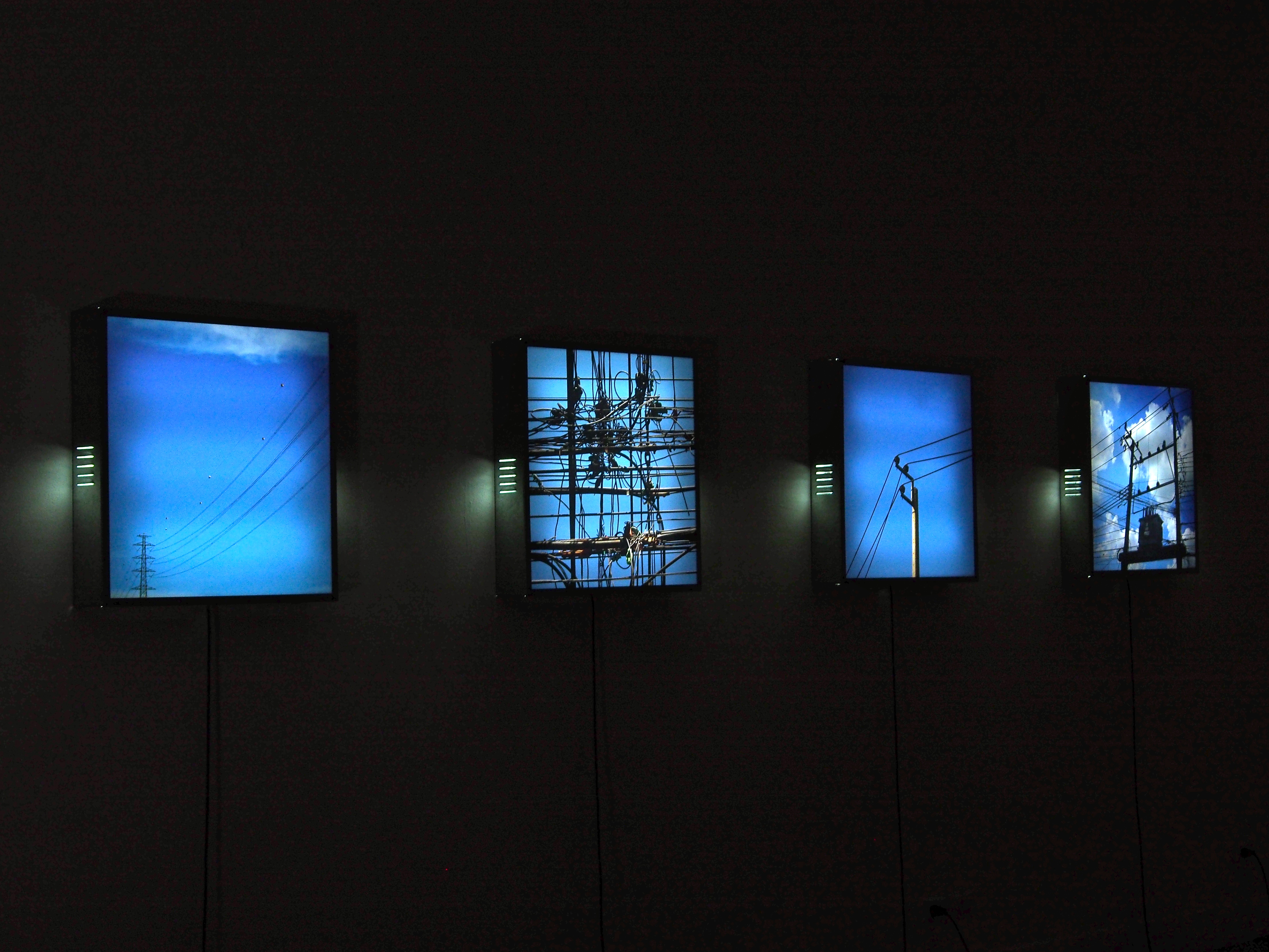
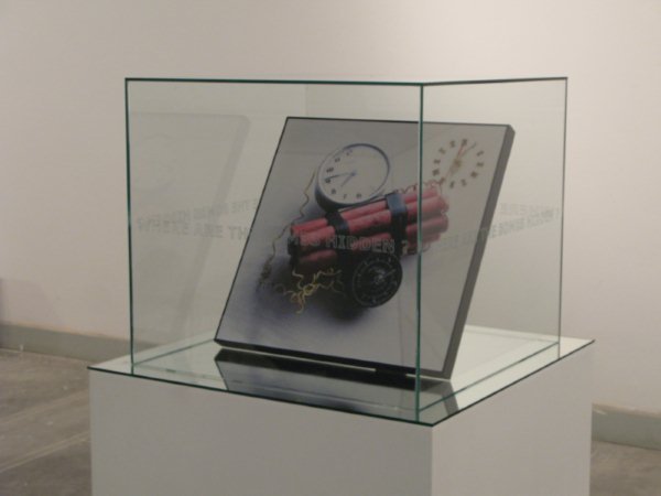
"Far Far Away... (Butterfly Effect)"
Wire is a path that connects and conducts electricity to everywhere. The work presents such idea through advertising light boxes, each displays a photo if electric wire and pole from each area Light shone in the work proves the transformation of electric power into light which is interconnected and distributed to the work while the origin of electric power is actually remoter than the image of wires or the work one sees. Power plant has employed many resources and generated them into electical power. Power is thus transformed, distributed and dynamically connected . It is infinitely related and interconnected.
"Diplomat"
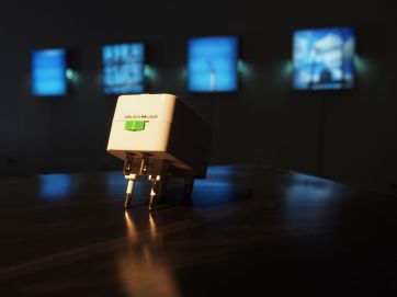
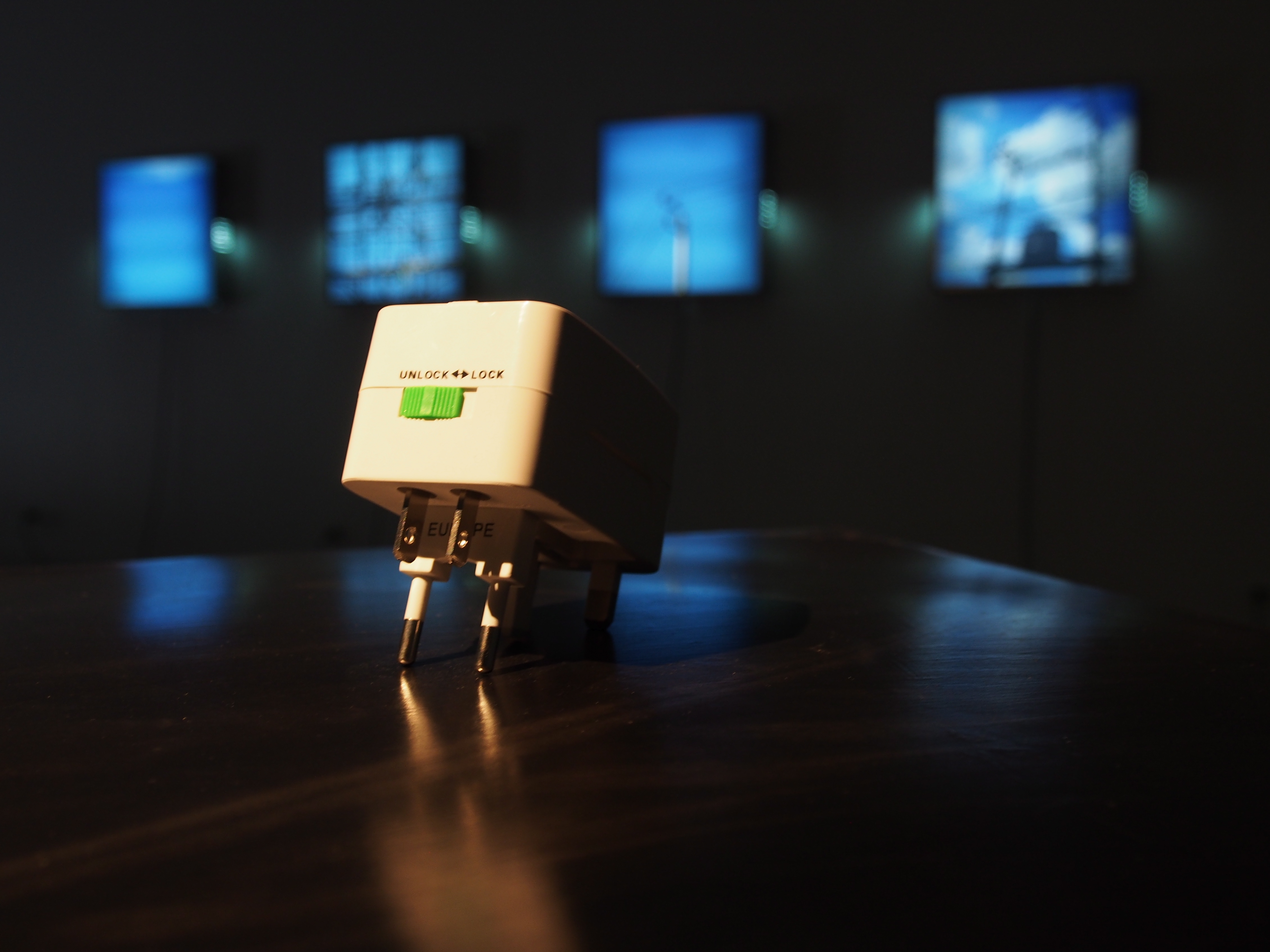
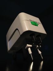
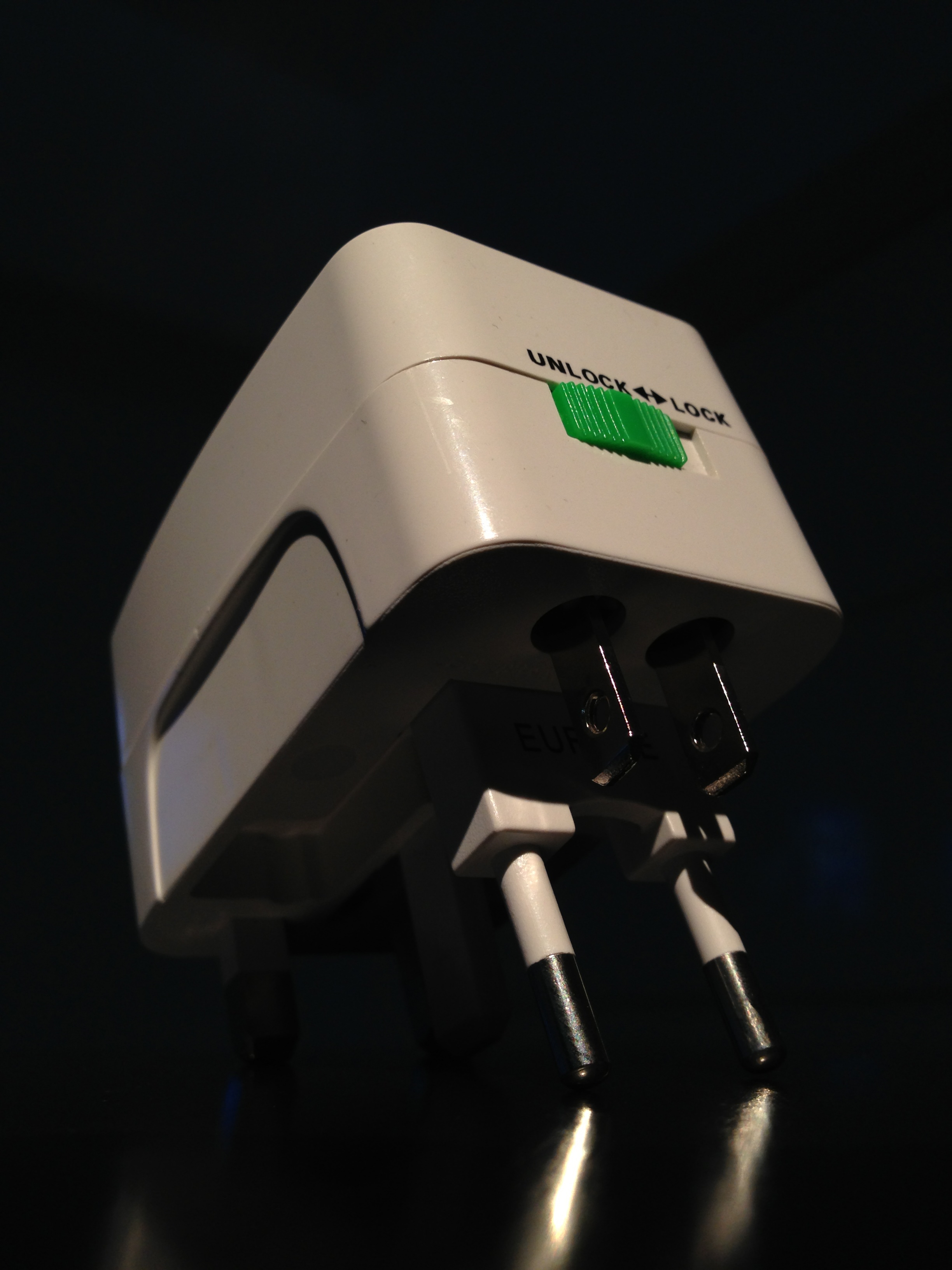
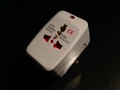
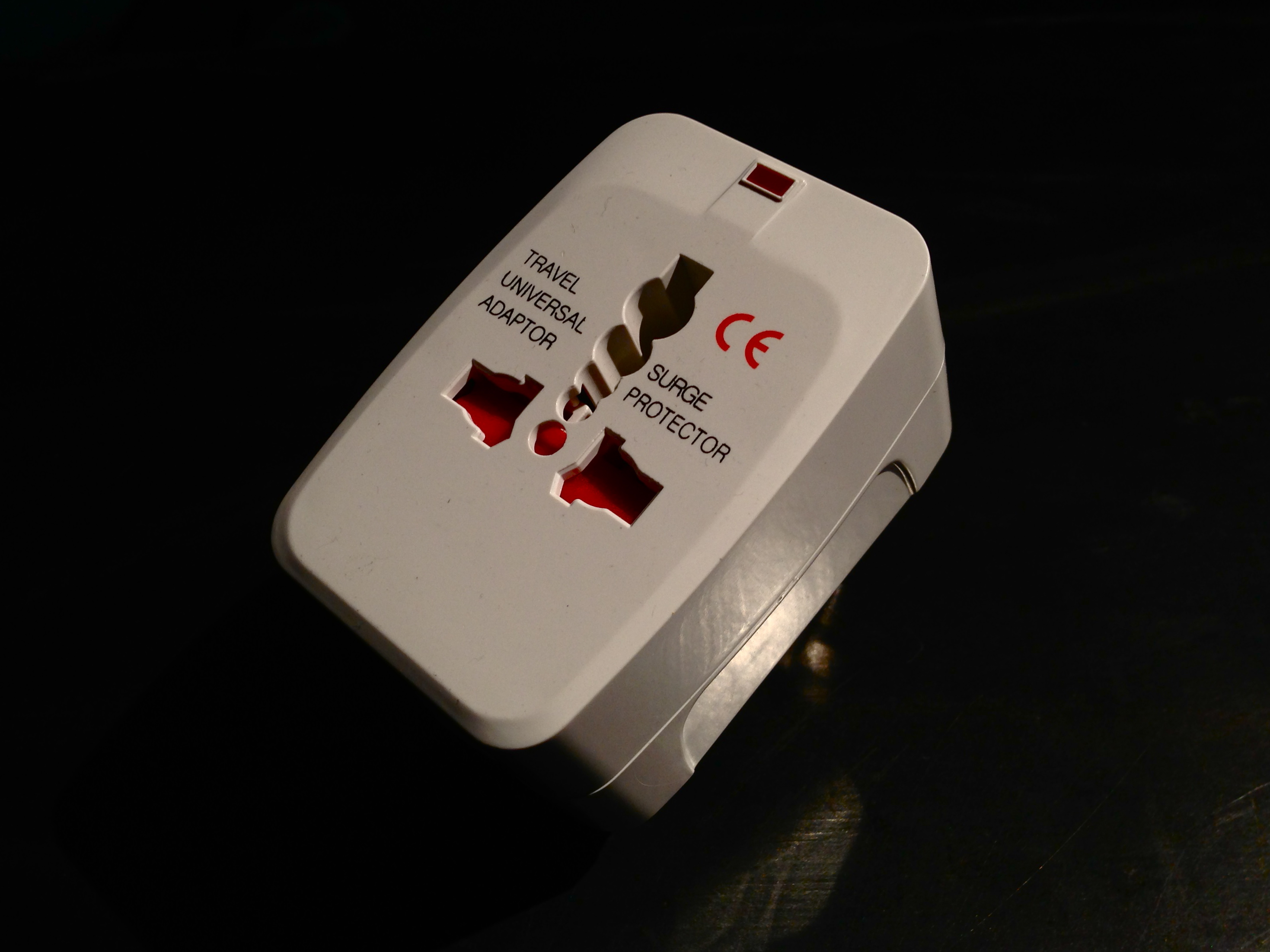
“Travel universal adapter” or an all-applicable plug – is a portable device that is frequently carried when traveling aboard. Each country has different cultures and languages; even power sockets. An Universal Travel Power Adapter allows sockets and plugs of each country which are different to connect so all appliances could be compactible. Its function could be personified as “the diplomat” who unites all diversities.
 click here
 click here
 click here
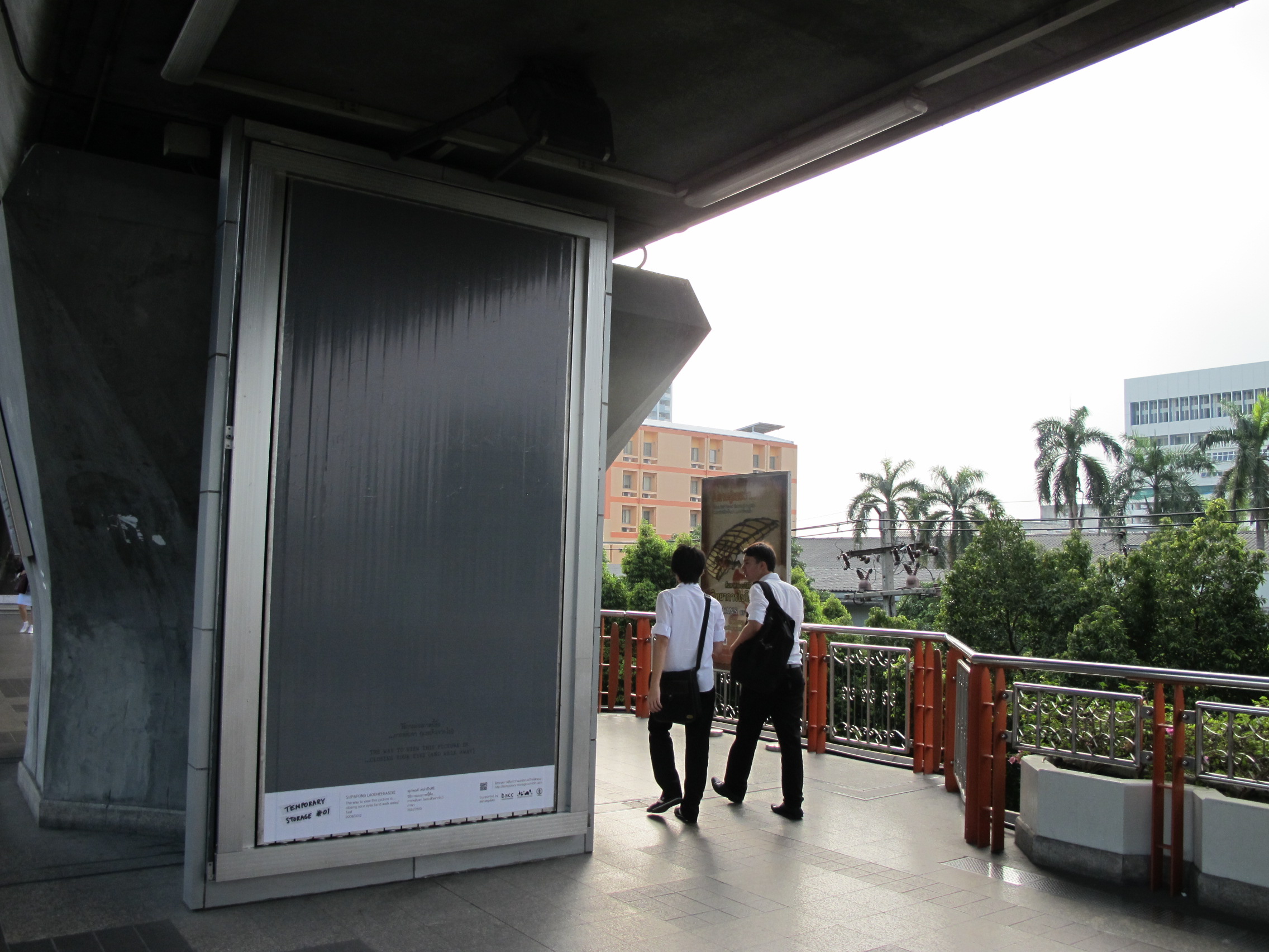
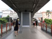
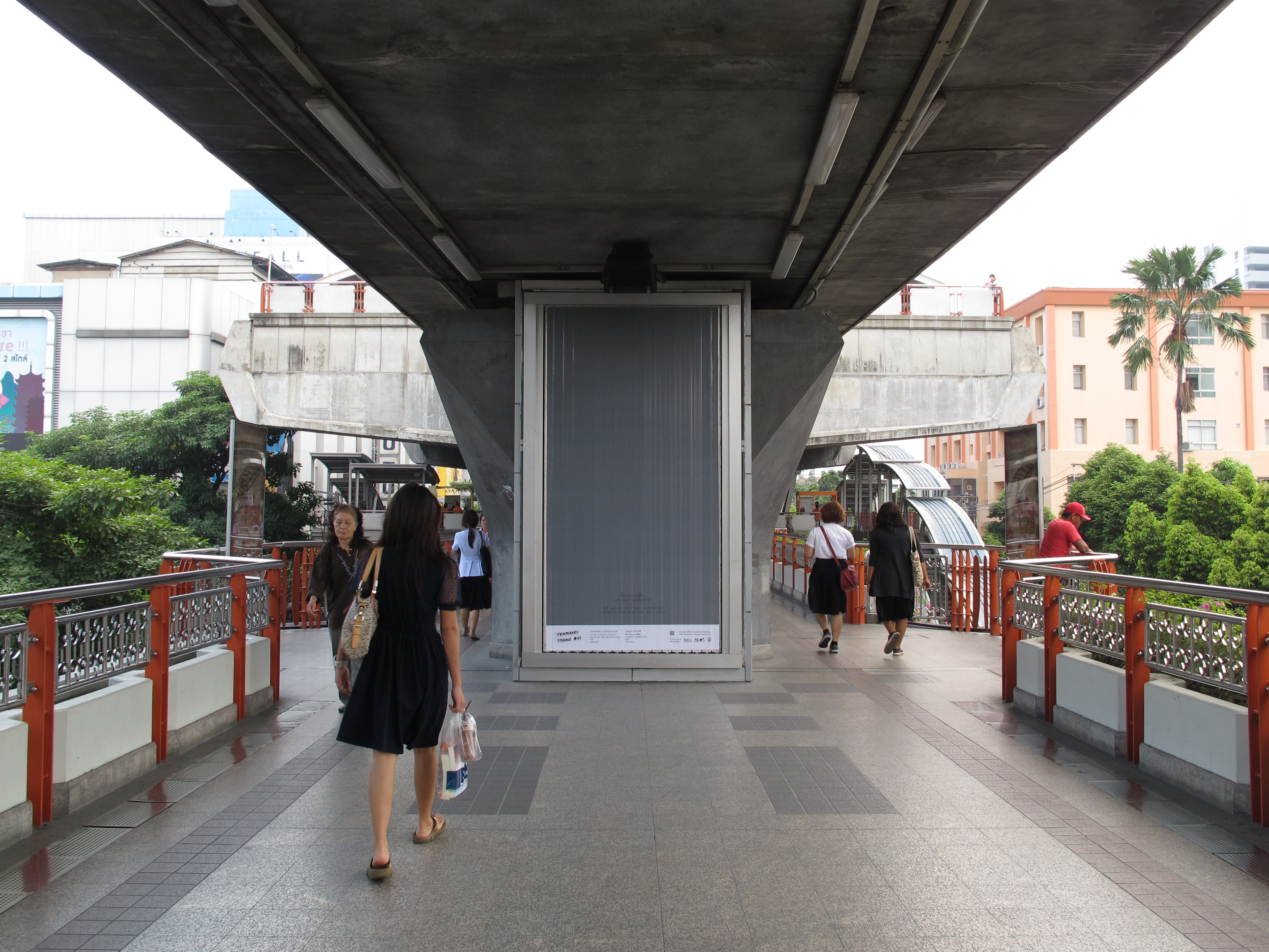
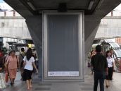
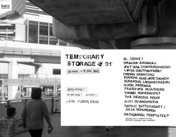
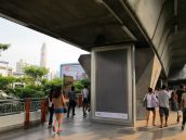
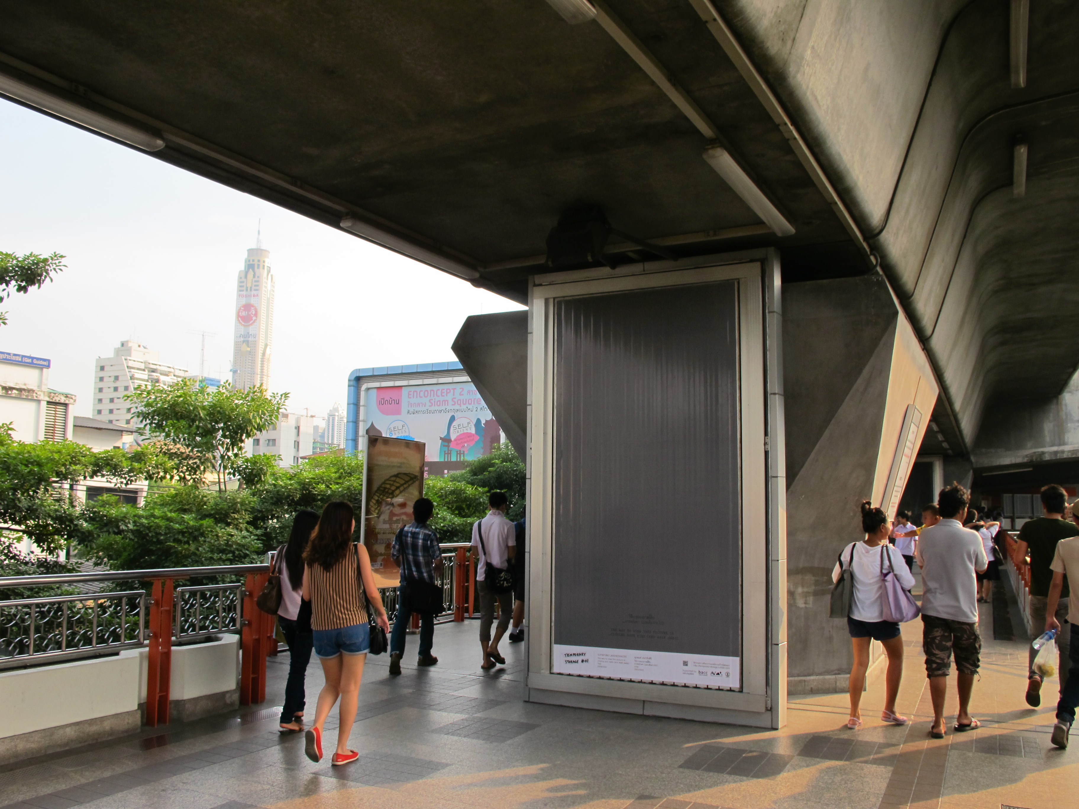
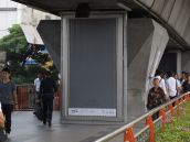
Temporary Storage #01
10 November – 9 December 2012
Opening: 10 November 2012, 6 – 8 PM
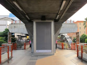
Bangkok Art and Culture Centre & Advertising Banners around BTS Stations (Siam – Victory Monument)
all(zone), Orawan Arunrak, Pattara Chanruechachai, Viriya Chotpanyavisut, Disorn Duangdao, Suwicha Dussadeewanich, Supapong Laodheerasiri, Noon Passama, Pratchaya Phinthong, Vipash Purichanont, The Reading Room, Miti Ruangkritya, Pathompon Tesprateep, Sathit Sattarasart & Julia Schwadron
Curator: Chitti Kasemkitvatana
Assisting Curator: Mary Pansanga
Bangkok Art and Culture Centre presents “Temporary Storage #01”, as part of BACC Experimental Project 2012, curated by Chitti Kasemkitvatana.Temporary Storage #01 is a project-based exhibition, which is trying to explore the possibility of creating multi-platform for contemporary art exhibitions. Focusing on the process of transmitting research work, artwork and idea produced by artists and those who are in related fields to the public. Works included in this exhibition are from artists who are based in both Thailand and abroad, Orawan Arunrak, Pattara Chanruechachai, Viriya Chotpanyavisut, Disorn Duangdao, Suwicha Dussadeewanich, Supapong Laodheerasiri, Pratchaya Phinthong, Miti Ruangkritya, Pathompon Tesprateep, Sathit Sattarasart & Julia Schwadron; and also from an architects’ group, all(zone); a jewelry designer, Noon Passama; an art historian/independent curator, Vipash Purichanont and a not-for profit organization, The Reading Room.
Temporary Storage #01 is an overlapping platform for intervention and participation of both the artists and the viewers and also a platform for future project. This exhibition/project does not present the whole idea as a single narrative but rather to provide the possibility of readings, interpreting and perceiving the presented works in relation to the context of time and place and to emphasize the viewers’ experiences.
Temporary Storage #01 features, firstly, “Temporary Architecture” a temporary exhibition unit designed and constructed by all(zone) in collaboration with Suwicha Dussadeewanich. Located on the 5th floor at BACC, this unit will function as an exhibition space, a small library, a meeting point and a temporary workplace for the participants and the viewers.
Secondly, three issues of broadsheet, entitled “Temporary Storage #01” will be published during the exhibition period. This publication is considered as a space for presenting ideas and research based works including Orawan Arunrak’s drifting map of Bangkok, Miti Ruangkritya’s photographic observation on urban tectonics, Mary Pansanga’s article about cinematic experience, Vipash Purichanont’s historical account on the use of Bangkok’s public space in contemporary art and Sathit Sattarasart’s unrealized works. The broadsheets will be on display and be available for the public on the 5th floor at BACC and other places around the country.
Thirdly, “Temporary Storage #01” on advertising banners, exhibiting works by all(zone), Viriya Chotpanyavisut, Disorn Duangdao, Supapong Laodheerasiri, Noon Passama, Pratchaya Phinthong, Vipash Purichanont, Miti Ruangkritya, Pathompon Tesprateep, Sathit Sattarasart & Julia Schwadron. These banners are located on road islands and along the BTS Sky Walk from the Pathumwan intersection to the Victory Monument intersection.
Finally, “Bangkok Book Map” by The Reading Room. This project is aimed at creating a reading network in Bangkok City. The Reading Room has created a Bangkok library and Bookshop Map. Gathering basic information about both private and public libraries and independent bookshops, as information for bookshop and library owners and also for the general public to have a complete and easily accessible resource. This Book Map will be available on the 5th floor at BACC as a publication for the interested general public and also as an online map, which focuses on the participation of the public to provide information regarding their own community reading platform.
Link : http://temporary-storage.tumblr.com/
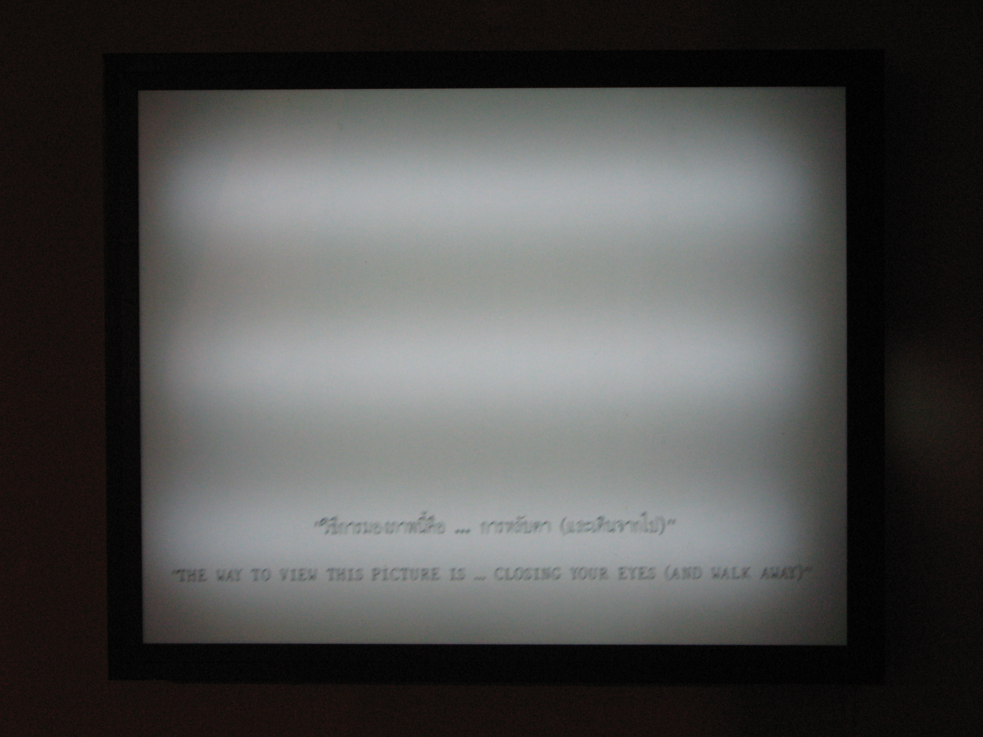
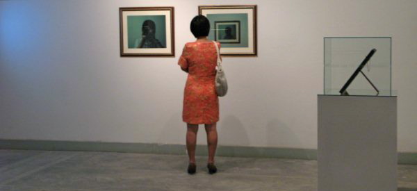
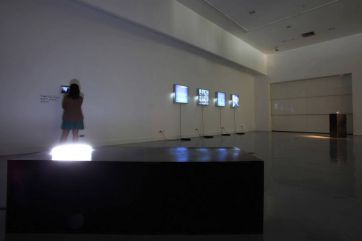
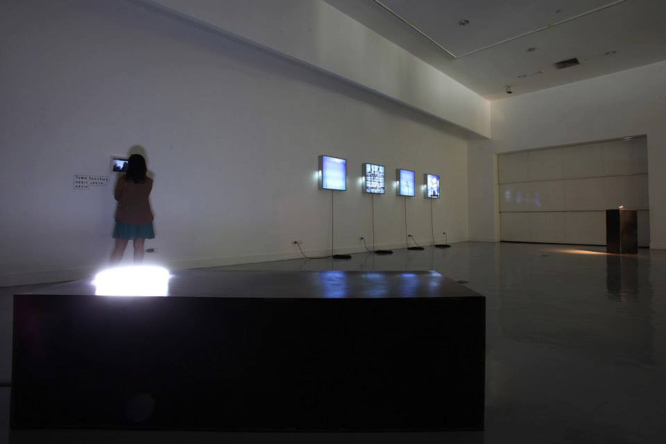
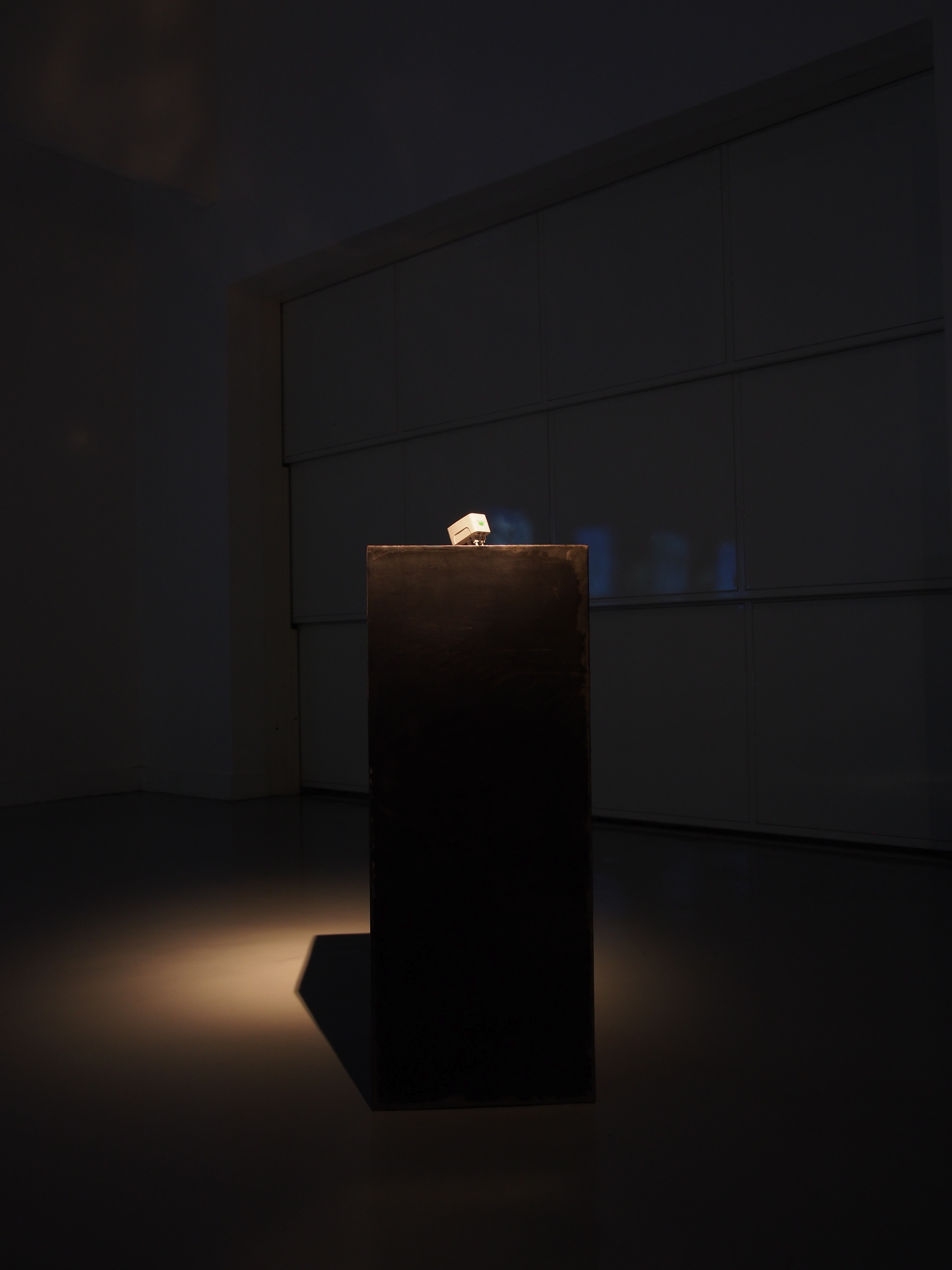
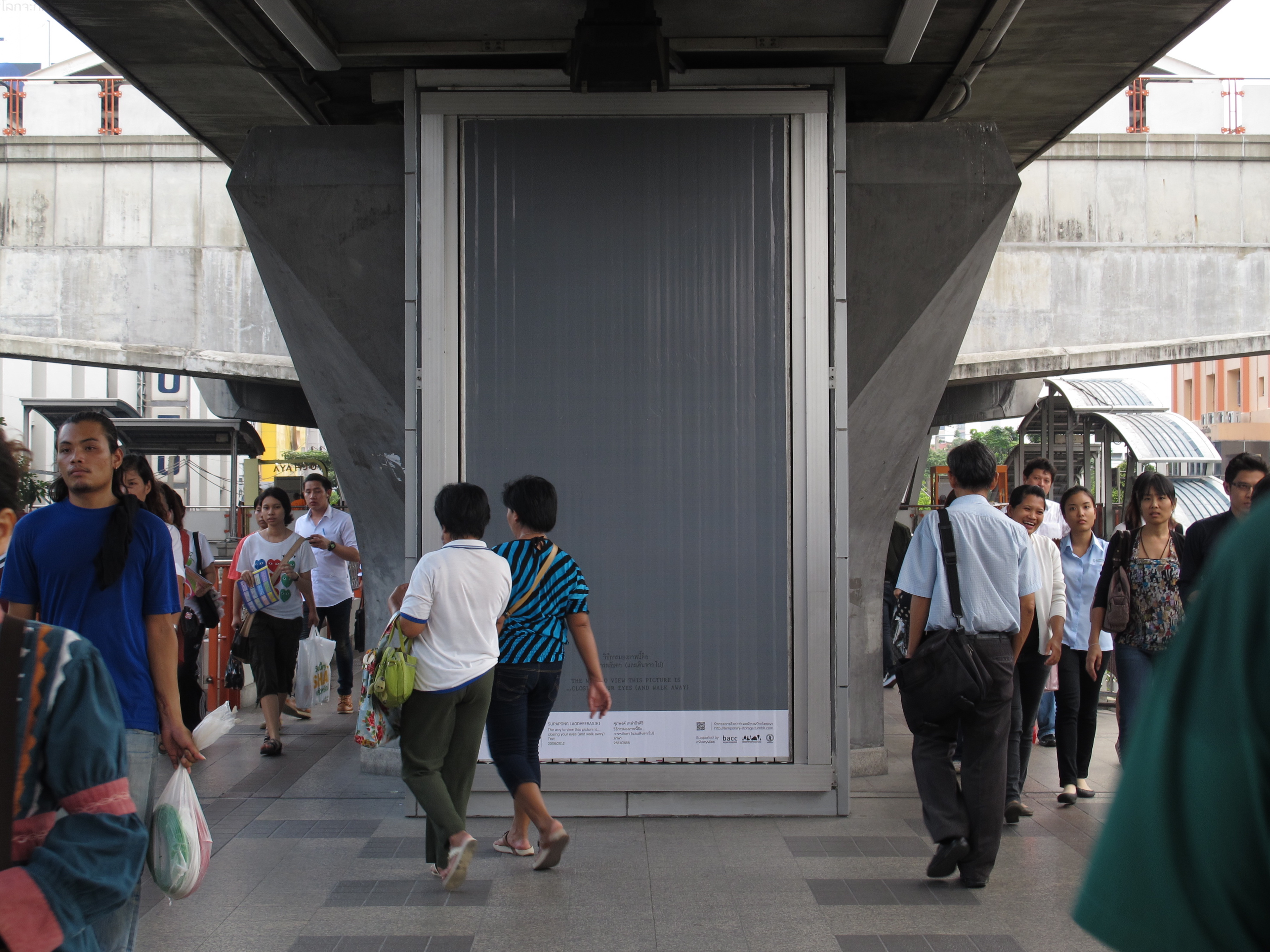
"The Way to View This Picture is... Closing You Eyes (and Walk Away)"
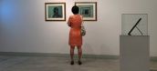
I would like to present signification of experience and memory which is evocable from art work’s image more than the aesthetic value as object. My idea is that any art work will be worthy if it can interacting with the audiences and provoke their memory and experiences. This intuition experience which occurs during comprehending art work will be memorable (imprinted in the audiences‘ mind). This called the absolute power of image.
 click here
 click here
 click here
 click here
 click here
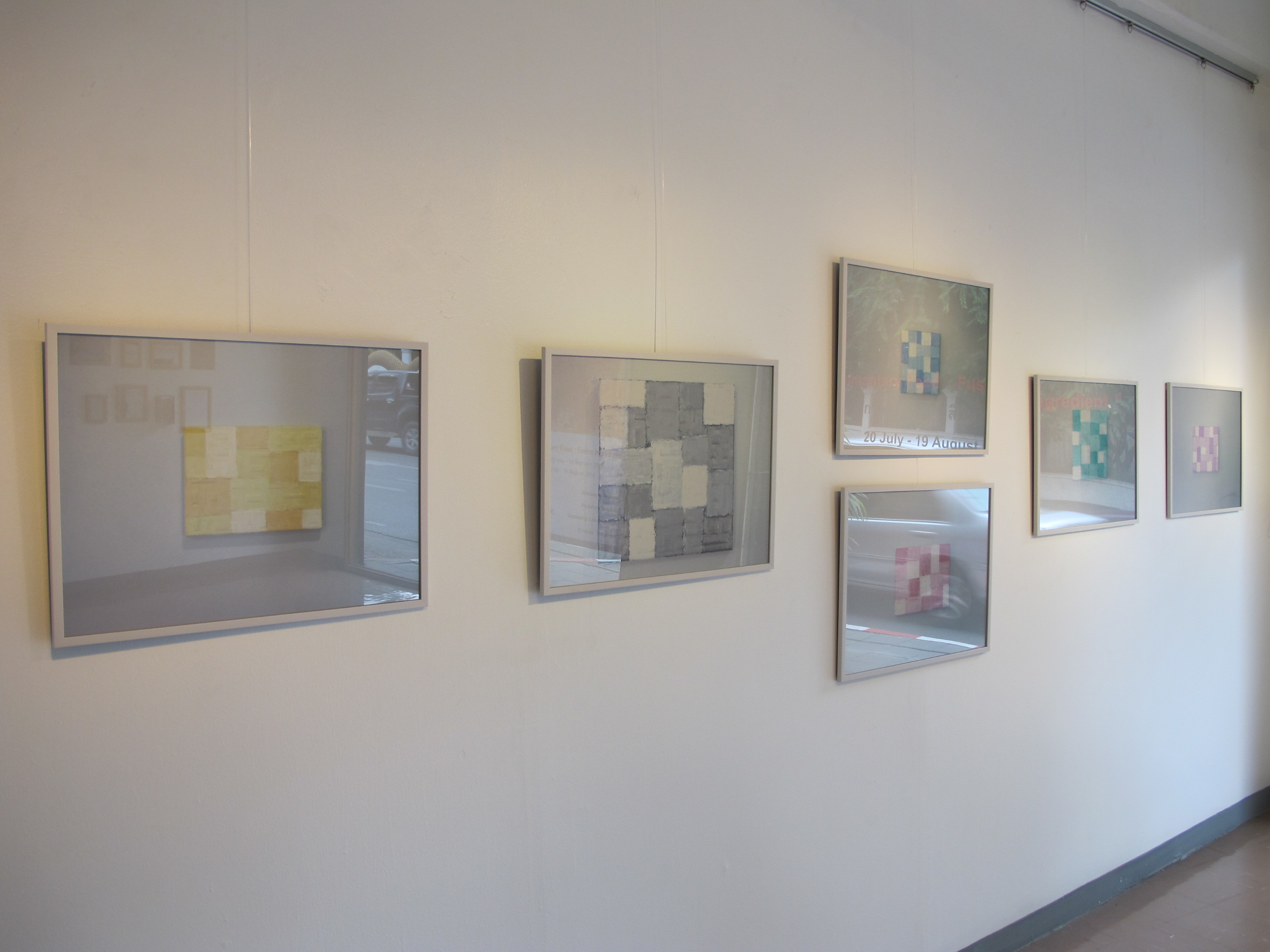
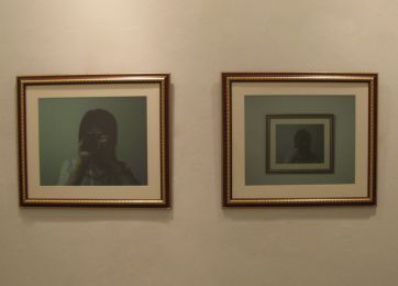
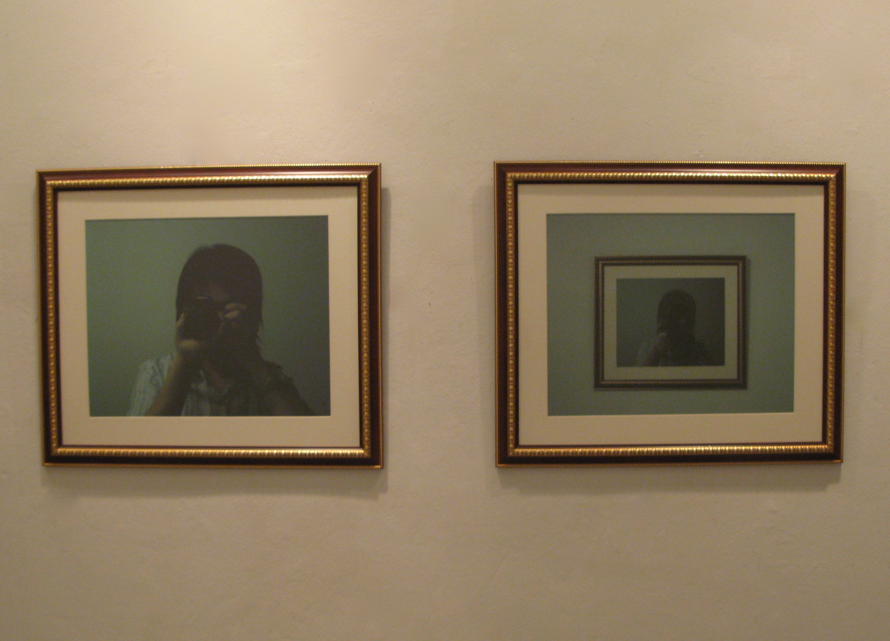
"Photograph of Abstract Painting"
Supapong Laodheerasiri’s work on the other hand is photographs which challenge and play with the viewers’ thoughts. Supapong’s art works are photographs of his own abstract paintings featuring interesting textures and shapes. When paintings become photographs, the painting in a photograph automatically becomes an object. Supapong’s art encourages viewers to ponder the difference between concrete and abstract, between a painting and a photograph, and between at and object.
Writer : Asst. Prof. Somporn Rodboon
Translation : Asst. Prof. Dr. Wilailak Saraithong
 click here
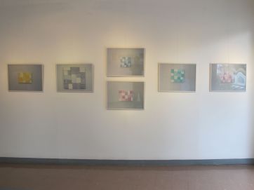
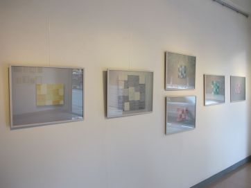
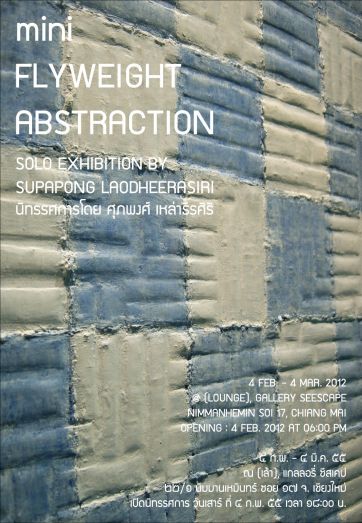
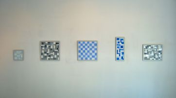
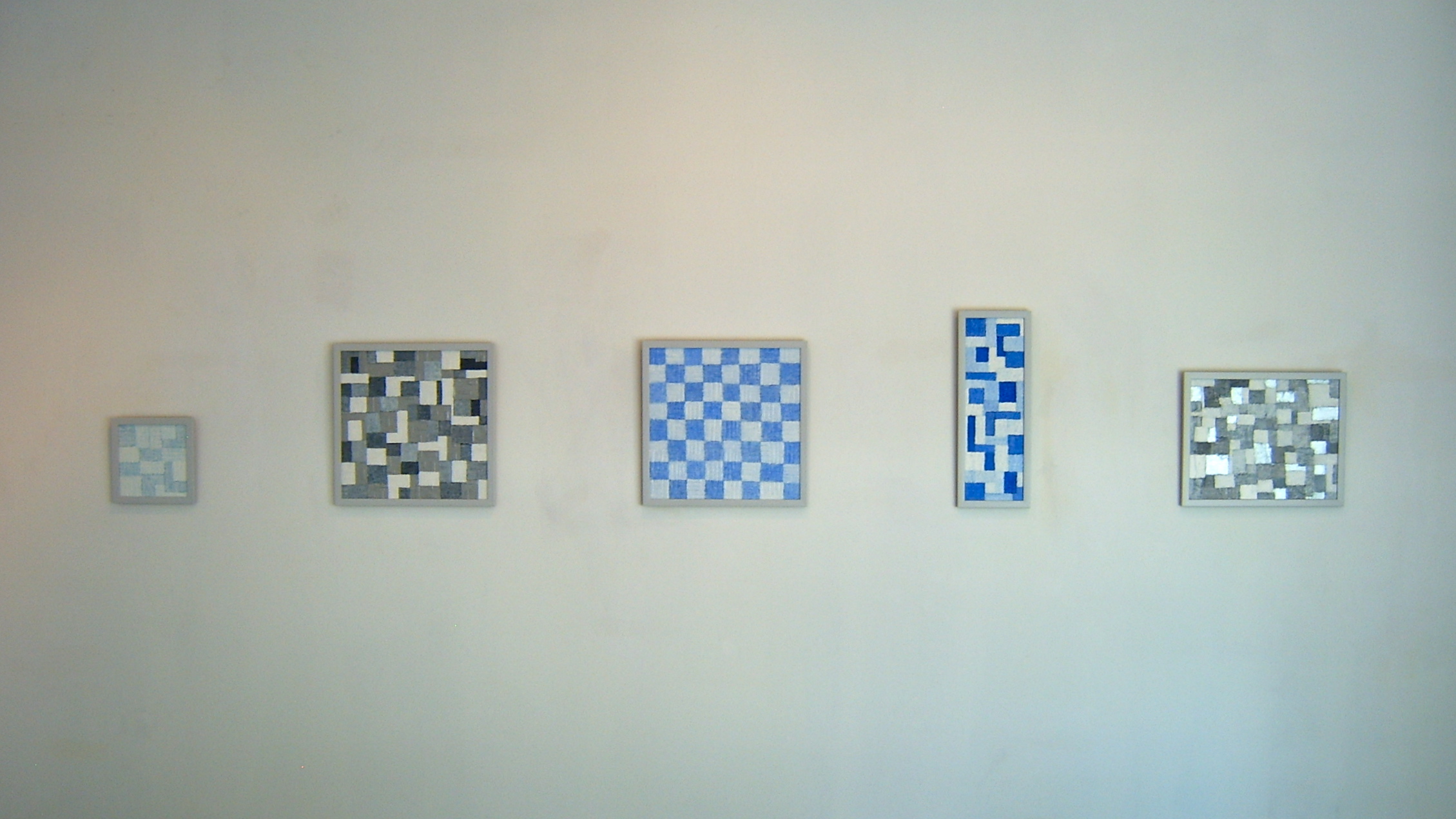
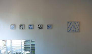
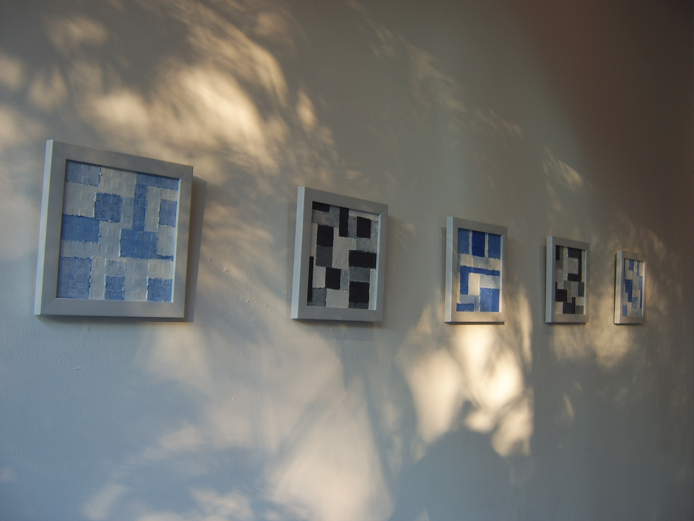
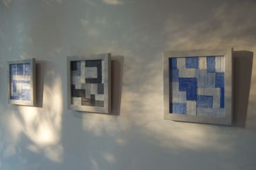
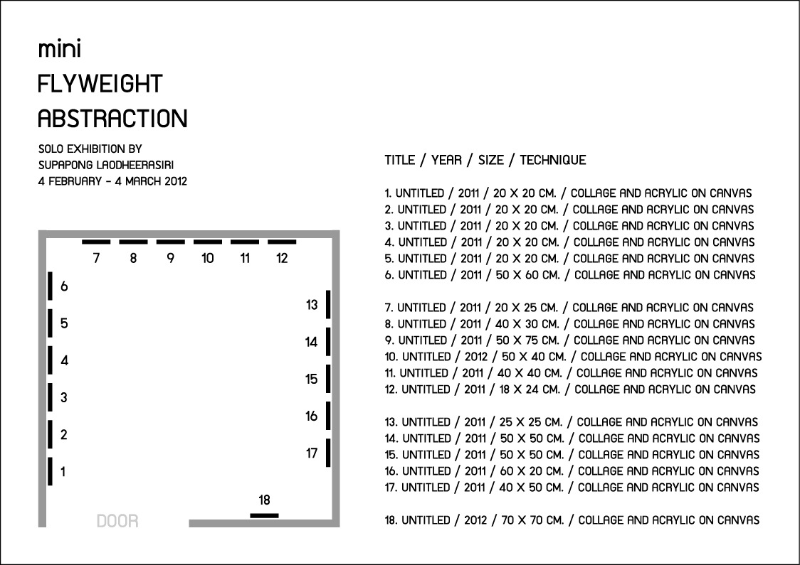
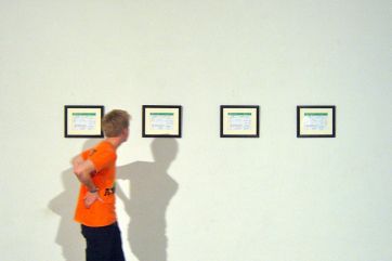
Exhibition : Mini Flyweight Abstraction
(Solo Exhibition By Supapong Laodheerasiri)
Period : 4 February - 4 March 2012
Place : (Lounge), Gallery Seescape, Nimmanhemin Soi 17, Chiang Mai, Thailand.
Opening : Saturday 4th February 2012 at 06:30 PM
 click here
 click here
 click here
 click here
 click here
 Plan of exhibition
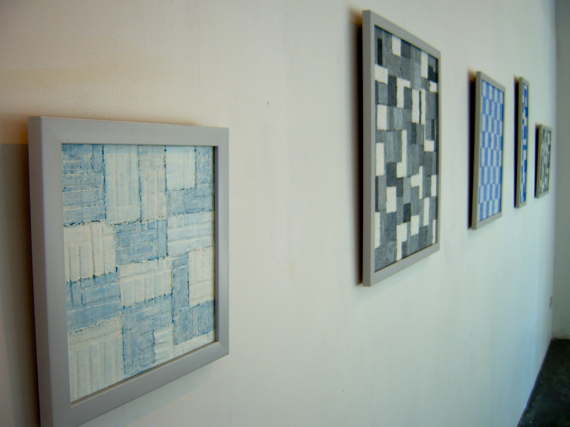
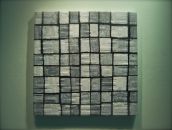
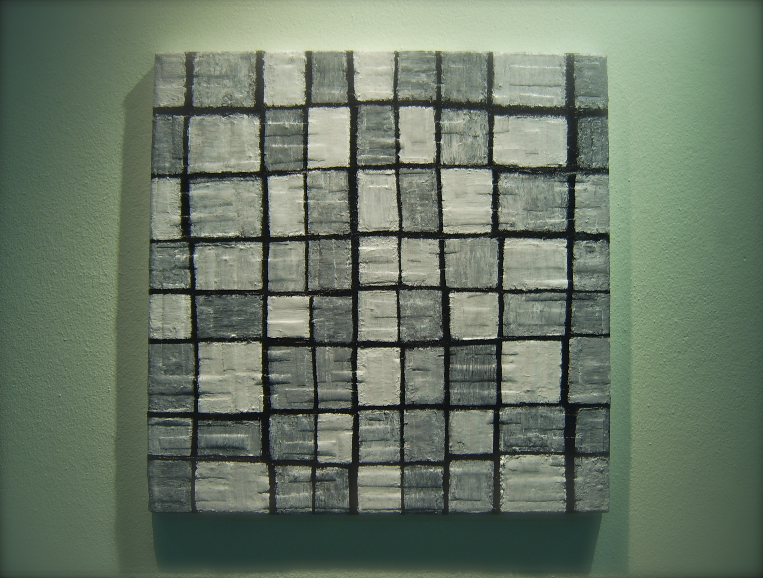
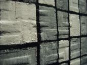
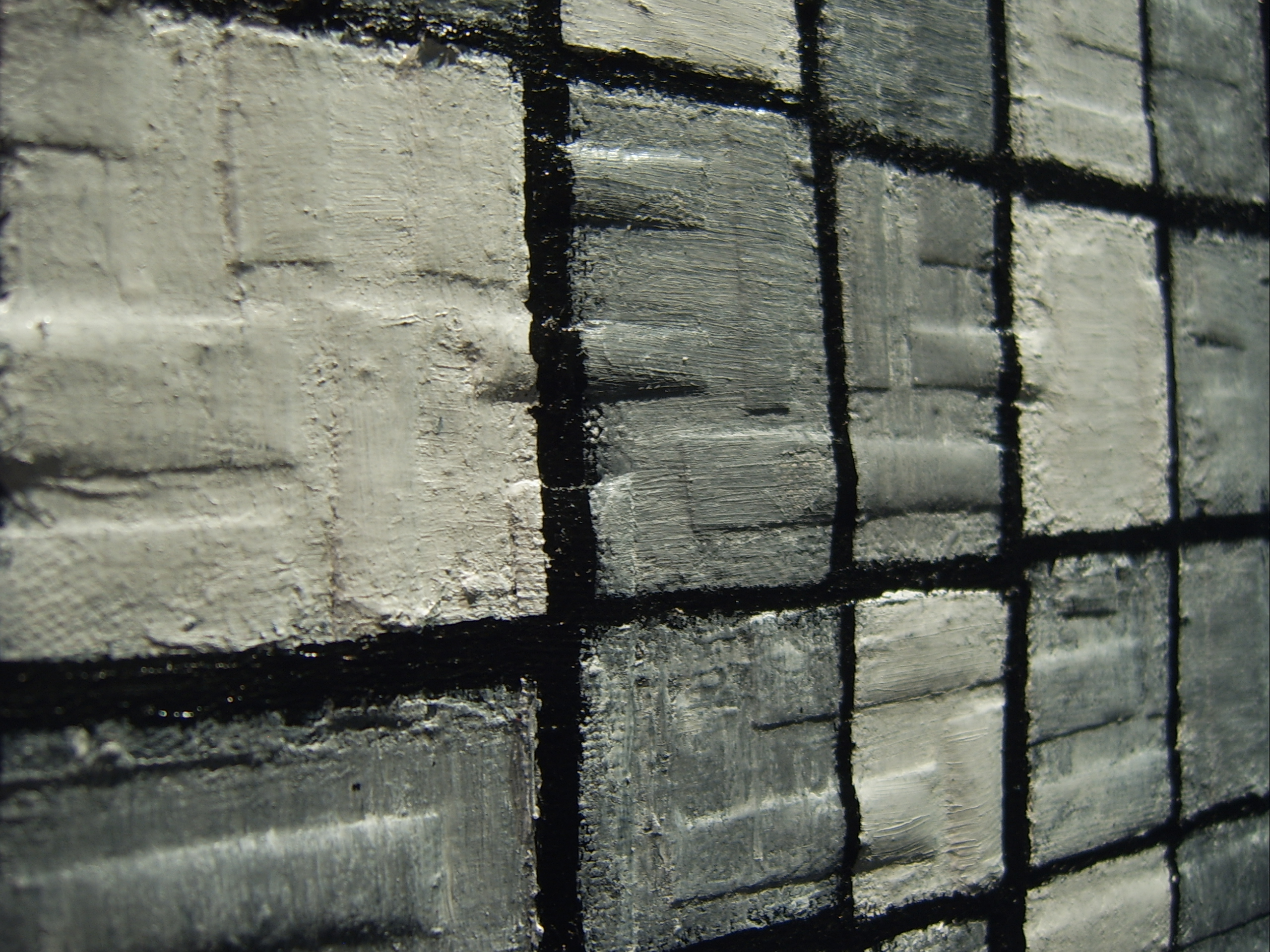
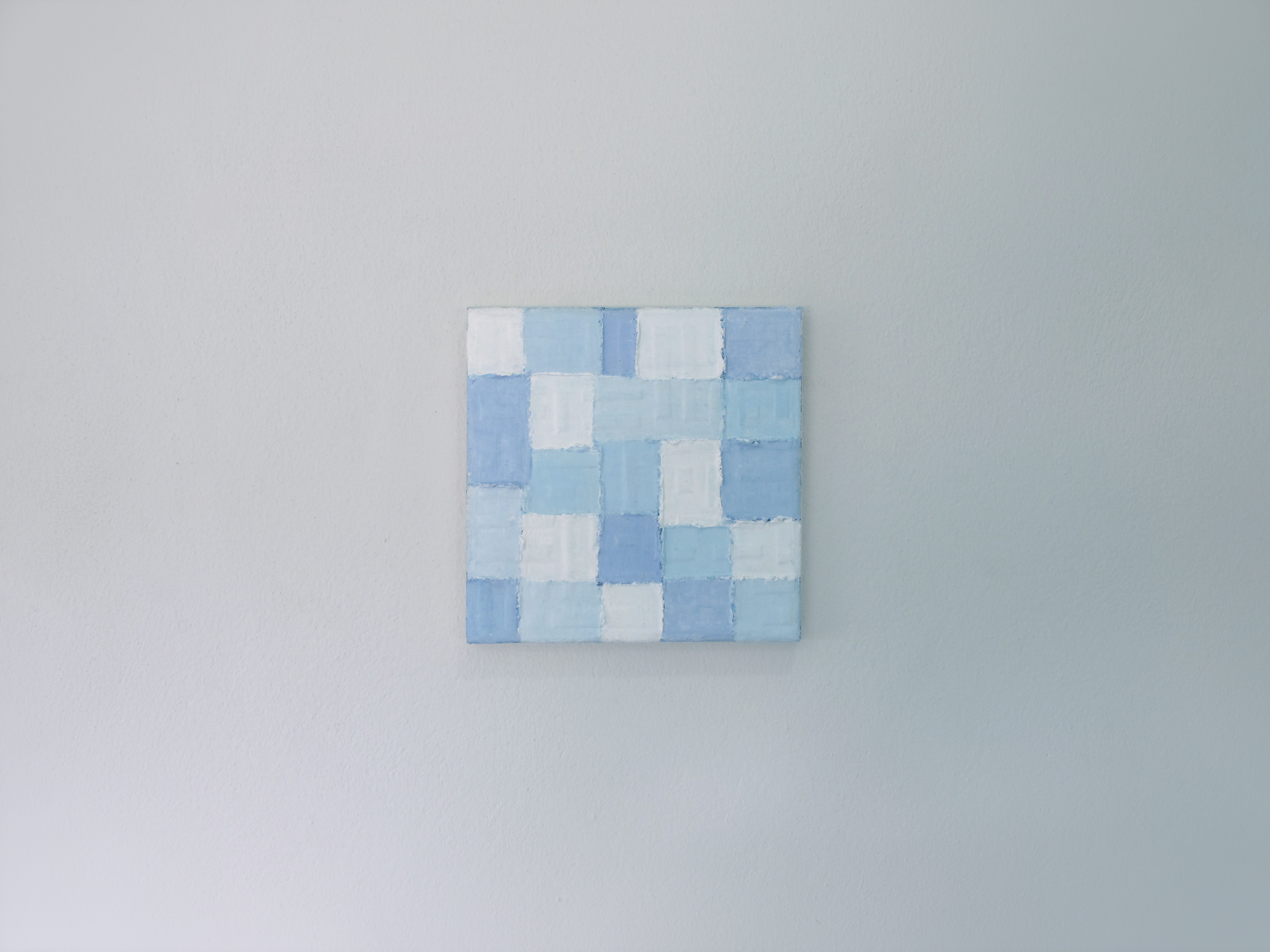
“Mini Flyweight Abstraction”
Since the March 2011 year ago, I was invited to donate works. To bid for money given to Japan. After the catastrophic events like earthquakes and tsunamis. It was a pleasure to work with them. I do not know if it’ll work with you to work through because it would not be much good. I have tried to create an abstract painting. This is a small contribution to the ease of delivery by mail. …And this is the beginning of the creation of abstract painting in this series was.
Once it starts to create an abstract painting to be donate. I also try and create an abstract painting on a continuous basis throughout the year. With the beginning of work is small. It reminds me of the “Mini” and I find relevant. I find the word “Mini Flyweight” which is the smallest weight in the boxing world. The terms of Institute of International Boxing Federation (IBF) are a boxer who can punch in the coordinates. The maximum weight of 105 pounds (45 kilograms), I feel like with this. It has taken a series of abstract painting.
Typically, the most recent of these is the concept art in the Conceptual Art, which is an art that focuses on the core concepts. Works in this series is quite different from the past. Concept of art in the Art-oriented and focused on the concept. The art is Abstract Art which is the subject of aesthetic value and visual Element, with no content or meaning of the picture. What I am interested in the creation of the painting in this series. The texture of a work of art with the coloring and the overlapping of several layers. The compositions are distributed throughout the image. Without point or points in the second. This makes the works of looking like a picture. Using a simple feature of the Monotone and well-balanced between the formal and the Informal by even using the simple form and structure have geometric features. How to pain, but did not use the gauge symmetry completely. The painting mode to improvise, without a draft. The organization did not plan in advance all. Often results when finished will look like from the start he was paint in the first period. Or as intended.
 click here
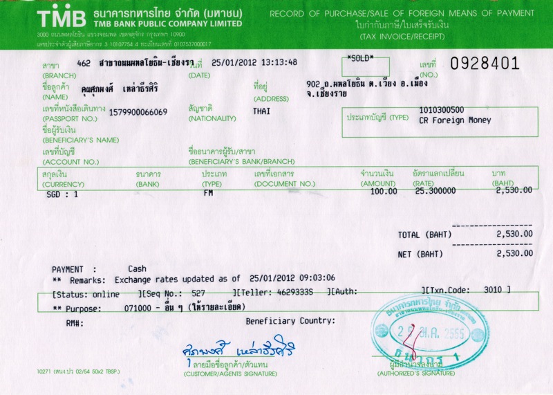
Title : 100 SGD, 100 NZD, 100 CNY and 100 MYR (Example of One Hundred project)
Material : Tax Invoice / Receipt
Size : 15 x 21 CM. Each
Year : 2012
 click here
Exhibition : The Same Rain, The Same Wind
(International workshop Seminar and Exhibition)
Period : 1 - 14 February 2012
Place : Chiang Mai University Art Center, Chiang Mai, Thailand.
Link : http://www.finearts.cmu.ac.th/âthe-same-rain-same-wind-2012â
 click here
A number of 100 will be used to present the differences of the meaning of a number 100. Normally a number of 100 indicates the amount or the quantity. However, if we consider the monetary or currency, not only the quantity but a number of 100 has become valuable. Moreover difference type of currencies have difference valuable depending on the currency exchange rates.
According to the above details, I pick up this topic to create the art project in order to set up the question and represent the understanding of the monetary, worth and valuable by using the money form many countries with the same amount of 100 monetary unit.
I will represent the art work of the project by the Process Art, using the money exchange documents.
......................................
Supapong Laodheerasiri in his work entitled “100 SGD, 100 NZD, 100 CNY and 100 MYR (Example of one hundred project)” shares with us the awareness of the value of things. In the past, the ringing of bells used to regulate the pace of life, now the Stock Exchange interferes in our lives. By using 100, Supapong shows us that if we consider the monetary or currency, not only the quantity, the number 100 has become valuable. Moreover different types of currencies have different values depending on currency exchange rates. By choosing the money from many countries‘ 100 monetary units, he wants us to think of problems that happen now with globalization. It is not a coincidence that groups of people now want to backtrack and try to show (as per the famous French economist Jacques Sapir) that other options are feasible. As he links to say “everything that has been built by mankind can be undone and rebuilt differently”.
Written by Sebastien Tayac
 click here
 click here
 click here
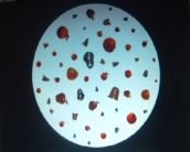
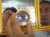
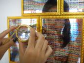
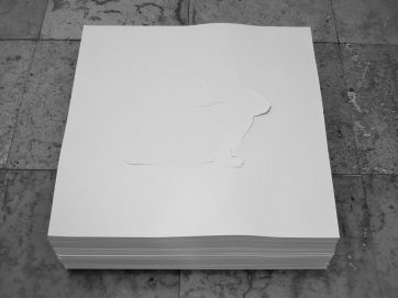
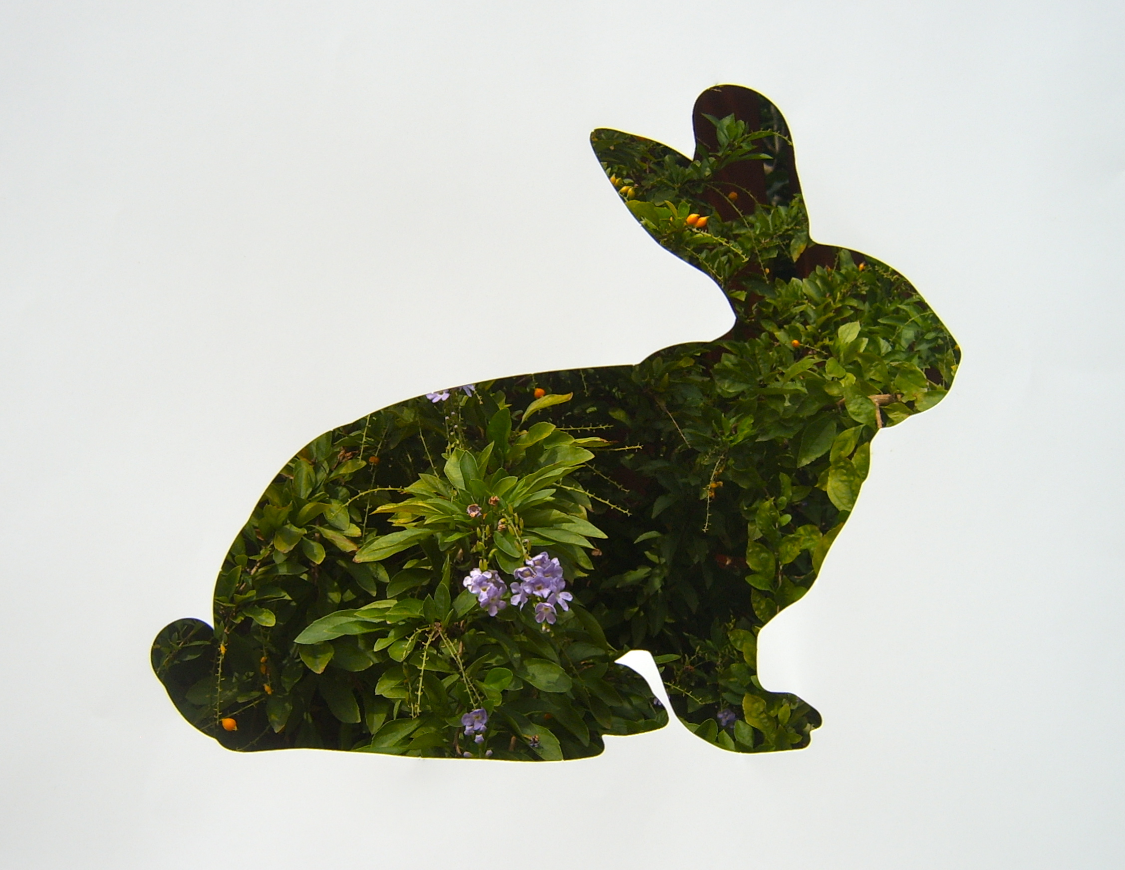
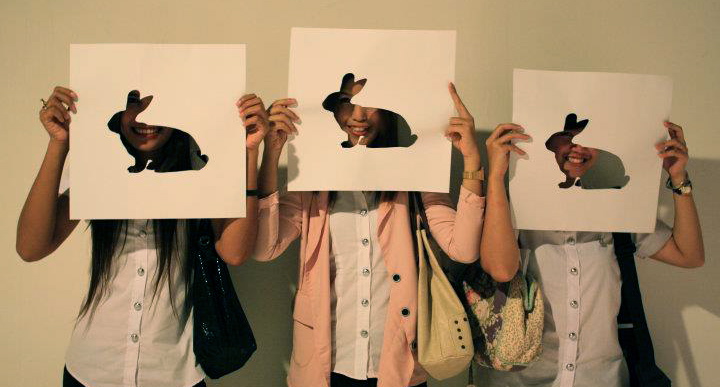
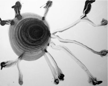
"THE LAST NIGHT I SAW A RABBIT ON THE MOON"
The weight of objects on earth, if the same thing move into the moon would be left with a weight of only 1 in 6. To metaphor, I take this issue with the perception of the same thing, but when changing the space or context may be perceived to differently thing. Then I’ve proposed through the rabbit symbol which came from the nature of the surface and the shadow on the moon that resembles the shape of a rabbit. This concept is presented by perforating rabbit image on papers. The audience can participate the artwork by moving the papers to other places.
 click here
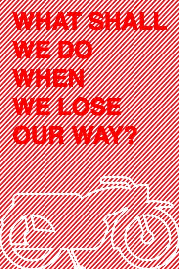
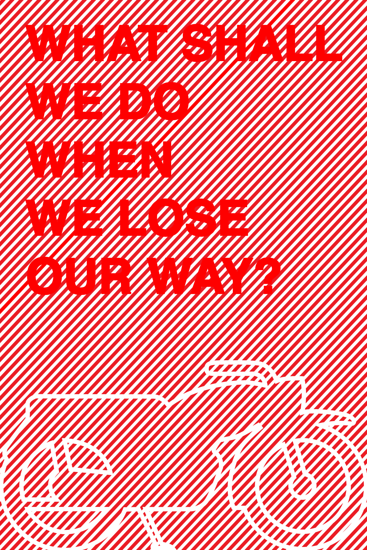
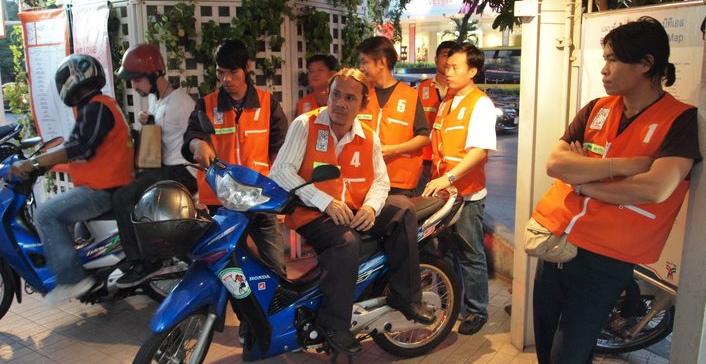
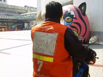
"WHAT SHALL WE DO WHEN WE LOSE OUR WAY?"
SOLO EXHIBITION BY SUPAPONG LAODHEERASIRI
6 FEB - 6 APR 2011 AT MUSEUM SERVE, BKK
(MOTORCYCLE TAXI STATION NEXT TO BACC)
 click here
 click here
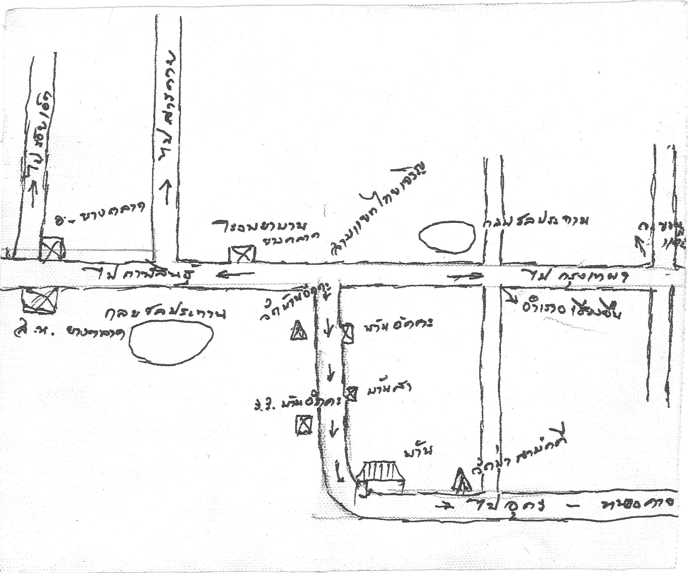
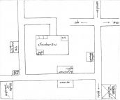
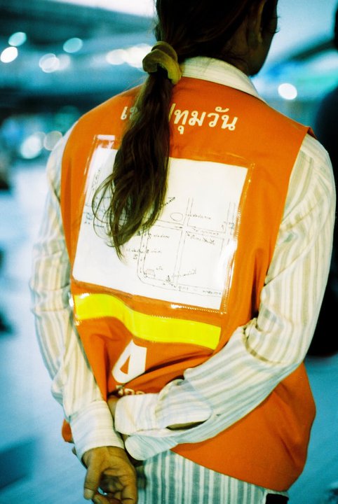
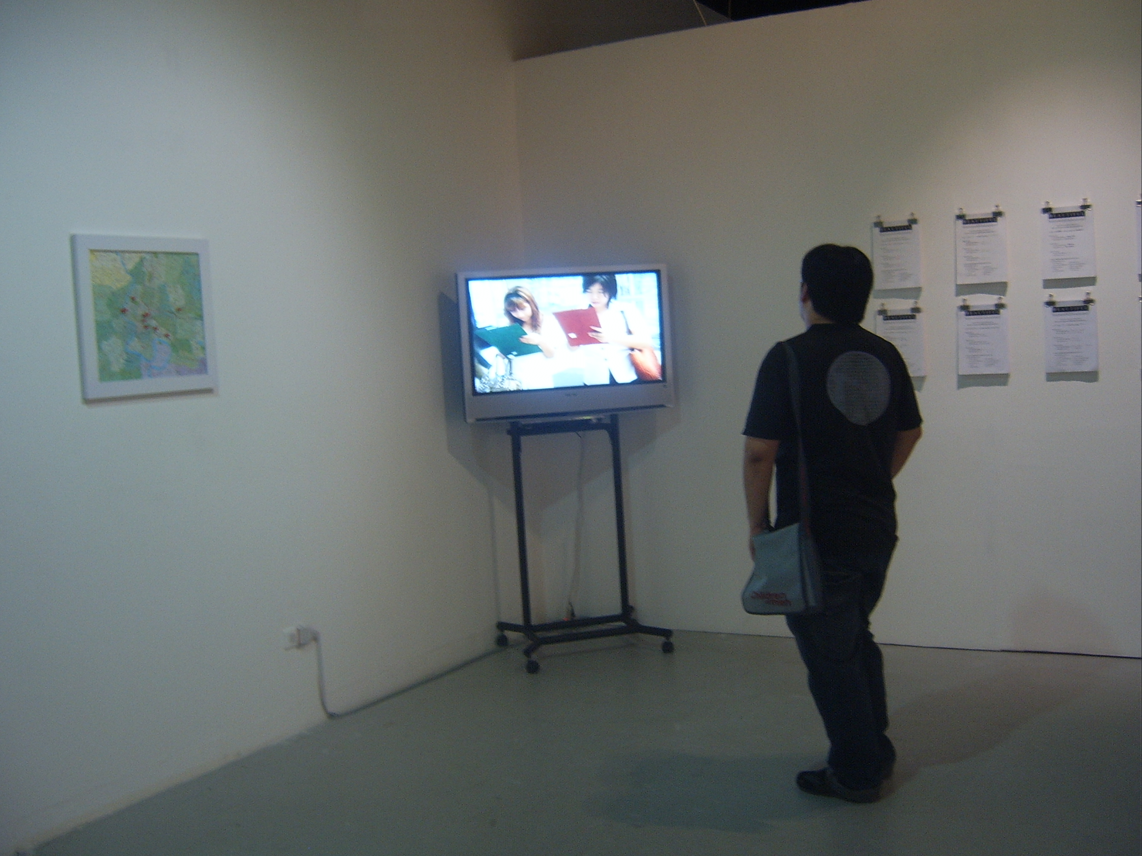
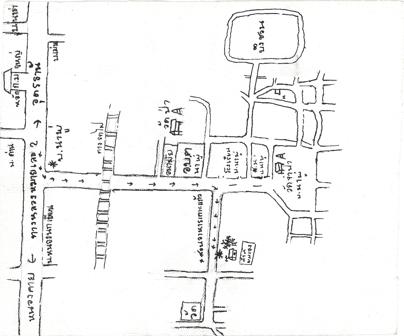
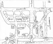
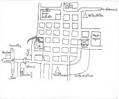
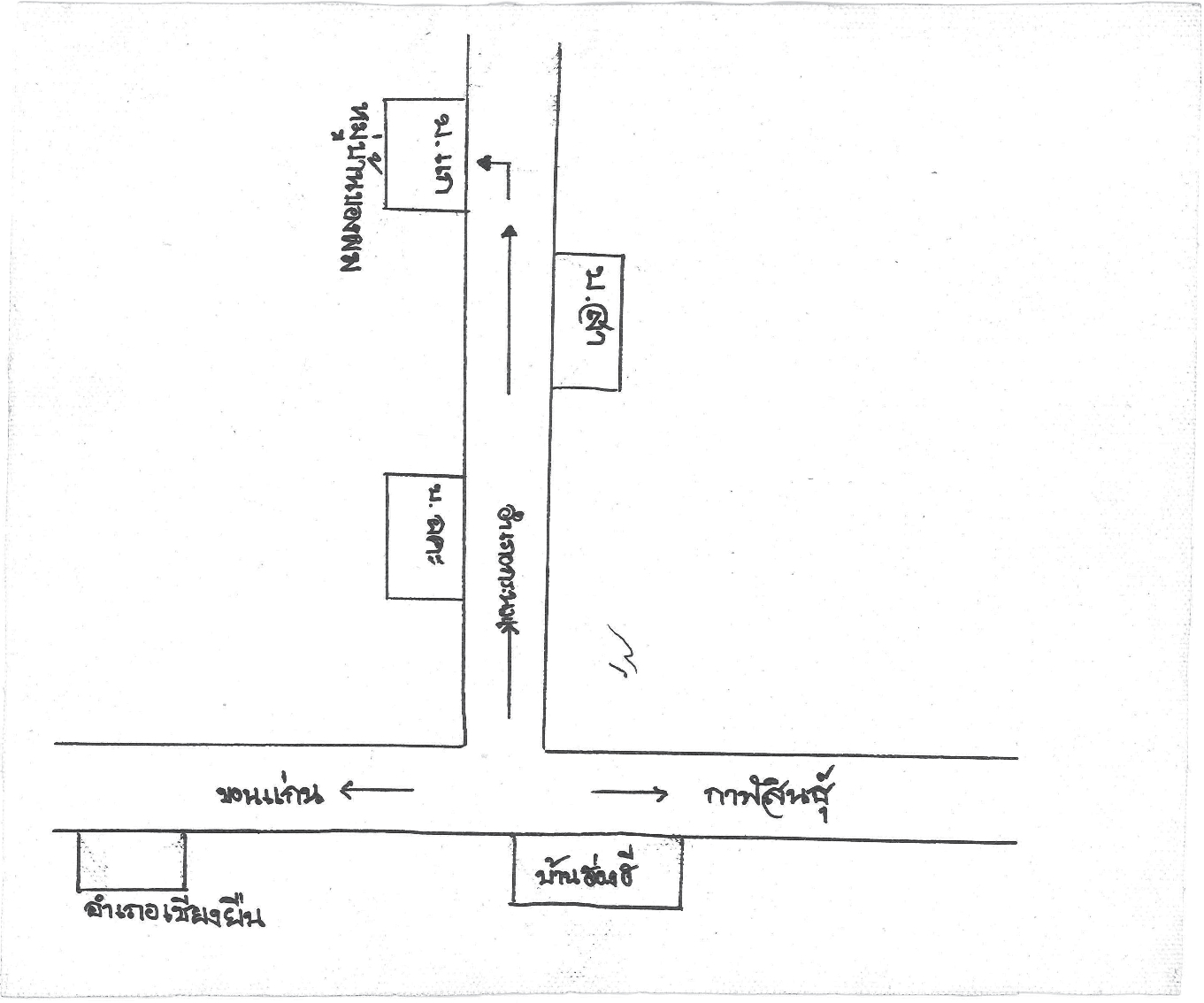
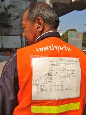
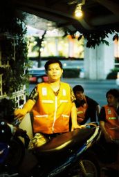
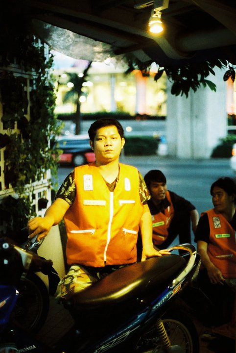
9 Motorcyclists at motorcycle taxi station were asked to draw up a hometown map where they were from presenting as artworks conceptualized by the artist, Supapong Laodheerasiri. Each map drawing then was inserted into a sleeve of their motorcycle jackets en route to be seen by passengers as riding around Bangkok. At a first glance the map seems to indicate areas of the city, though looking closely it represents entirely different landscapes layered on top of street views in Bangkok.
“What shall we do when we lose our way?” delivers a concept of public art through multi-layered relationships of artist and motorcyclists in a subject of travelling simultaneously in mentality and in the actual space. As map represents elements of a place, our ability to draw up a map then means a clear understanding of a particular area. When we get lost, the first that comes to mind is to find a map, in turns that is signifying as a need to put in place a space, and to be relieved from foreignness in the area.
On daily commuting, our starting point is from home and the destination also is back to home. “What shall we do when we lose our way?” is a public art project posing questions, exploring multiple stories of space and travelling. The exhibition suggests an idea that opens up for free dialogues and interpretations from all viewers.
 click here
 click here
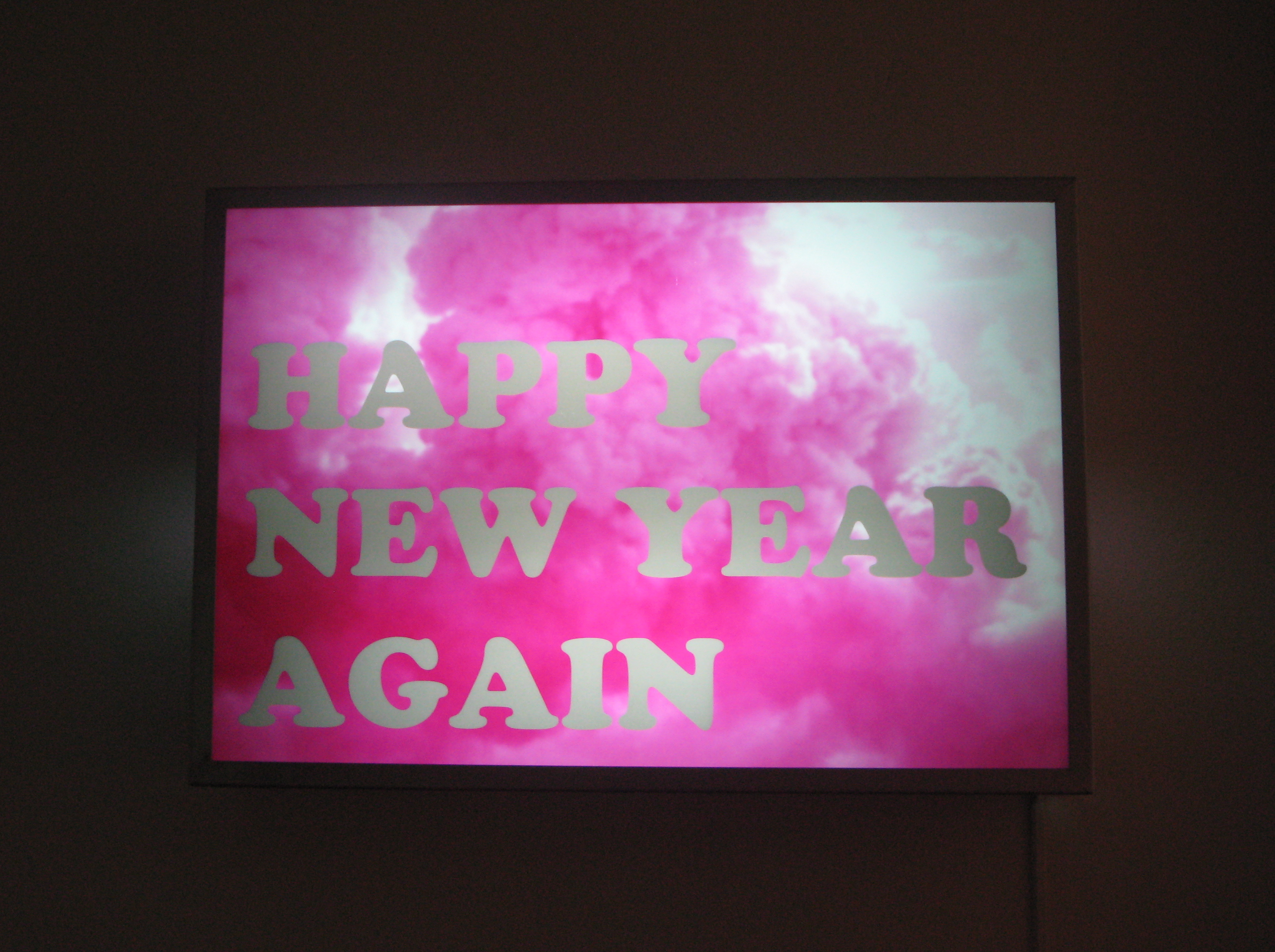
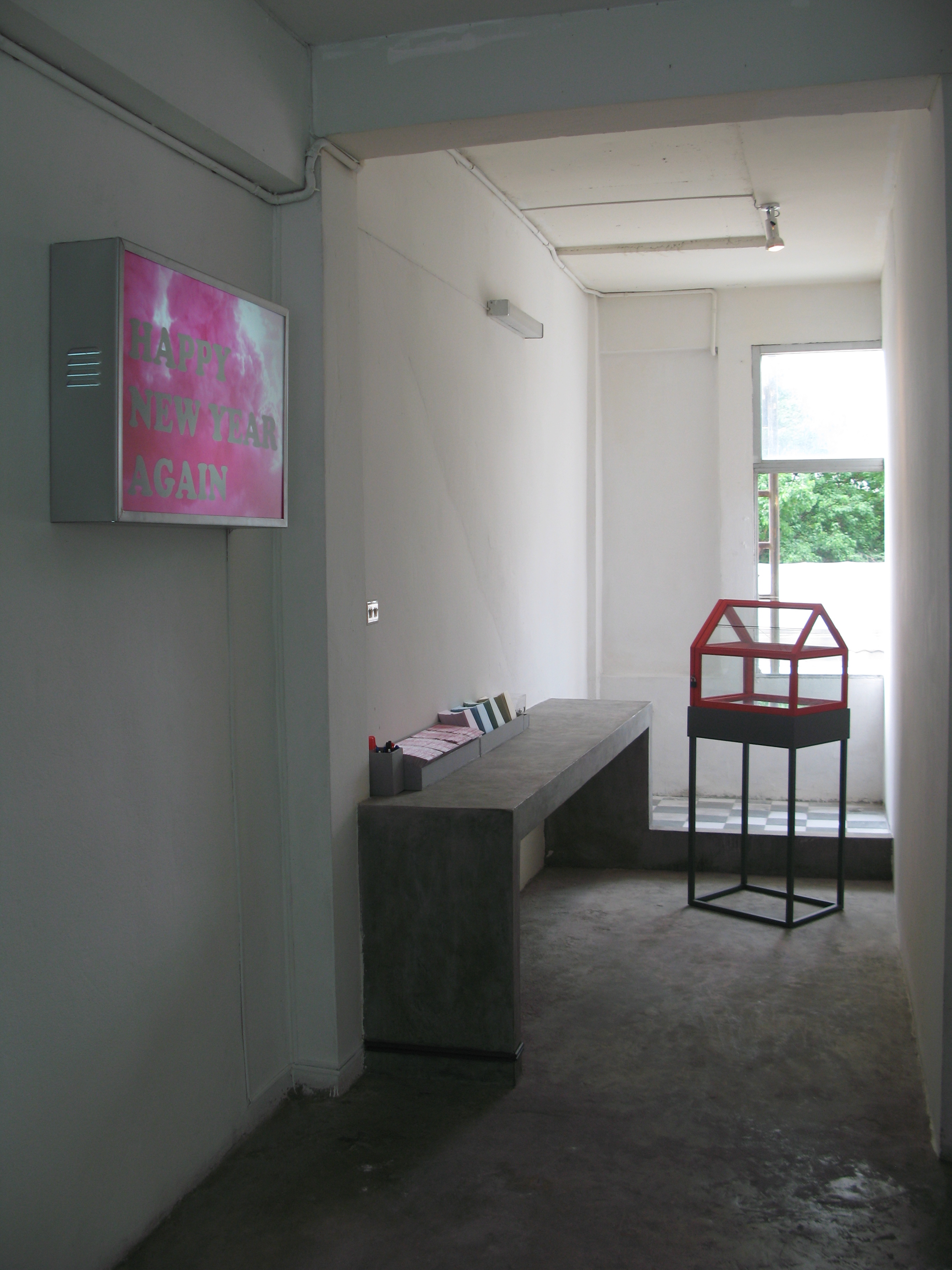
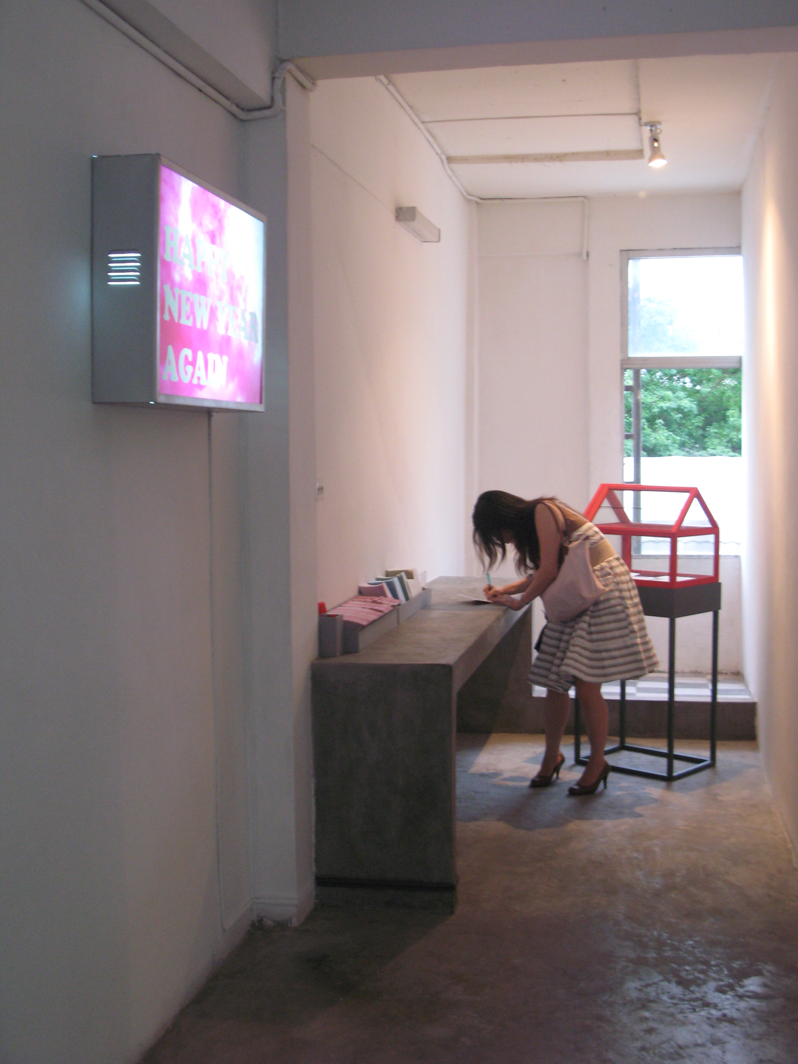
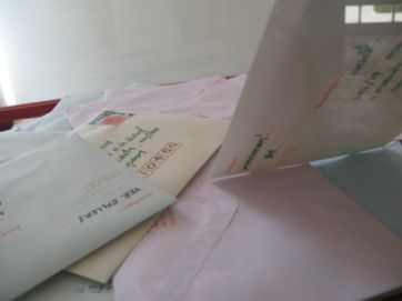
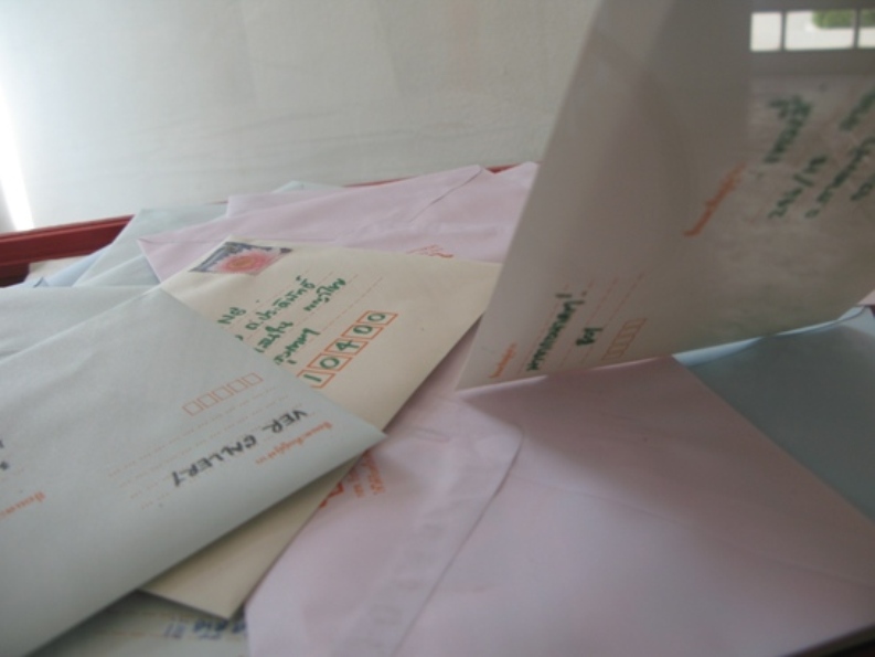
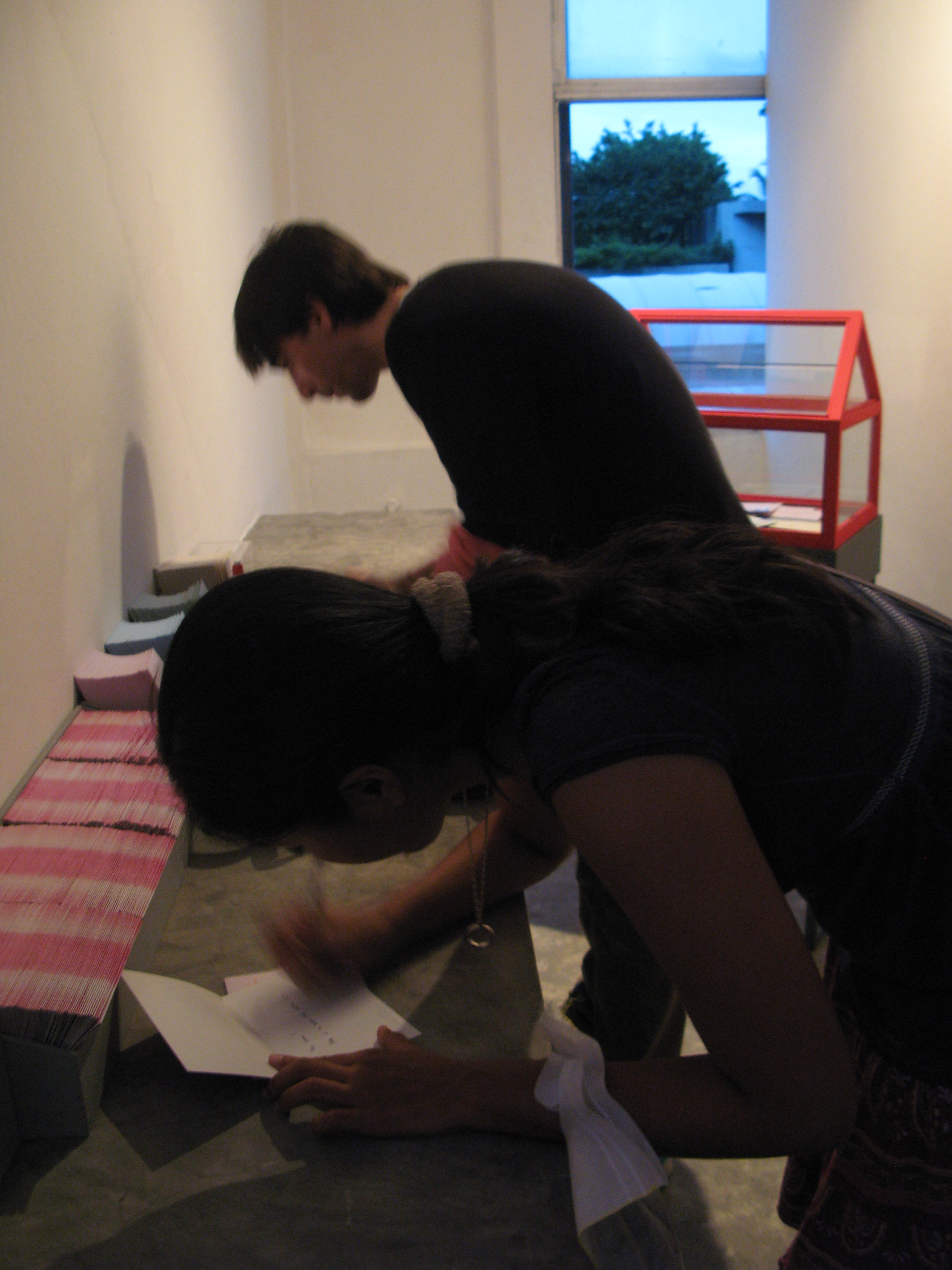
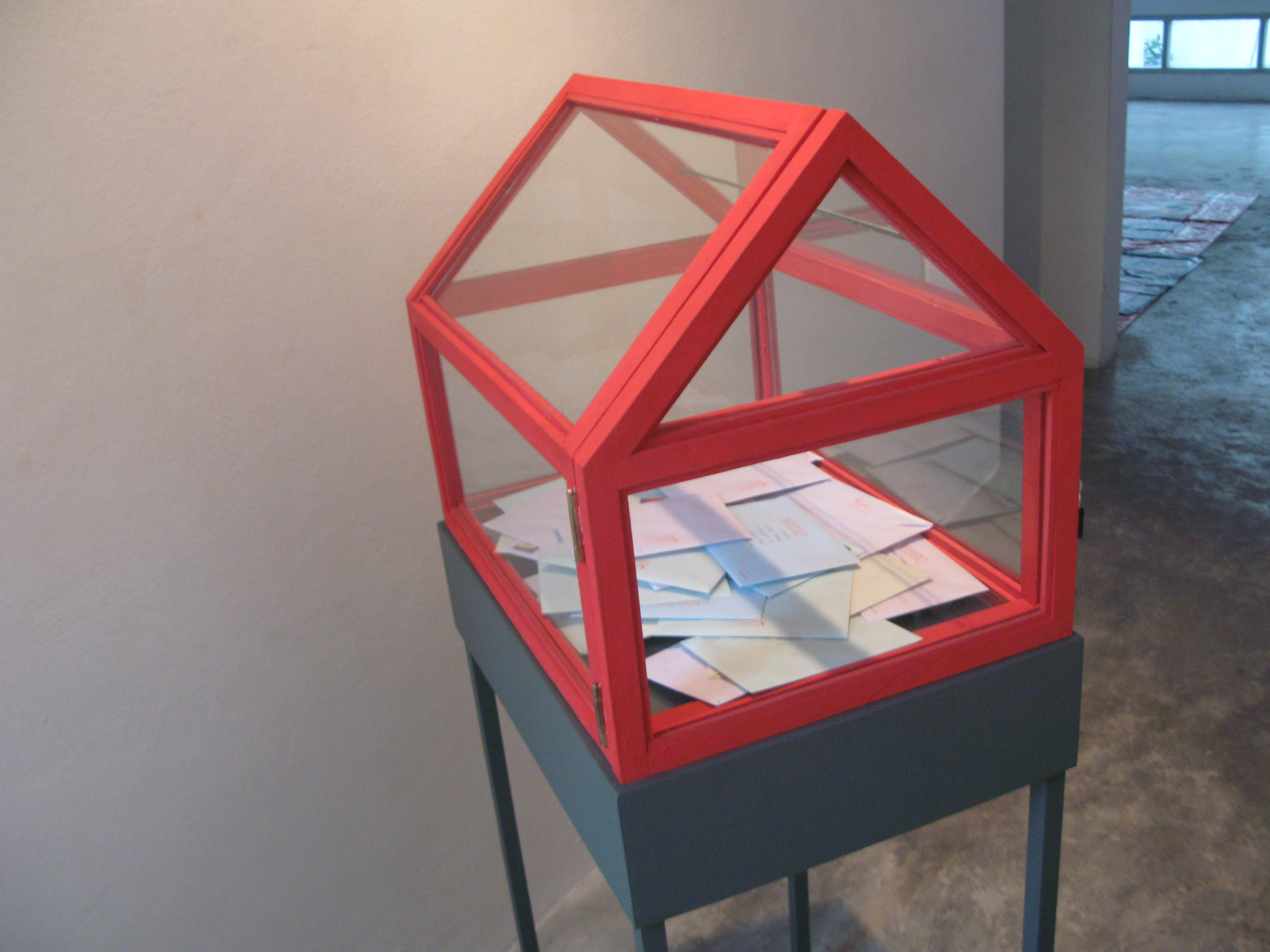
a conceptual art by Supapong Laodheerasiri, invited viewers to write new year cards for their love ones and drop the cards in a box. The cards will later be sent by post to addressees. “BKK 31 Dec 06 / 1 Jan 09” in the cards intended to take viewers back to name of place and that what happened during that specific period of time. During the time people were enjoying the celebration, unaware and unprepared for imperceptible calamities, that rapidly swept the city. Those catastrophes were momentarily remembered in a community with rapid daily flood of news and information, sometimes, people forget that catastrophes once happened can recurred in a specific condition, place and time.
 click here
Technique: photograph
Size: 60.5 X 70.5 cm (2 pieces)
Year: 2009
 click here
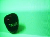
When Looking At Art ?
Technique: Mixed Media
Size : 50 x 50 x 116 cm (2 piece)
Year: 2008
 click here
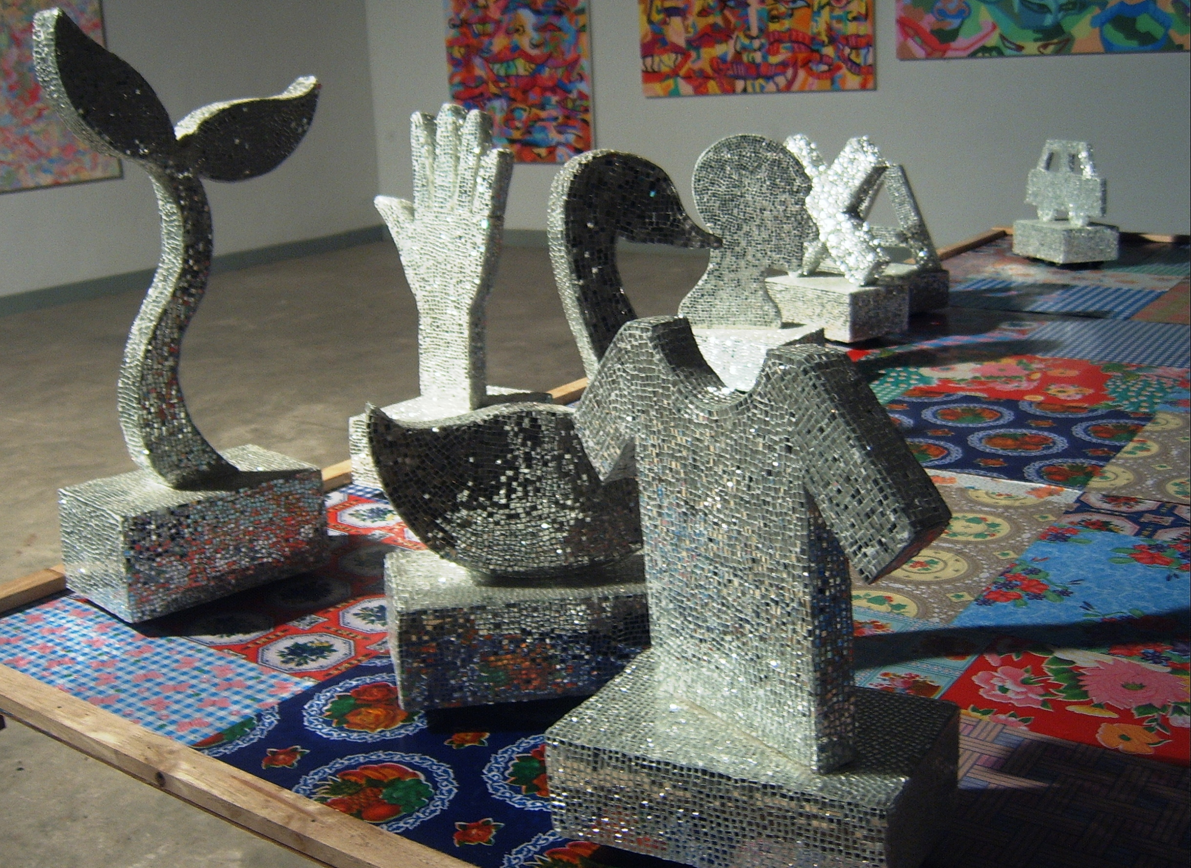
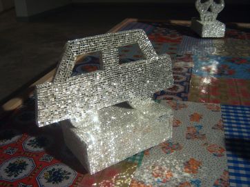
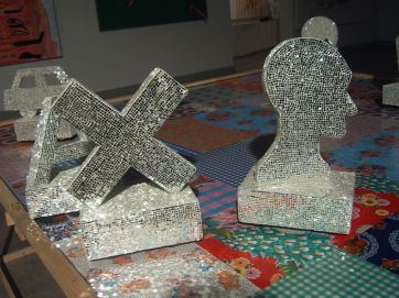
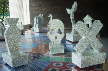
In this art thesis titled
“Acknowledgment and Meaning”, I want to question socially acceptable traditions, belief and symbols used in communication. I take things that are familiar to us a means to raise issues on acknowledgment and understanding of meaning. This is important in our daily lives. We should increasingly consider the extent of our ability to acknowledge, to understand and to communicate in our daily live as well as its value and true meaning, in order to lead a more meticulous, cautious, thoughtful and broad-minded life. I apply images in a conceptual manner, using a variety of styles and techniques, emphasizing the presentation and expression of my concept.
 click here
 click here
 click here
 click here
 click here
 click here
"Blah Blah Blah... Project"
I would like to question about acknowledgement and understanding in the meaning of chaotic. The chaotic will lead to the acknowledgement and understanding in the meaning of flux that creates the different meaning in a certain time. Therefore, mentioning about an authentic truth that extremely accurate could not be found in reality.
 click here
 click here
 click here
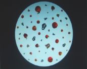
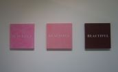
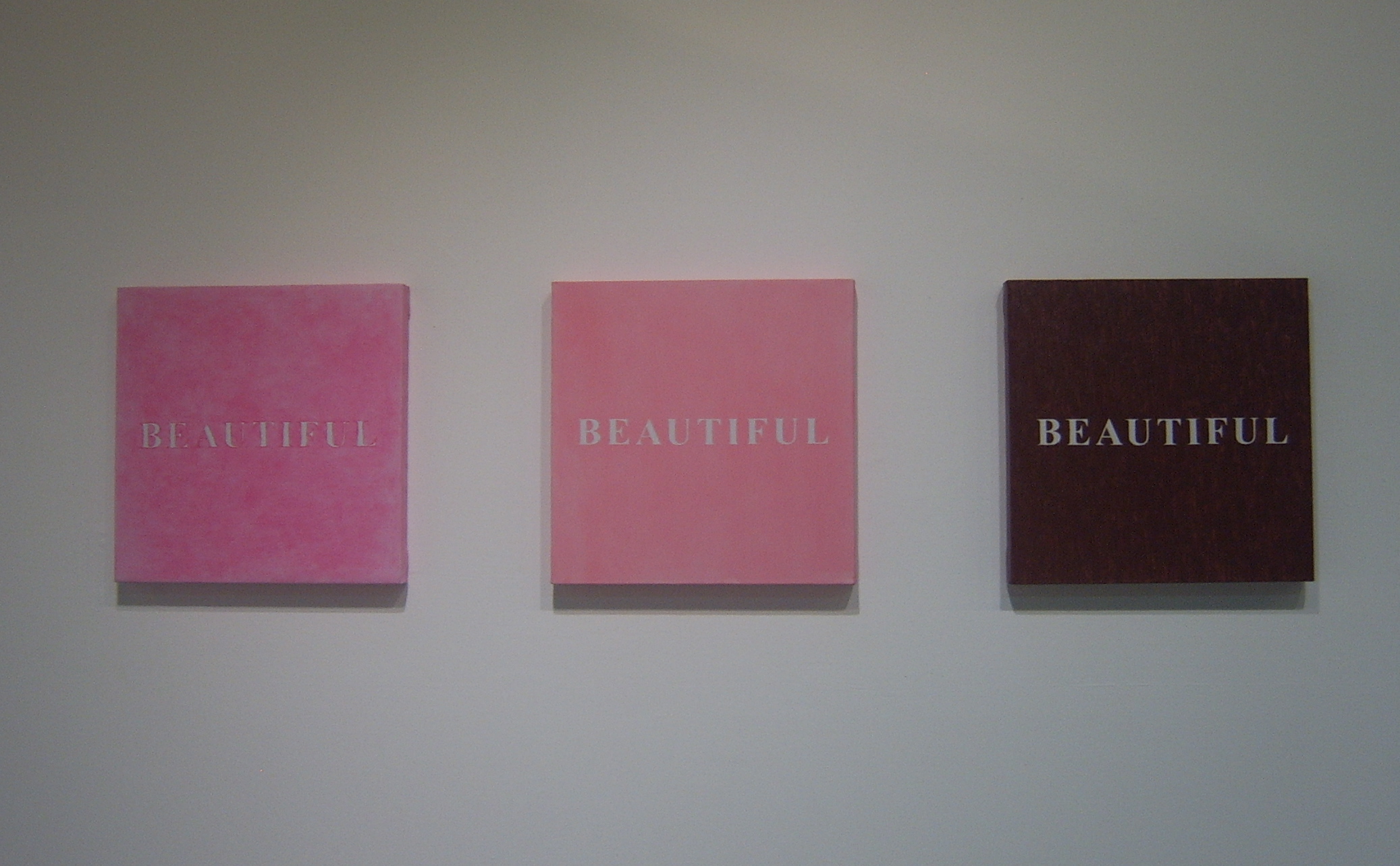
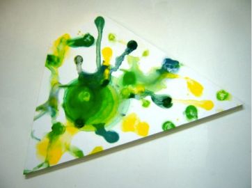
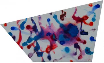
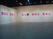
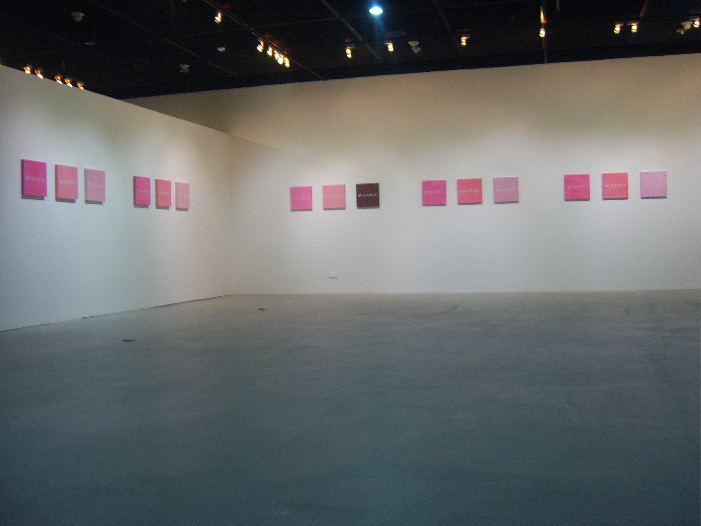
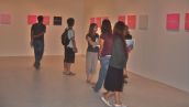
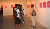
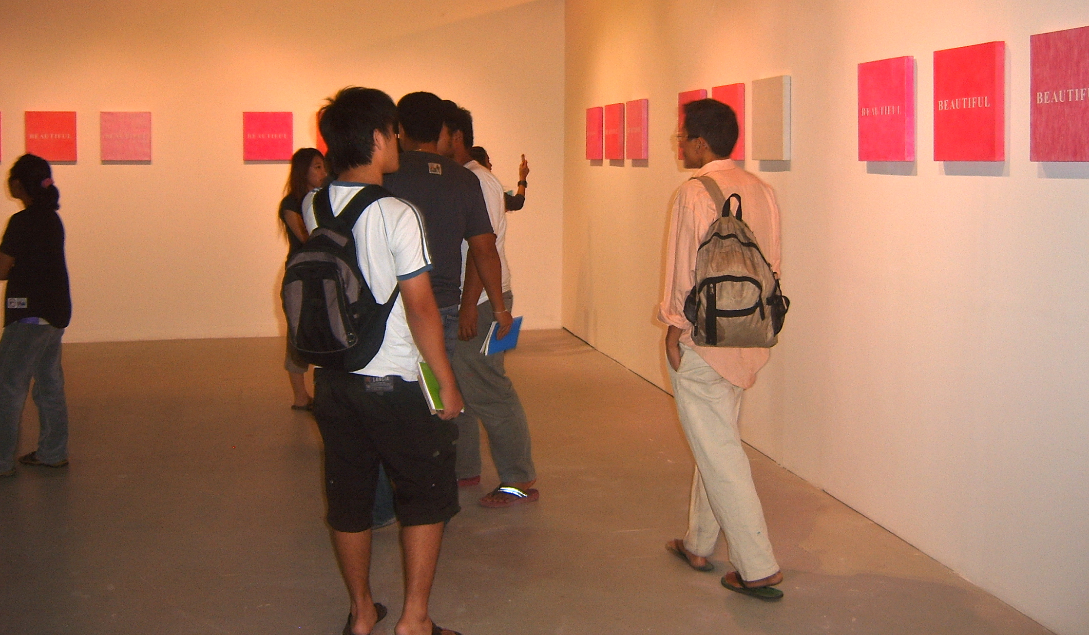
"Beautiful (Bangkok)"
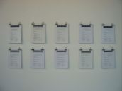
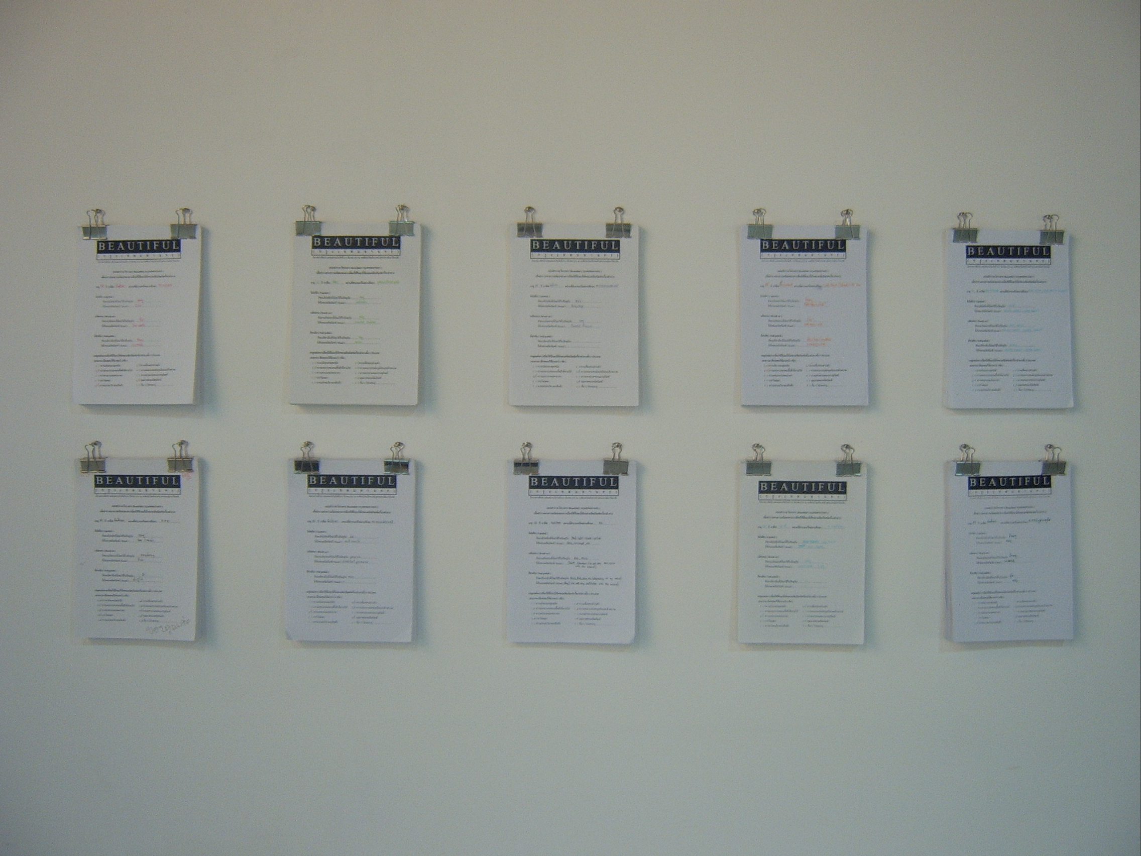
Beauty and art seem like a pair and so do beauty and woman. Supapong is interested in beauty, especially about how women use cosmetics, which he sees as similar to the creation of paintings. If we compare with a stretched canvas for painting, cosmetics are similar to "color" painted on the canvas. the beauty created by the "color" of cosmetics has inspired him to create paintings of "beauty" by conducting a survey on the favorite cosmetics of women in different areas. then, he collected the information of the most favorite color of cosmetics in each area and brought those ideas to paint. As a result, his paintings are not only created by an artist's desire or designation, but also by the quantitative influences of other people under the artist's frame-work. His paintings differ to some extent from the women use of cosmetics because cosmetics are now used in another context by a male artist. The Beautiful (Bangkok) exhibition seems like a visual research report by Supapong who had been surveying for one month on the favorite cosmetics of women in ten different areas of Bangkok, including such educational areas as Bangkok University and Thammasat University, and such a business area as Silom Road. The artist sampled 100 people in each area. Then, upon concluding his survey results he turned them into his paintings.
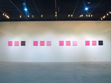
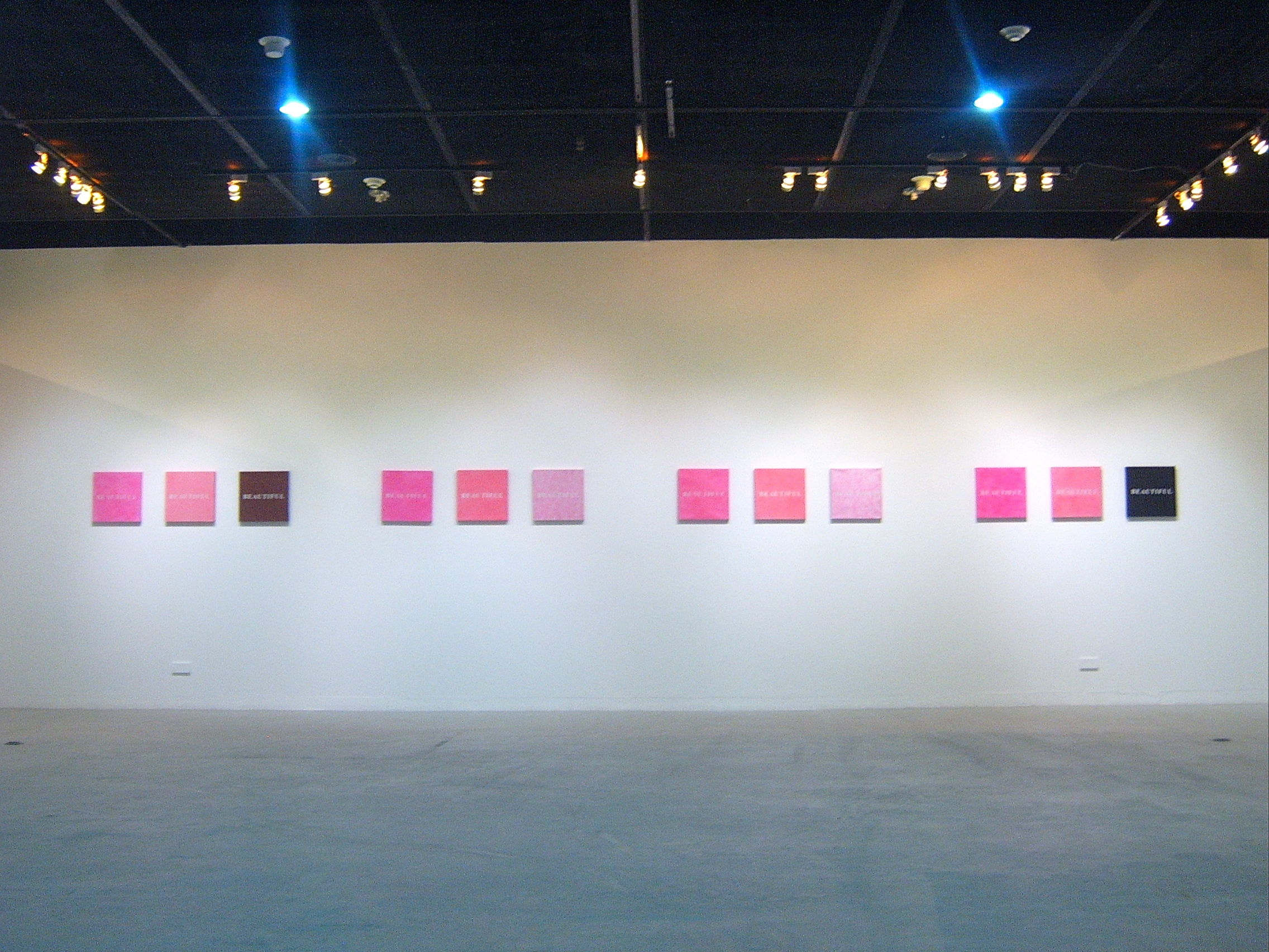
"Study And Experiment Works"
 click here
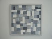
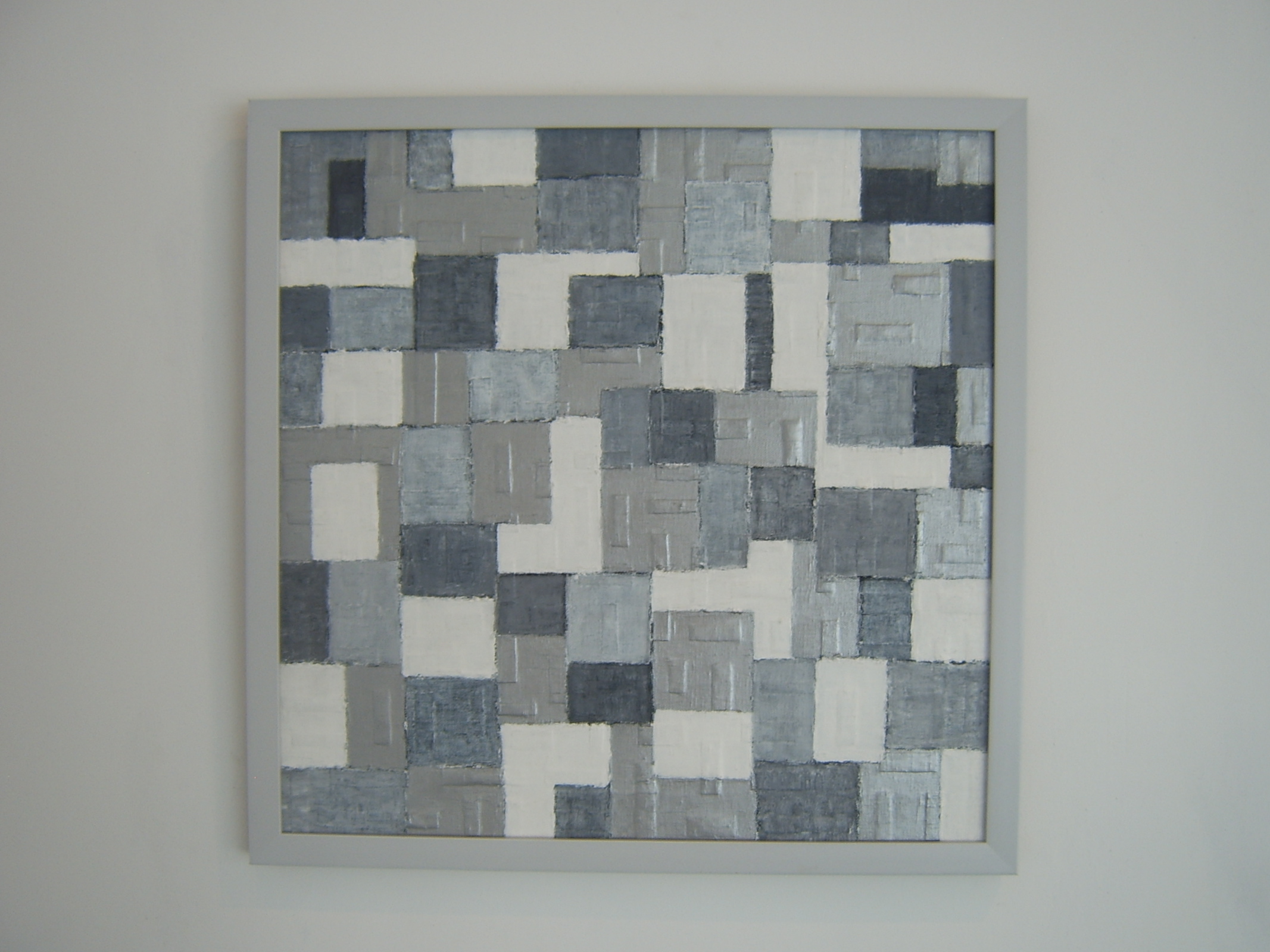
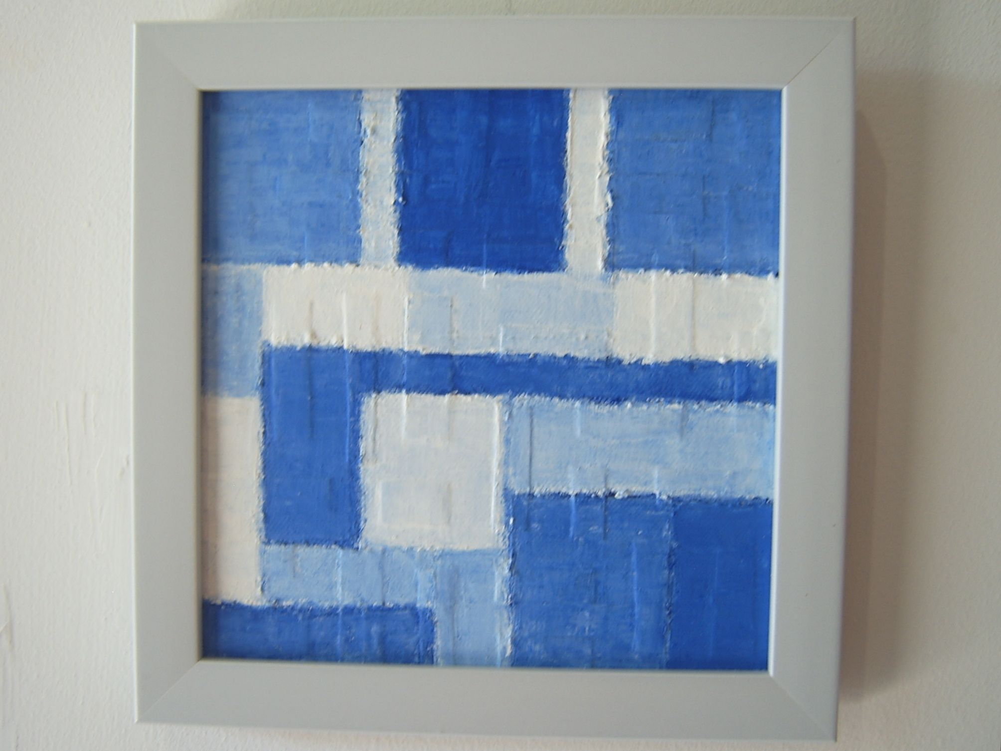
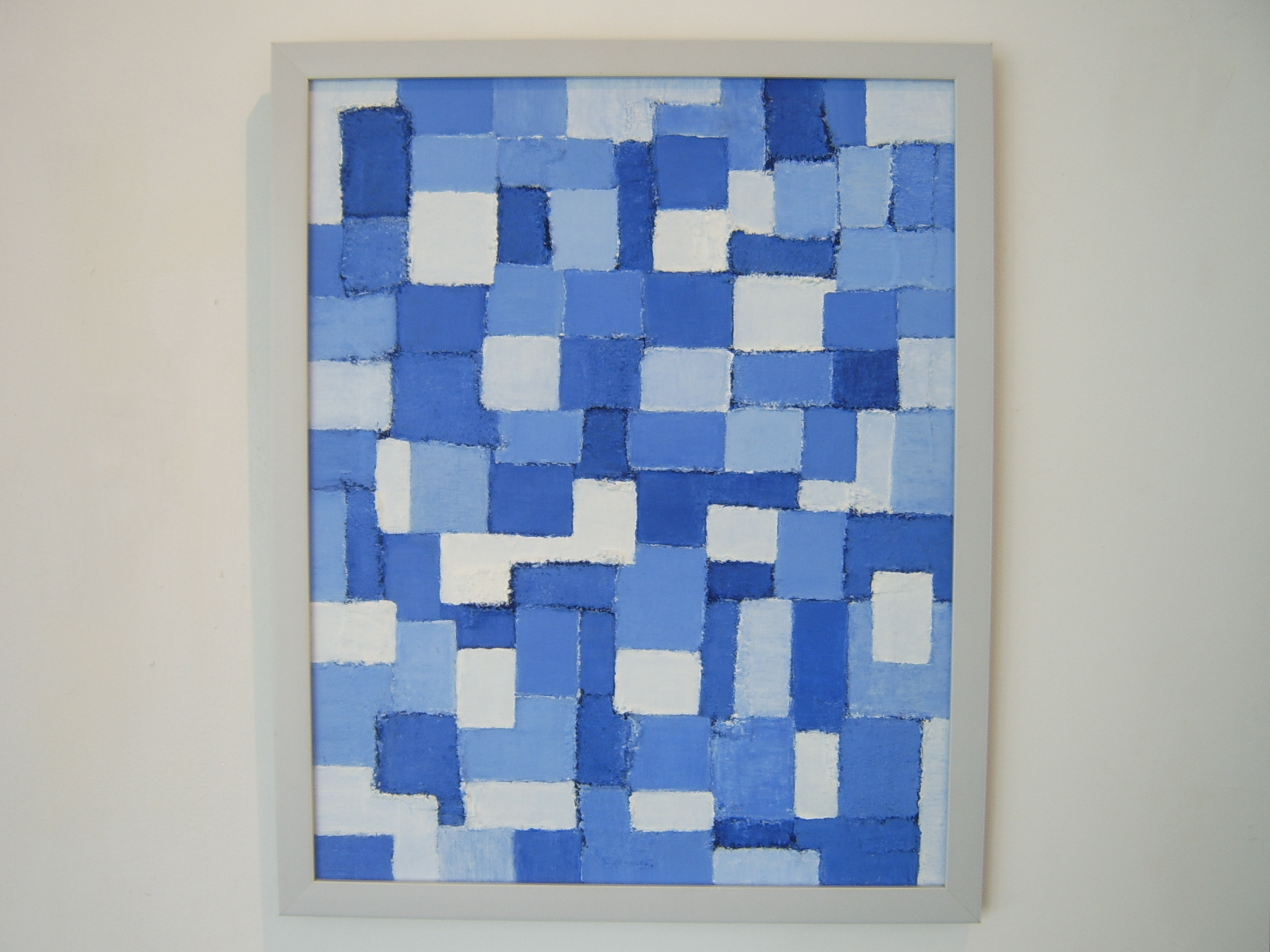
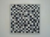
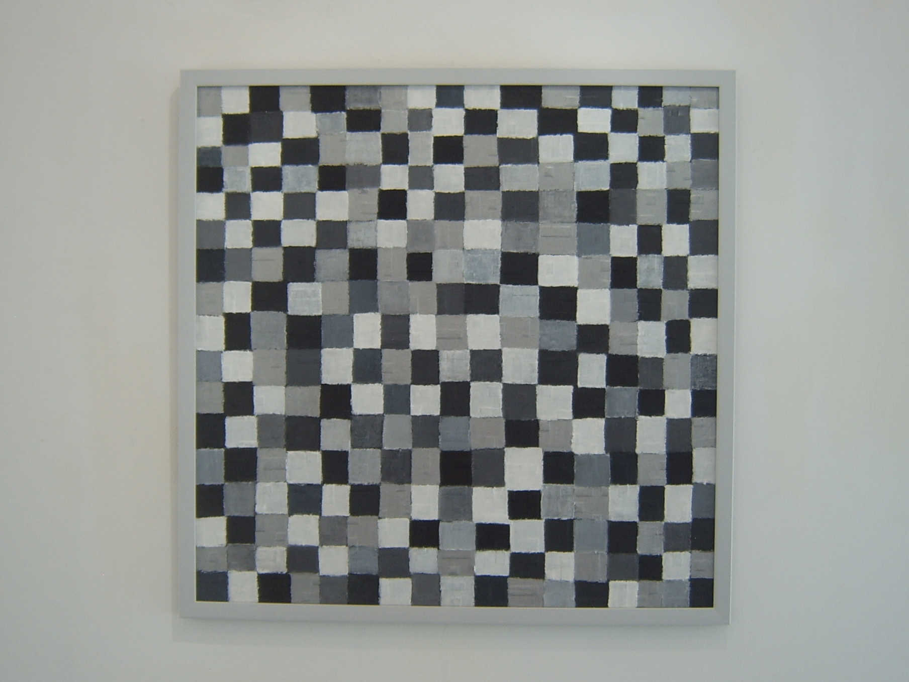
"The Five-coloured Flag"
The Five-coloured flag was used as a national flag from the inception of the Republic in 1912 until the demise of the warlord government in 1928.
This principle emphasized the harmony of the five major ethnic groups in China as represented by the colored stripes of the Five-Colored Flag of the Republic: the Han (red); the Manchus (yellow); the Mongols (blue); the "Hui" (Muslim Chinese) (white); and the Tibetans (black).
 click here
Date : 2014
Medium : Acrylic on Wood
Dimensions : 164 x 80 cm. and 164 x 60 cm.
 click here
Title : I am Happy / I am Happy Too (Made in Thailand, 2014)
Date : 2014
Medium : Acrylic on Wood
Dimensions : 60 X 164 cm. Each
 click here
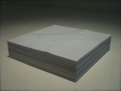
Date : 2010
Medium : Acrylic on Paper
Dimensions : 63.1 X 48 cm.
 click here
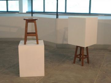
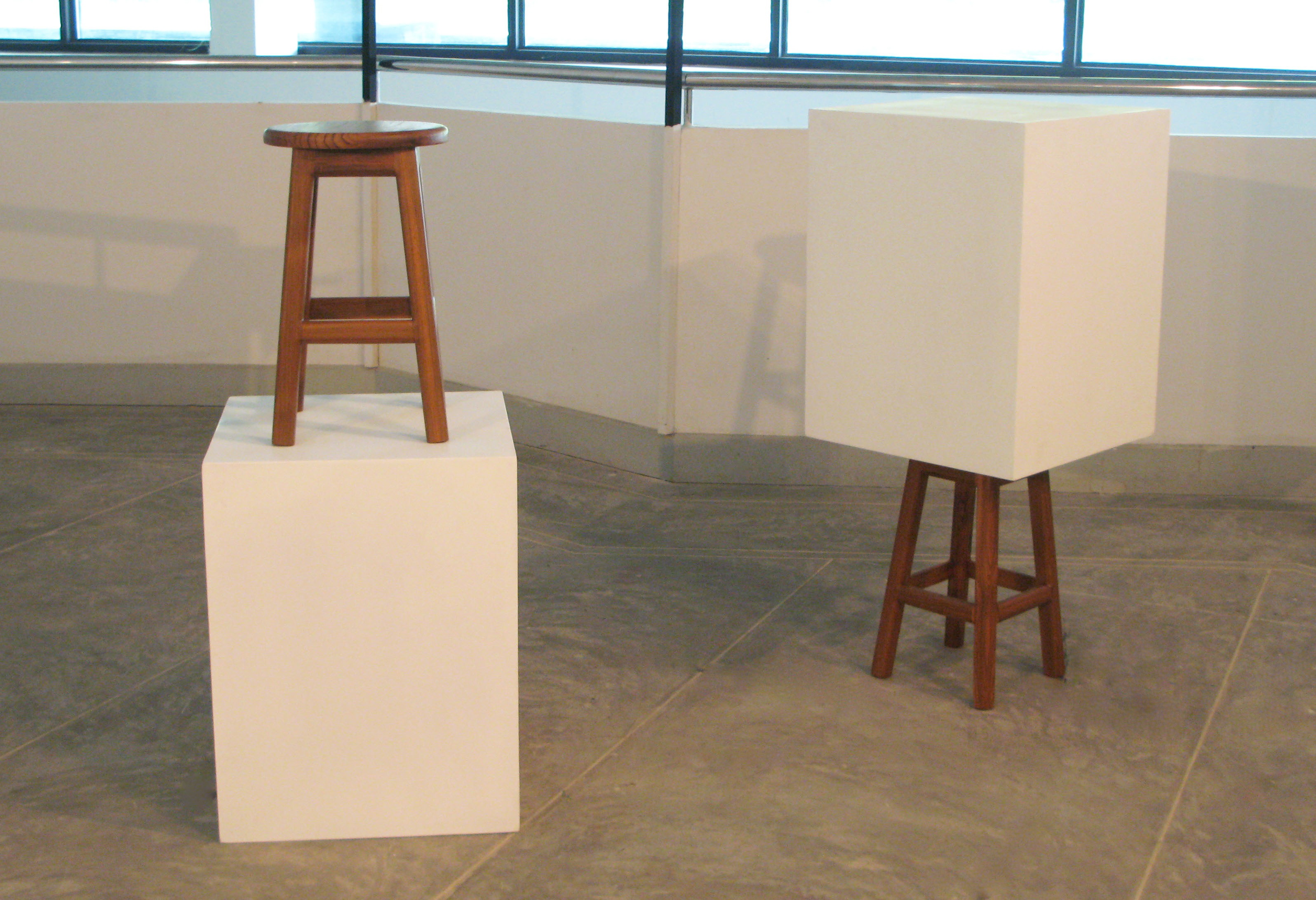
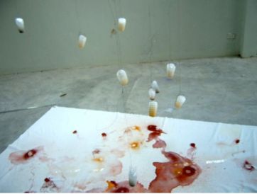
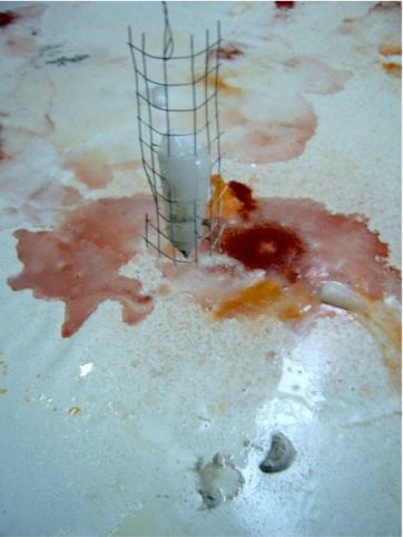
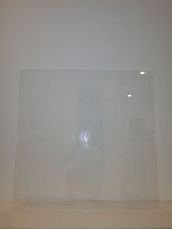
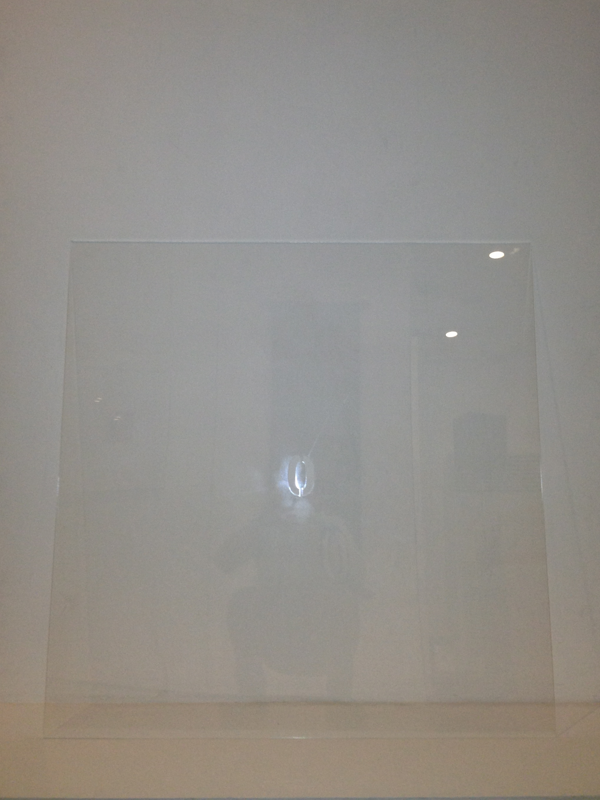
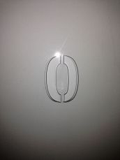
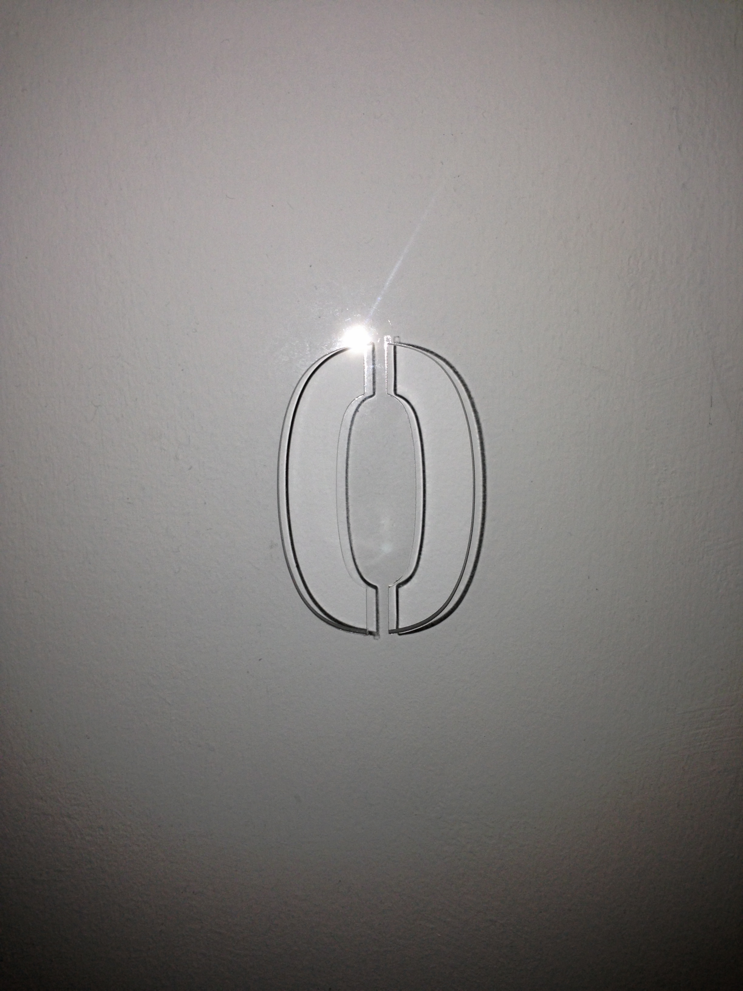
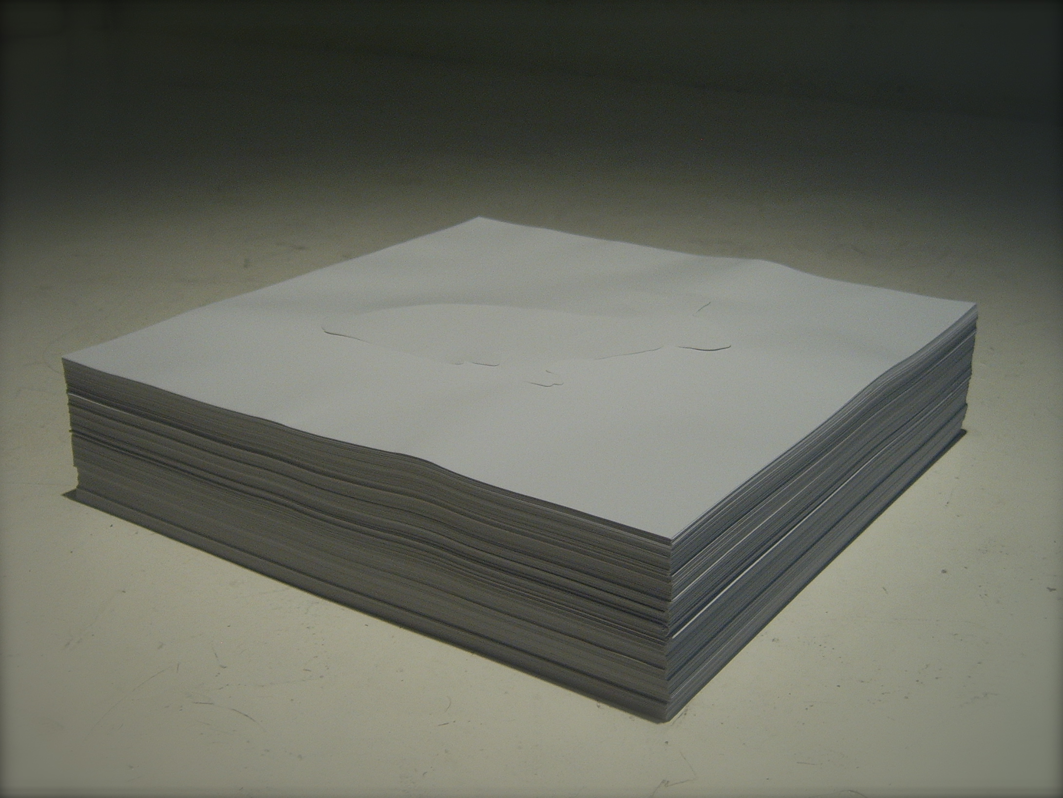
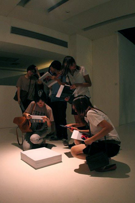
Date : 2013
Medium : Perforated on Clear Acrylic Sheet
Dimensions : 90 X 90 cm.
Period : 16 August - 5 September 2013
Place : Thailand Cultural Centre, Bangkok, Thailand.
 click here
Date : 2013
Medium : Perforated on Clear Acrylic Sheet
Dimensions : 90 X 90 cm.
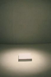
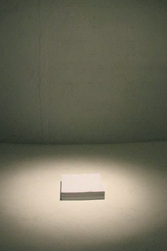
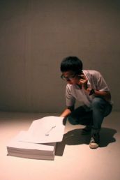
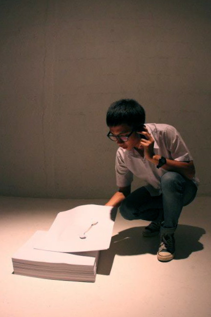
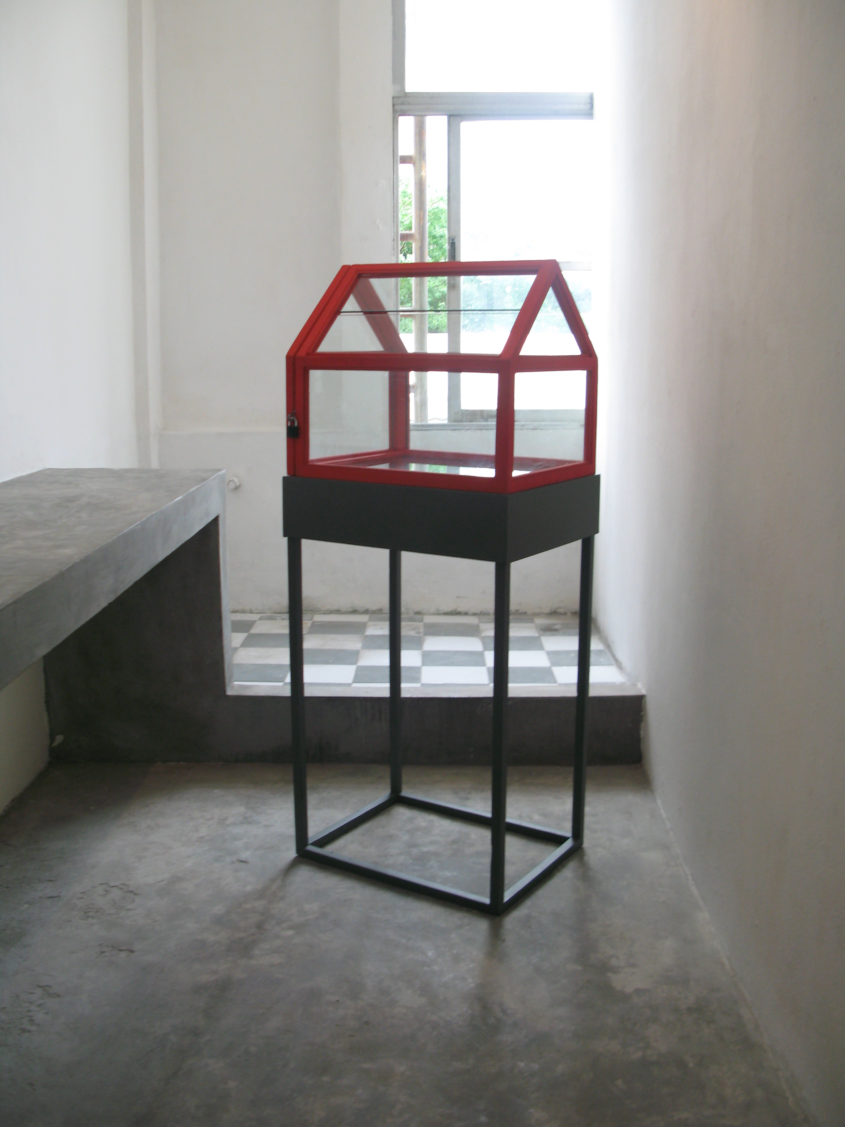
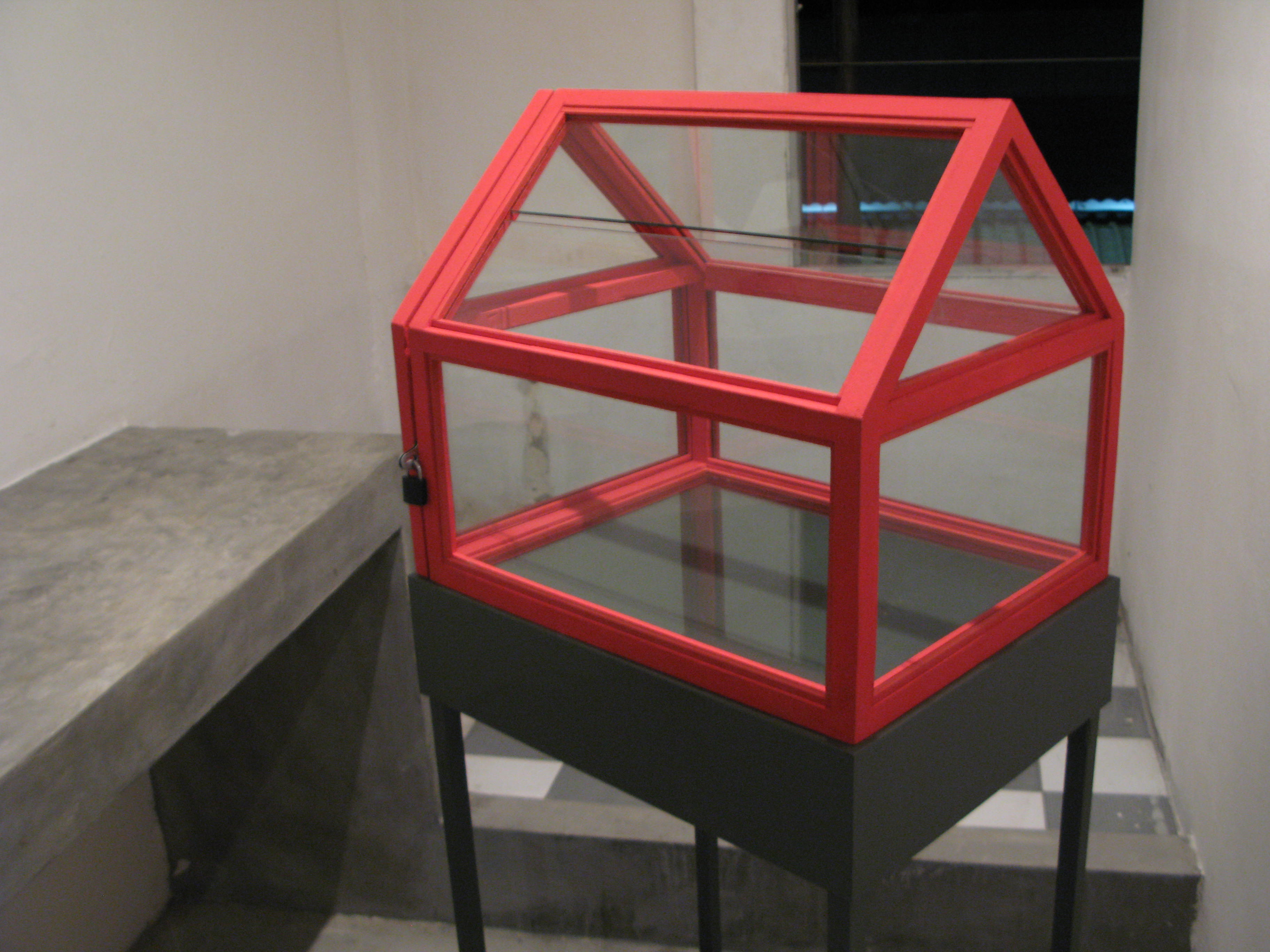
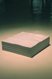
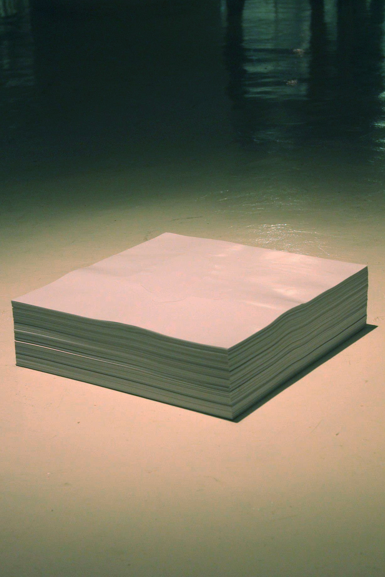
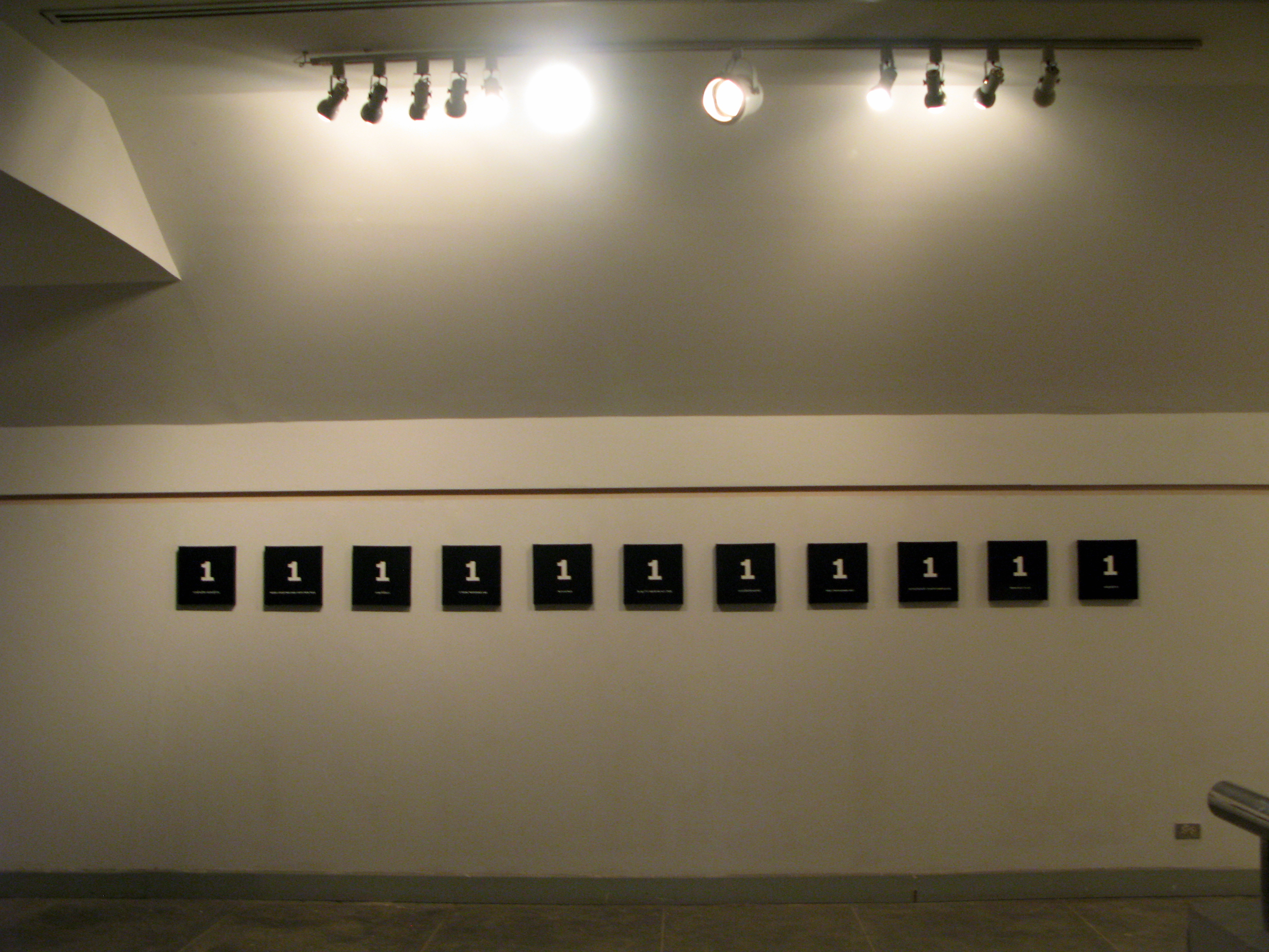
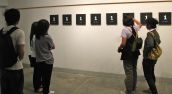
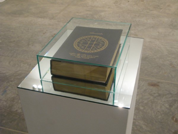
".....(0)"
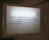
I would like to present and question about the vacancy (void) and object of art work beings by using clear acrylic sheet perforates symbol of zero “0”. The transparency of clear acrylic sheet itself make art work become vacancy and we can see through area of exhibition room. Symbol of zero “0” which perforated on clear acrylic sheet is real blank space on art work as this hole is a part of transparent acrylic sheet. It also implies void.
 click here
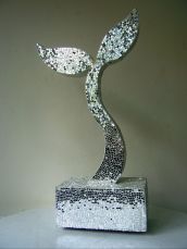
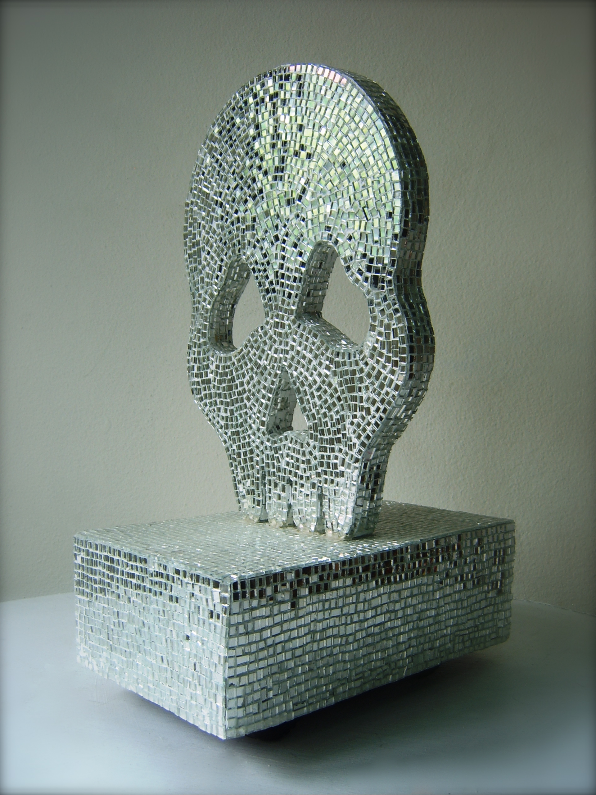
DIMENSION : 70 X 180 X 53 CM
TECHNIQUE : MIXED MEDIA
YEAR : 2013
 click here
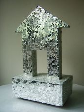
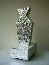
DIMENSION : 70 X 180 X 53 CM
TECHNIQUE : MIXED MEDIA
YEAR : 2013
 click here
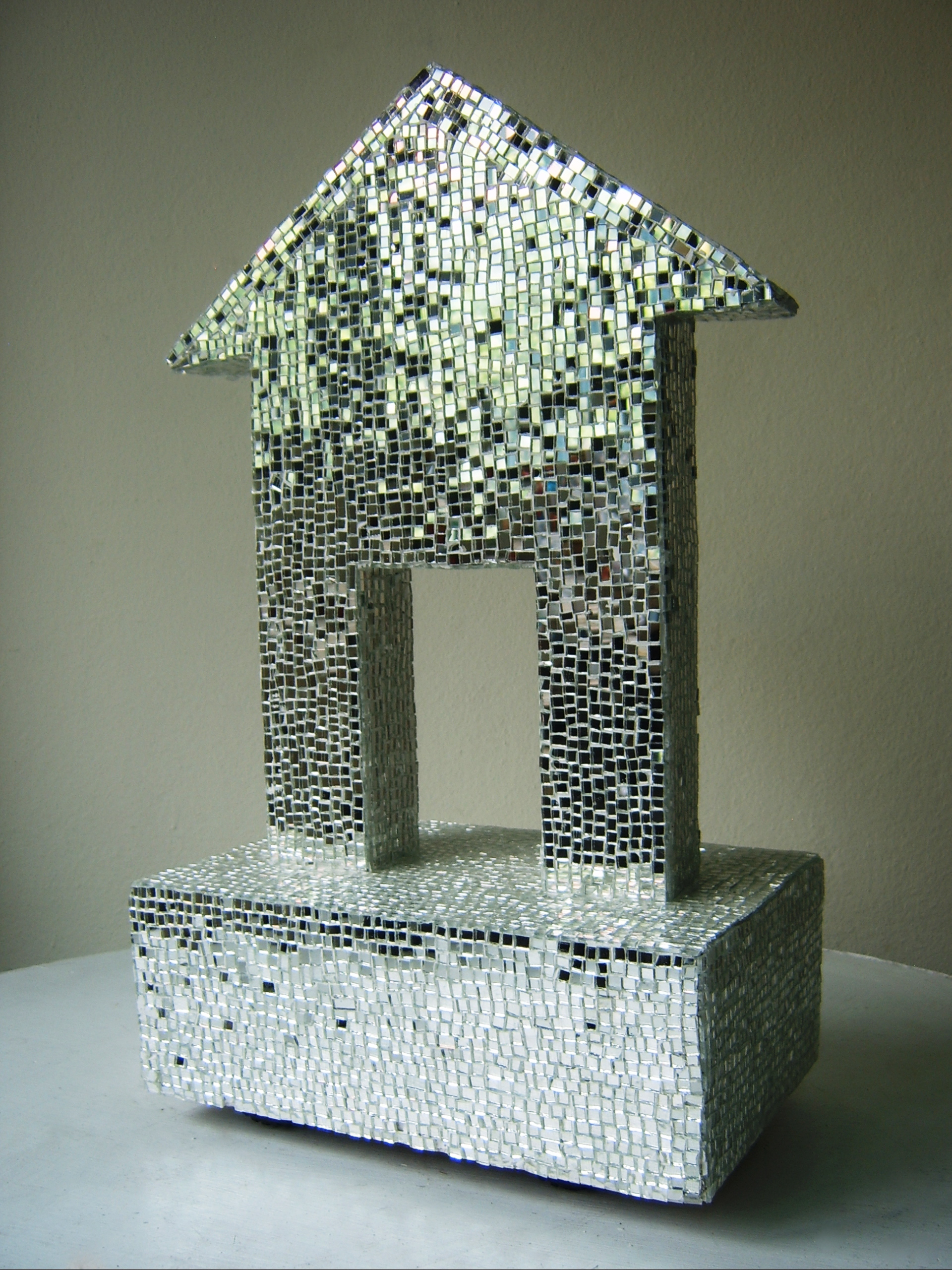
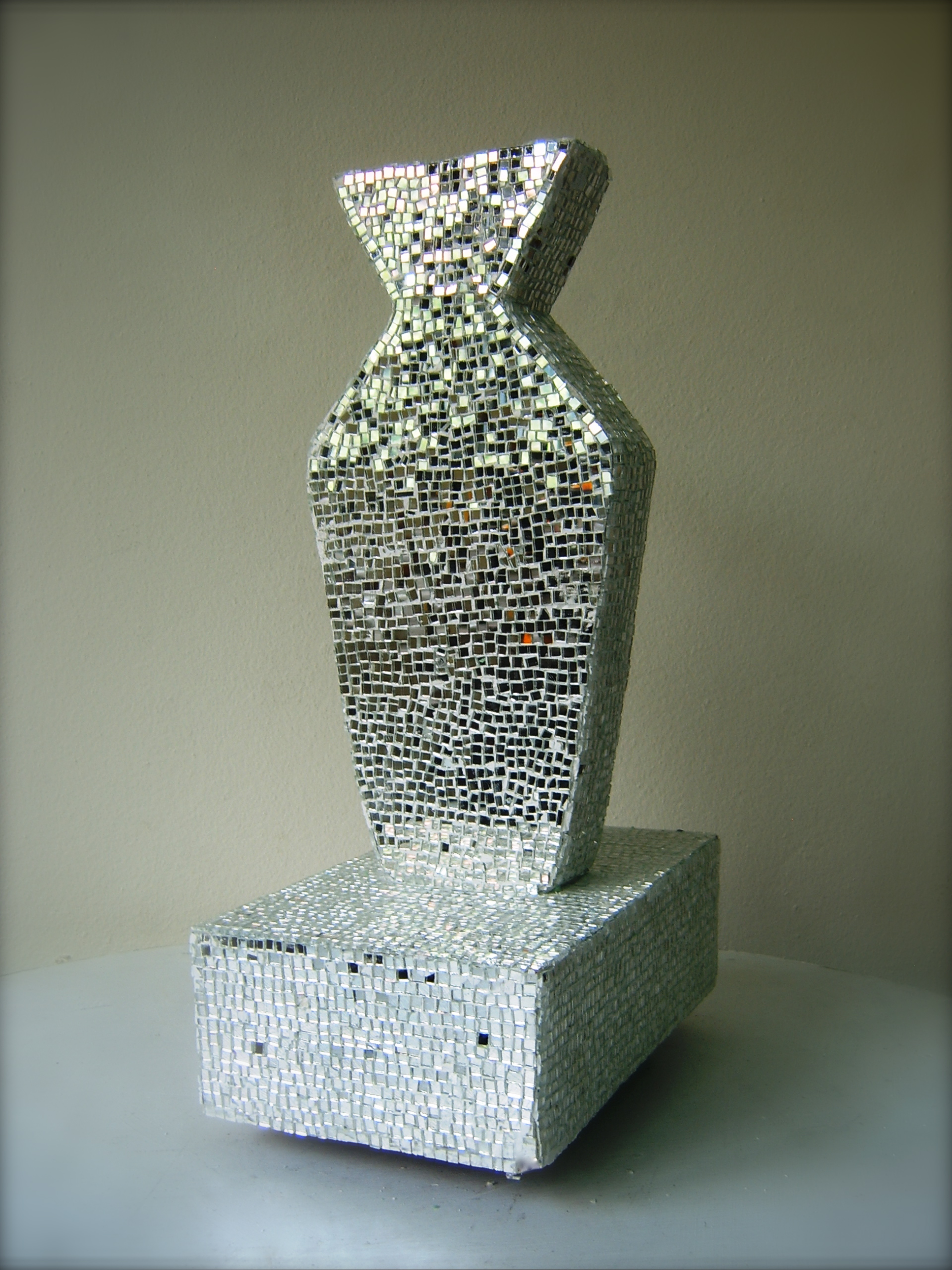
DIMENSION : 70 X 180 X 53 CM
TECHNIQUE : MIXED MEDIA
YEAR : 2013
 click here
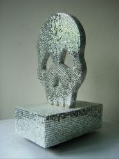
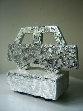
DIMENSION : 70 X 180 X 53 CM
TECHNIQUE : MIXED MEDIA
YEAR : 2013
 click here
DIMENSION : 5 X 7.5 X 7 CM
MATERIAL : TRAVEL UNIVERSAL ADAPTER
YEAR : 2013
 click here
DIMENSION : 5 X 7.5 X 7 CM
MATERIAL : TRAVEL UNIVERSAL ADAPTER
YEAR : 2013
 click here
DIMENSION : 5 X 7.5 X 7 CM
MATERIAL : TRAVEL UNIVERSAL ADAPTER
YEAR : 2013
 click here
 click here
 click here
 click here
 click here
 click here
SIZE : 18 X 20 INCH
TECHNIQUE : COLOR DIGITAL PHOTOGRAPHIC PRINT
YEAR : 2012
 click here
SIZE : 18 X 20 INCH
TECHNIQUE : COLOR DIGITAL PHOTOGRAPHIC PRINT
YEAR : 2012
 click here
SIZE : 18 X 20 INCH
TECHNIQUE : COLOR DIGITAL PHOTOGRAPHIC PRINT
YEAR : 2012
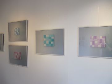
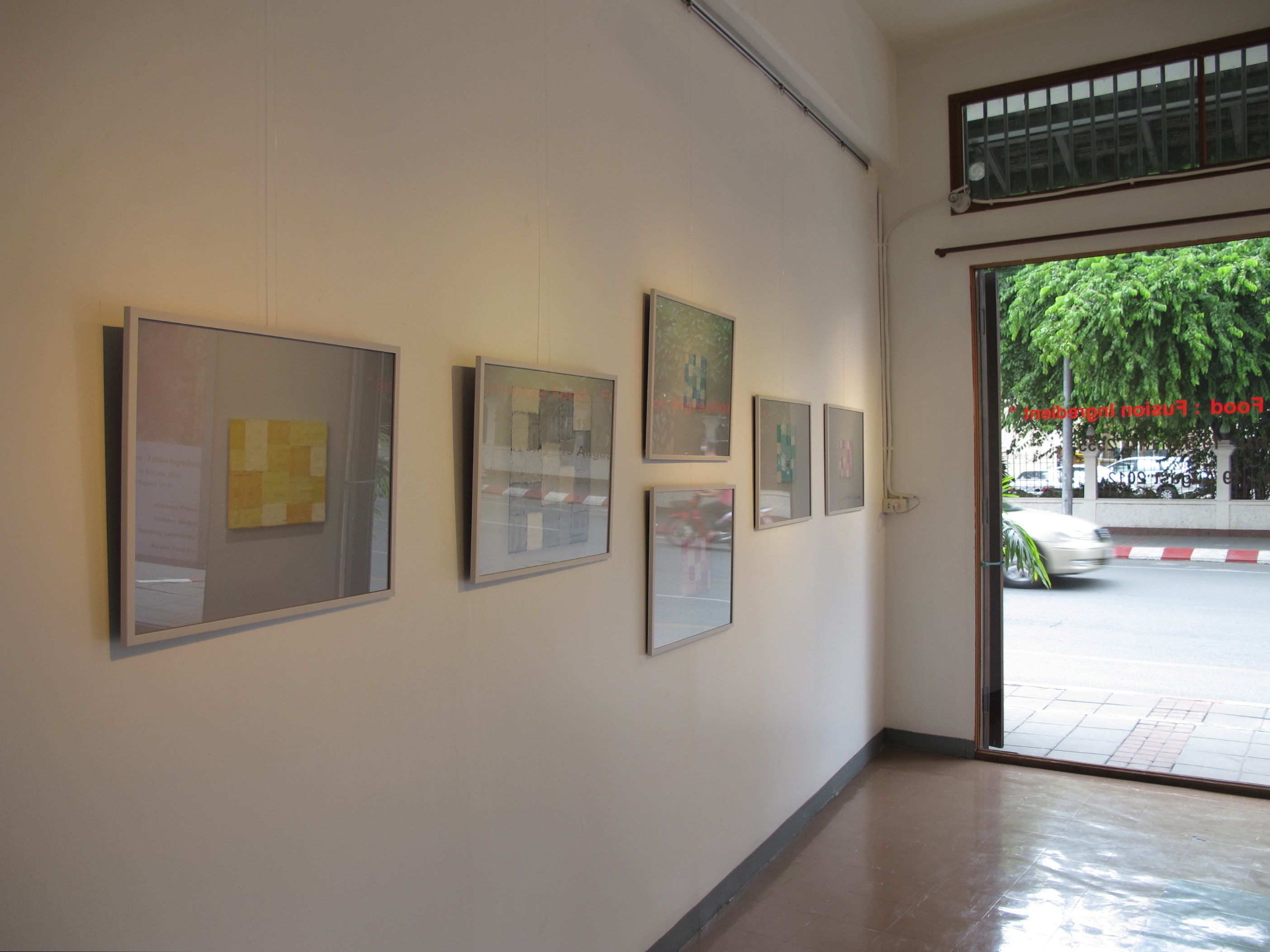
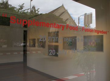
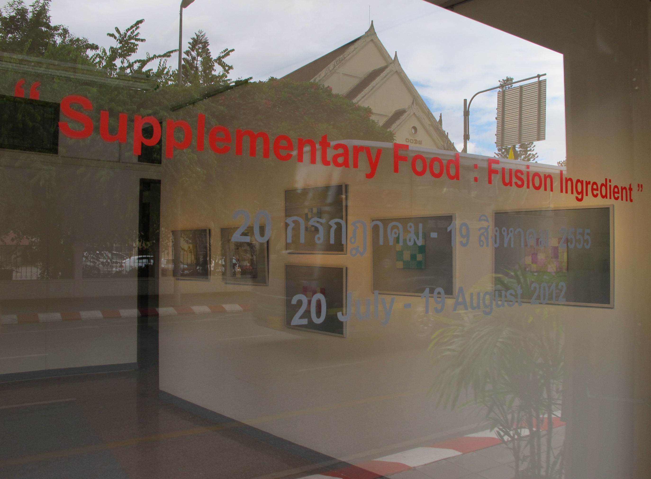
Exhibition : "Supplementary Food III Fusion Ingredient"
Period : July 19, 2012 - August 19, 2012
Place : Baan Tuek Art Center, Chiang Mai, Thailand.
Artist :
- Surajate Tongchua
- Jiratchaya Pripwai
- Supapong Laodheerasiri
- Vipaporn Nilubon
Curated by Somporn Rodboon
 click here
 click here
SIZE : 40 X 50 CM.
TECHNIQUE : COLLAGE AND ACRYLIC ON CANVAS
YEAR : 2011
 click here
SIZE : 18 X 24 CM.
TECHNIQUE : COLLAGE AND ACRYLIC ON CANVAS
YEAR : 2011
 click here
SIZE : 20 X 25 CM.
TECHNIQUE : COLLAGE AND ACRYLIC ON CANVAS
YEAR : 2011
 click here
SIZE : 70 x 70 CM.
TECHNIQUE : COLLAGE AND ACRYLIC ON CANVAS
YEAR : 2012
 click here
SIZE : 50 x 50 CM.
TECHNIQUE : COLLAGE AND ACRYLIC ON CANVAS
YEAR : 2011
 click here
SIZE : 50 x 75 CM.
TECHNIQUE : COLLAGE AND ACRYLIC ON CANVAS
YEAR : 2011
 click here
SIZE : 20 X 20 CM.
TECHNIQUE : COLLAGE AND ACRYLIC ON CANVAS
YEAR : 2011
 click here
SIZE : 20 X 20 CM.
TECHNIQUE : COLLAGE AND ACRYLIC ON CANVAS
YEAR : 2011
 click here
SIZE : 40 X 30 CM.
TECHNIQUE : COLLAGE AND ACRYLIC ON CANVAS
YEAR : 2011
 click here
SIZE : 50 X 60 CM.
TECHNIQUE : COLLAGE AND ACRYLIC ON CANVAS
YEAR : 2011
 click here
SIZE : 15 X 21 CM.
MATERIAL : TAX INVOICE / RECEIPT
YEAR : 2012
 click here
SIZE : 15 X 21 CM.
MATERIAL : TAX INVOICE / RECEIPT
YEAR : 2012
 click here
 click here
 click here
 click here
 click here
Exhibition : ART 20 KG.
Period : 20 SEP - 20 OCT 2011
Place : Artery Gallery, The Silom Galleria, BKK
Artists :
Noraset Vaisayakul
Torlarp Larpjaroensook
Nithiphat Hoisangthong
Natthames Preechadhamasak
Natnaran Bualoy
Krit Ngamsom
Supapong Laodheerasiri
Pisitakun Kuntalang
Curated by :
Nithiphat Holsangthong
 click here
SIZE : 20 X 24 CM
TECHNIQUE : PERMANENT PEN ON CANVAS
YEAR : 2011
 click here
SIZE : 20 X 24 CM
TECHNIQUE : PERMANENT PEN ON CANVAS
YEAR : 2011
 click here
SIZE : 20 X 24 CM
TECHNIQUE : PERMANENT PEN ON CANVAS
YEAR : 2011
 click here
SIZE : 20 X 24 CM
TECHNIQUE : PERMANENT PEN ON CANVAS
YEAR : 2011
 click here
 click here
 click here
 click here
 click here
In The Future (?)
Nipan Oranniwesana
Kata Sangkhae
Chakkrit Chimnok
Aphiwat Sangpattaseema
Supicha Tovivich
Supapong Laodheerasiri
Curated by
Somsuda Piamsumrit
Curatorial Association by Worathep Akkabootra
29 May 2009 – 11 July 2009 at VER Gallery, Bangkok, Thailand.
 click here
 click here
 click here
Technique : Acrylic on canvas
Size : 11 X 11 inch
(11 pieces)
Year : 2008
 cilck here
Technique : Mixed media
Size : 55 X 55 X 48 cm
Year : 2008
 cilck here
Size : 28 X 36 X 10 cm
Year : 2008
 cilck here
Art Thesis Exhibition,
Faculty of Fine Arts,
Chiang Mai University
6 - 30 March 2009
at Chiang Mai University
Art Center
Chiang Mai, Thailand.
 click here
 click here
 click here
 click here
 click here
 click here
Technique : Mixed media
Size : 244 X 366 X 100 cm
Year : 2008
 click here
 click here
 click here
 click here
 click here
 click here
 Plan of exhibition
Beautiful (Bangkok)
Brand new 2008 Art Project
Artist :
Supapong Laodheerasiri
Curated by
Marianne Massland
6 - 31 March 2008
at Chulalongkorn University
Art Center
Bangkok, Thailand.